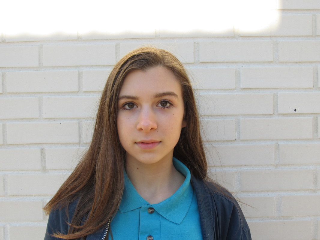
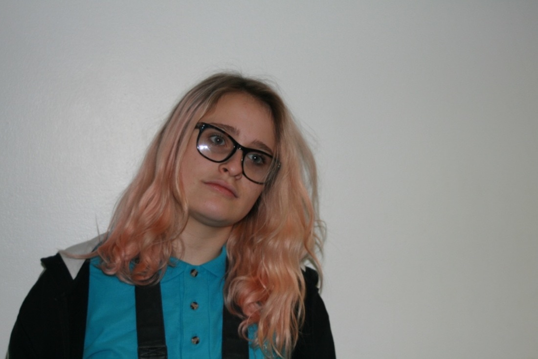
Introduction
Edges is our first in depth work on one theme. In this theme we have looked at some of the possibilities and idea, witch are endless.; We have also been looking at the concept of edges and how photography gives edges to everything despite weather or not it has a edge. We then began making images on the theme of edges. We done this in multiple ways witch are all shown below.
I am enjoying looking at edges as i like the concept of edges and also i like how broad the theme is seeing as every thing photographed will have an edge in the image.
I am enjoying looking at edges as i like the concept of edges and also i like how broad the theme is seeing as every thing photographed will have an edge in the image.
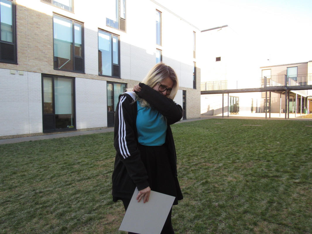
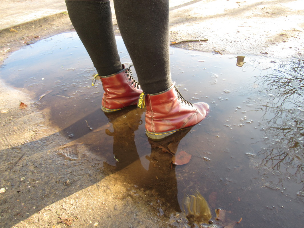
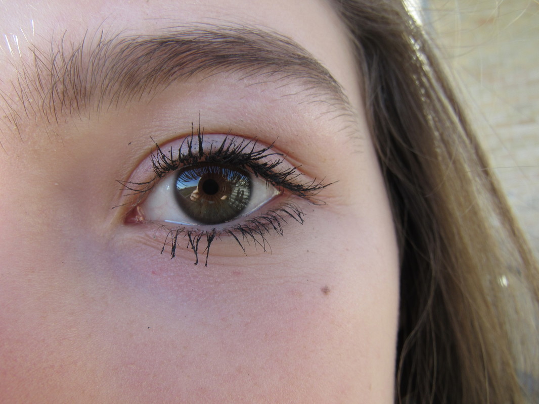
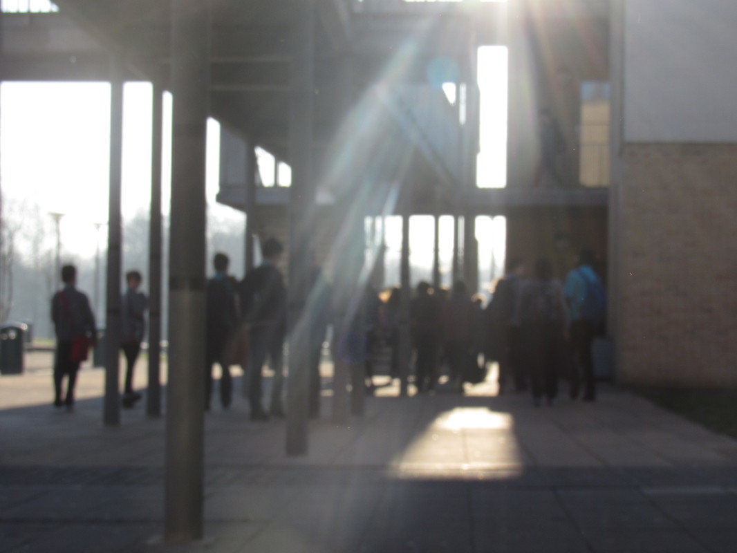
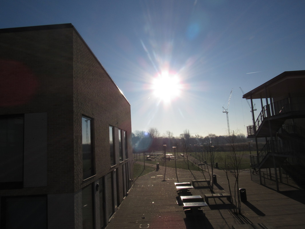
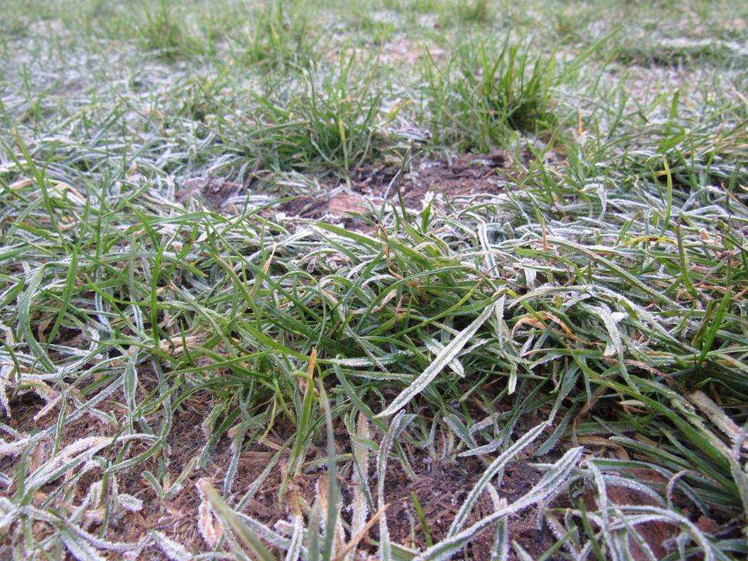
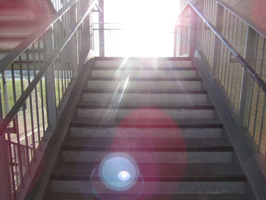
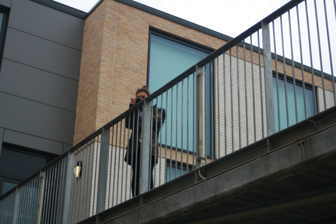
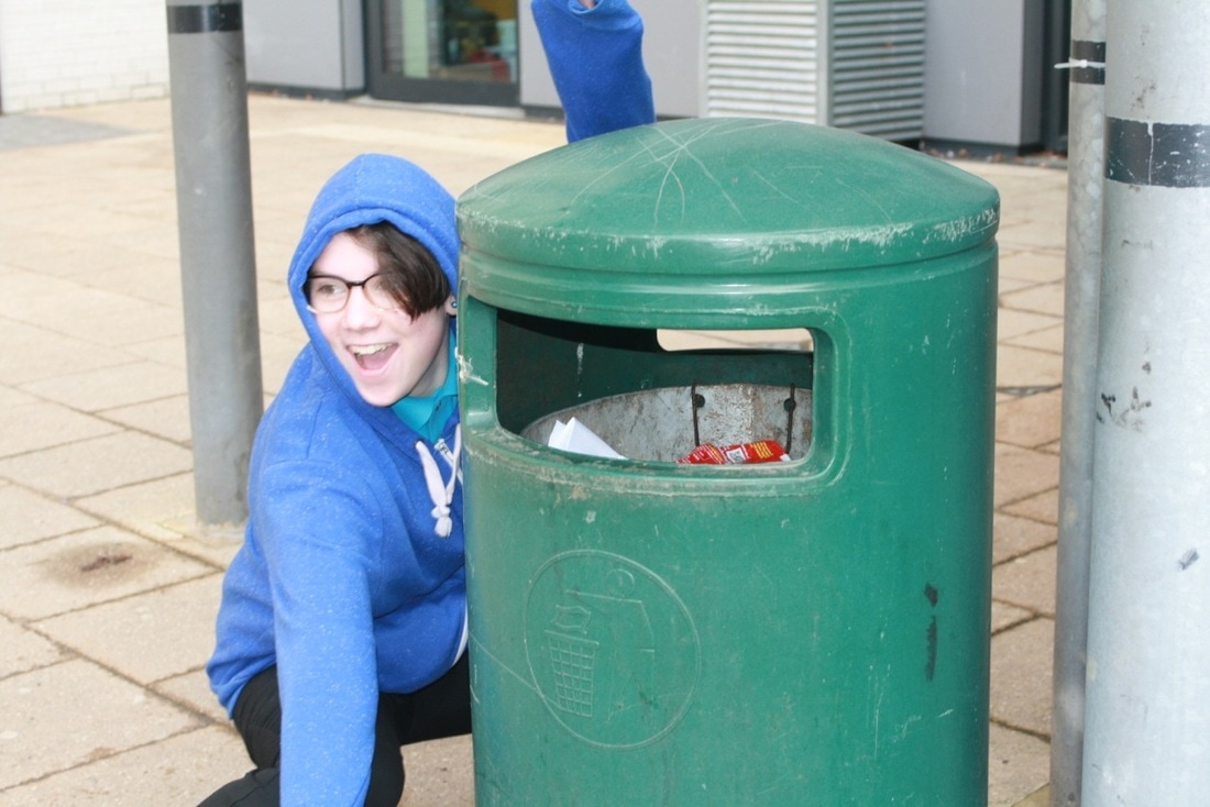
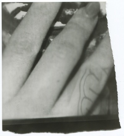
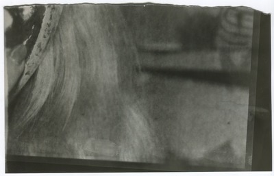
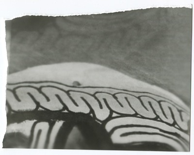
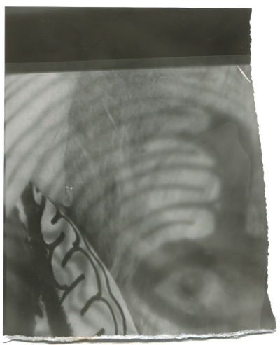
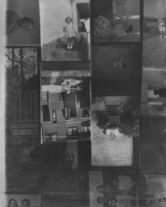
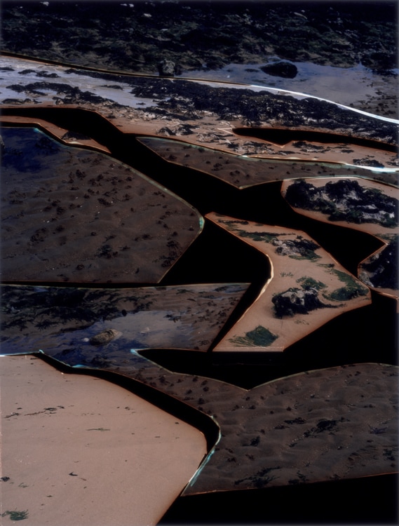
27 photos based on the theme of edges.
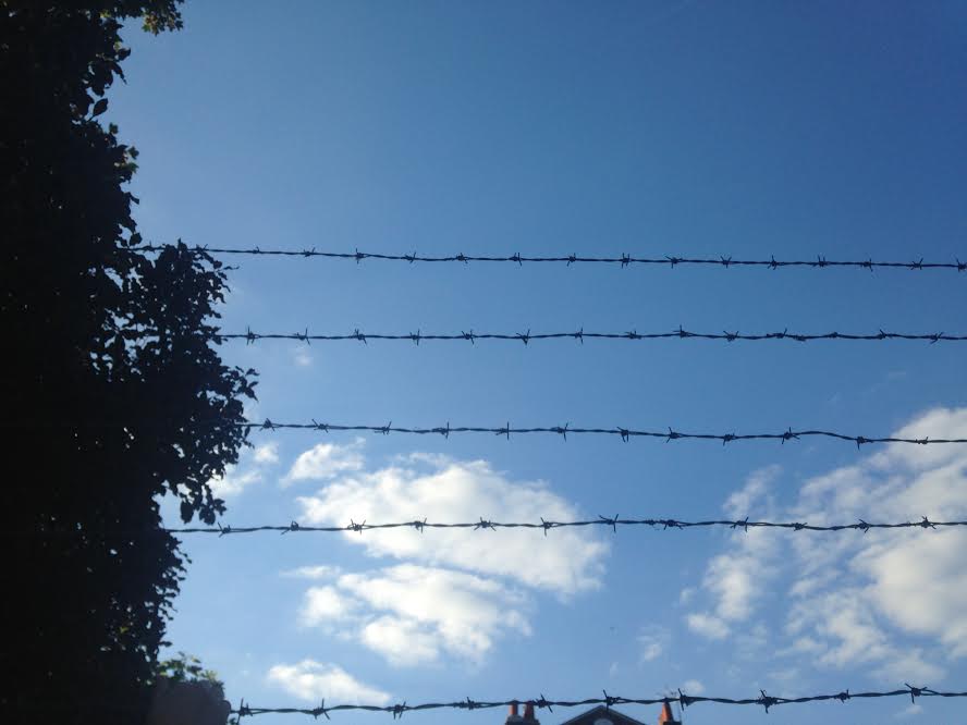


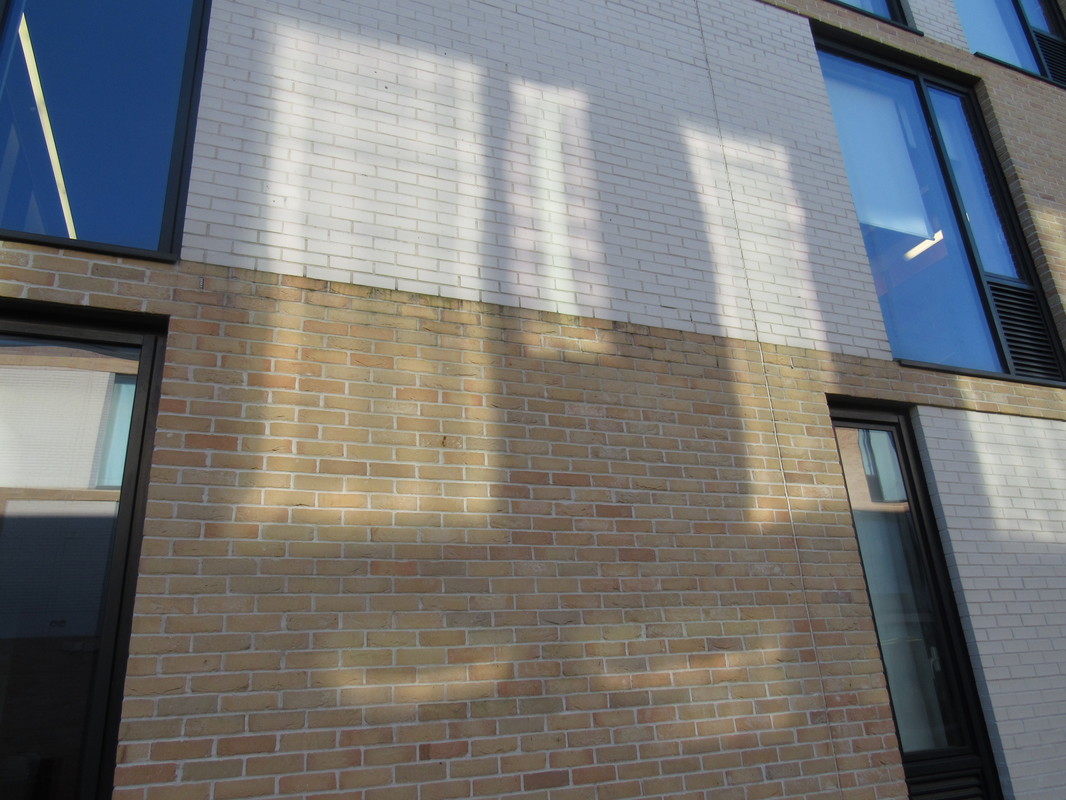
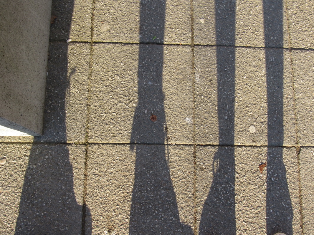
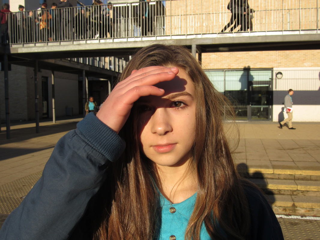
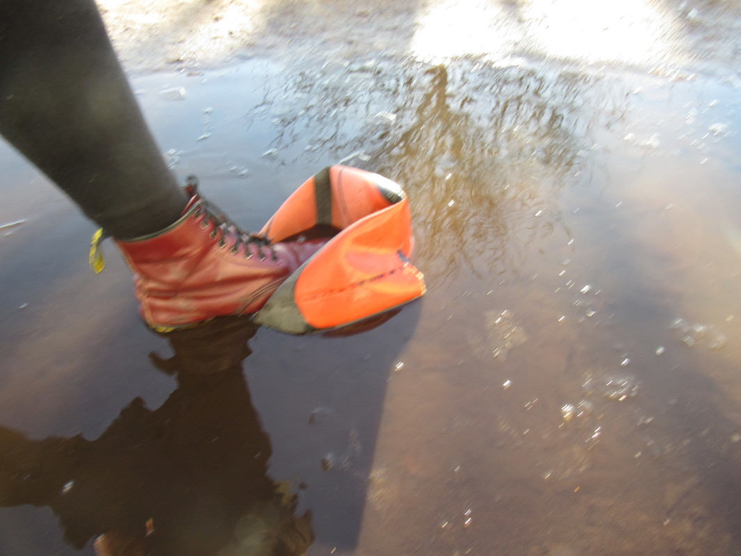
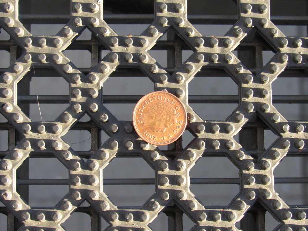
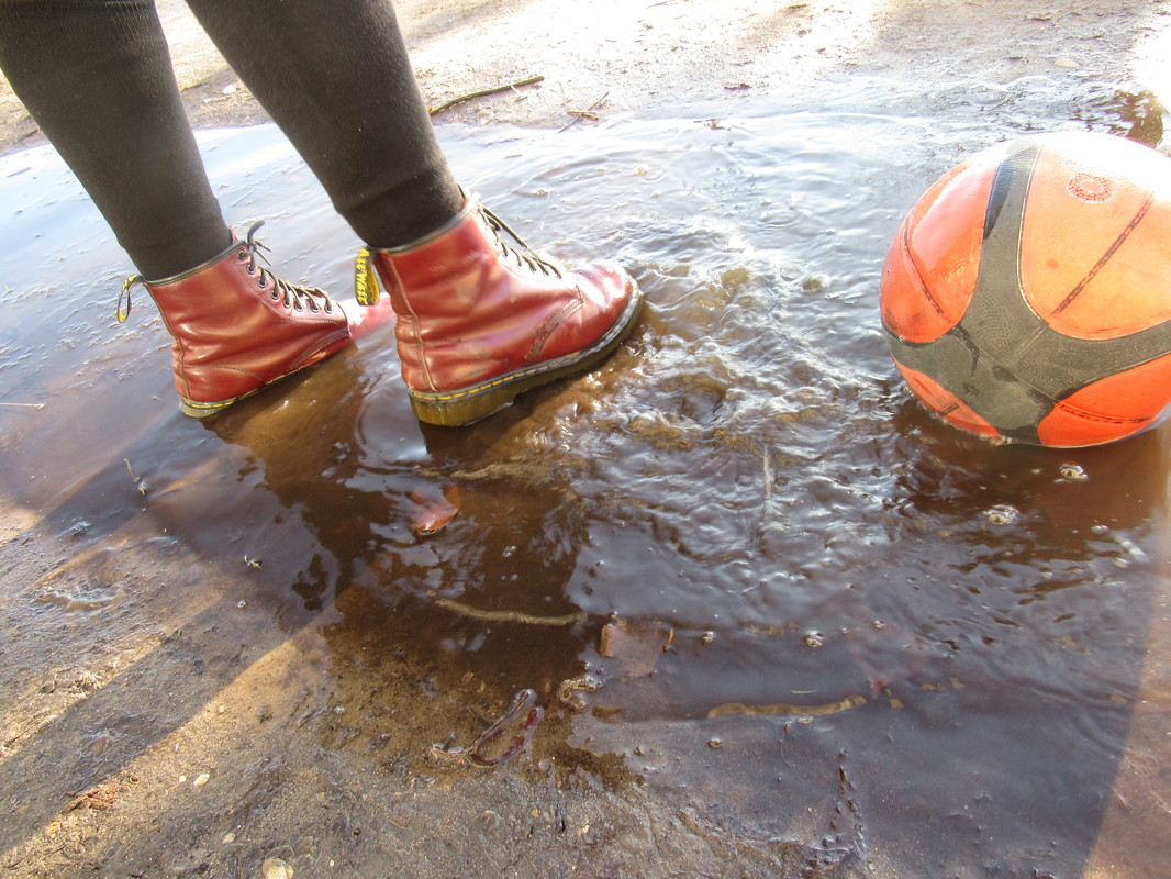
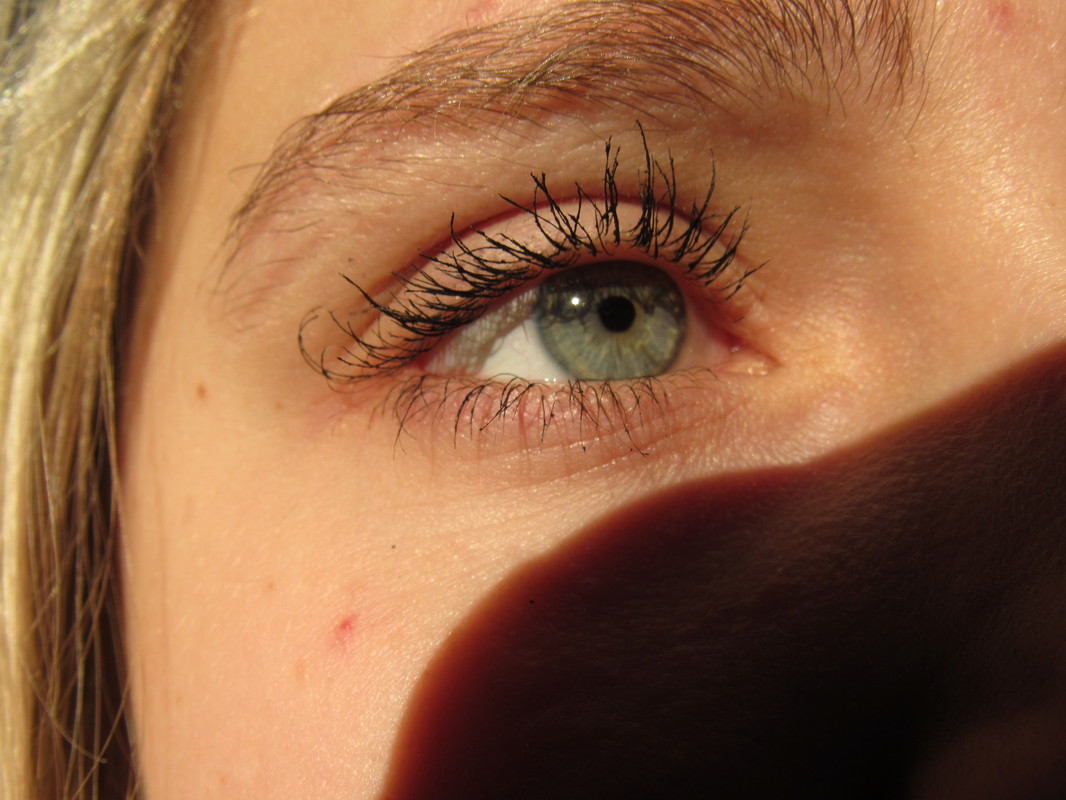
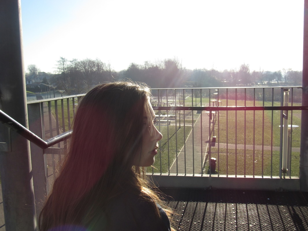
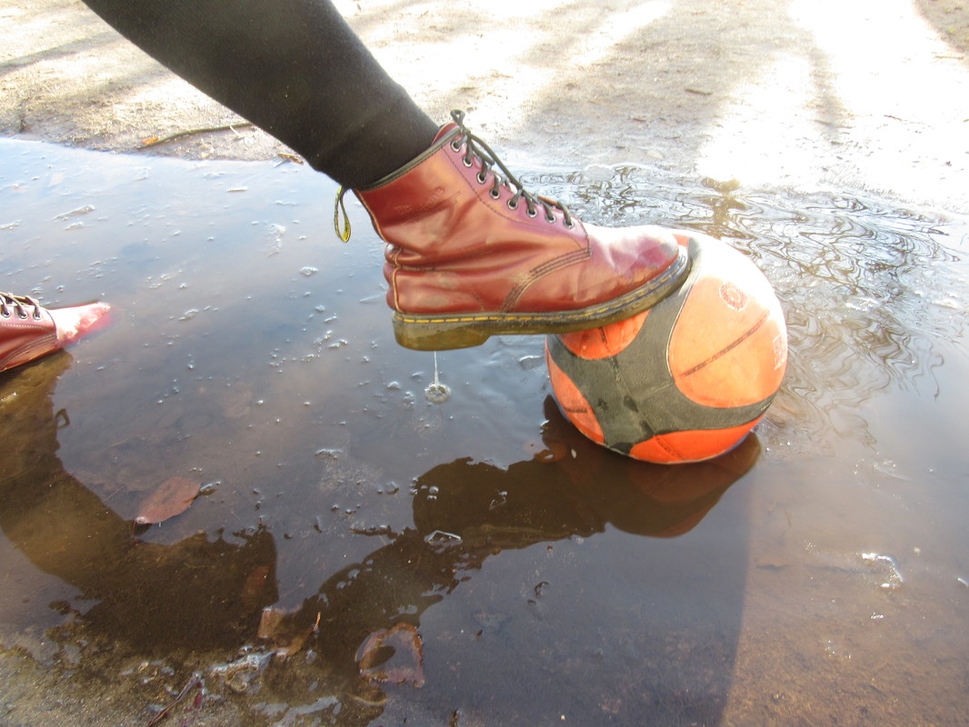
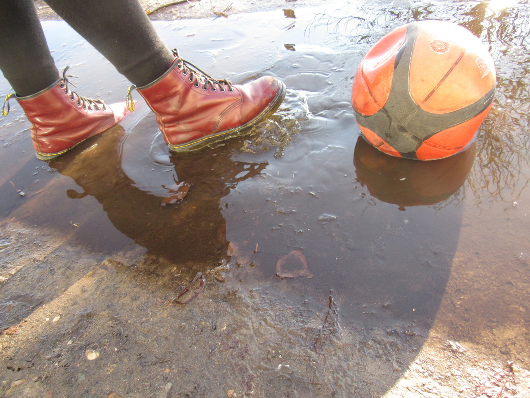
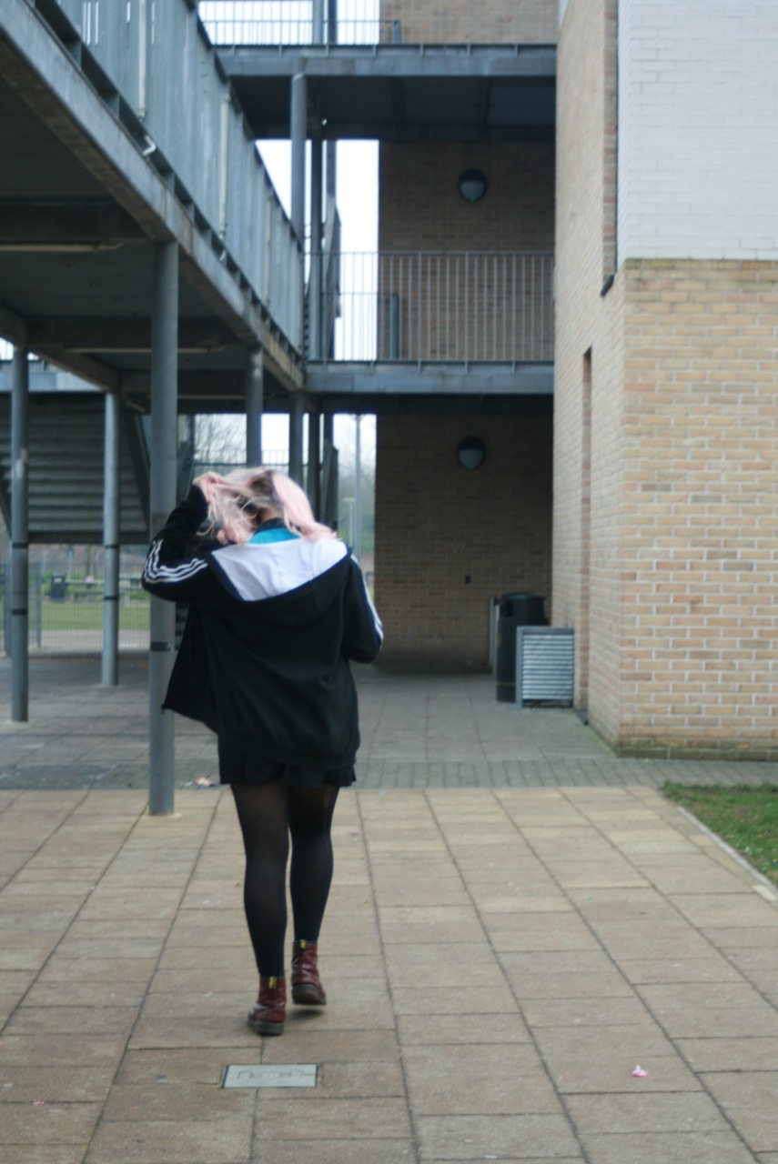
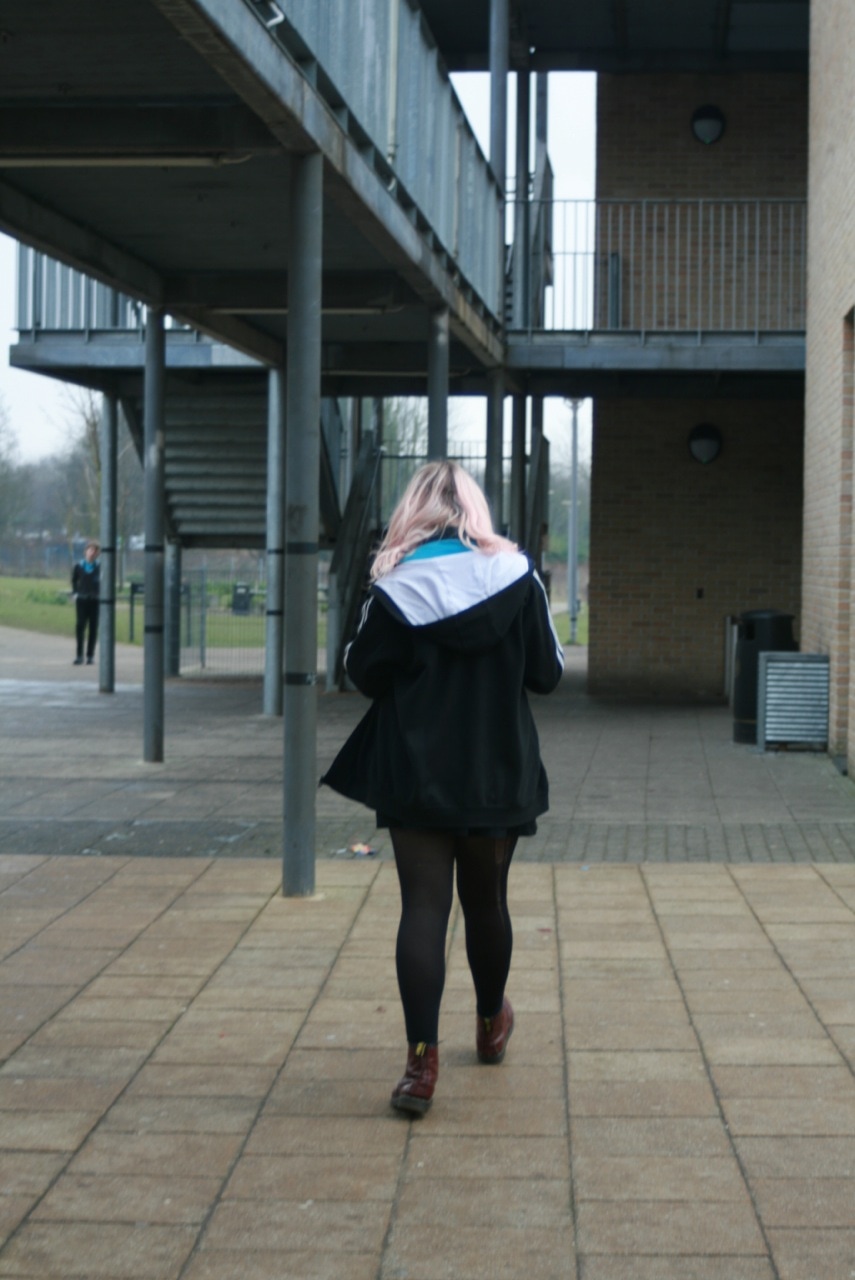
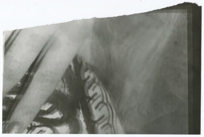
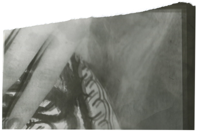
We were given a task to complete over the holidays. The task was to take 20 or more photos on the theme 'Edges'. We were given no other information on what kind of photos to take meaning we had to think about what the possibilities were with this task. I realised there were two main types of edges - Edges of flat objects for example the edge of a piece of paper, witch is not techniqualy an edge as evan a single sheet of paper has dimensions but we class it an edge anyways. The other type of main edge is the edges we create when we photgraph a subject for exanple a football with no edge can be photographed to give it an edge.
EVALUATION
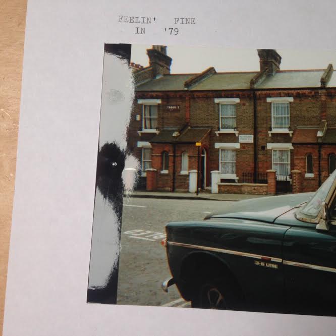
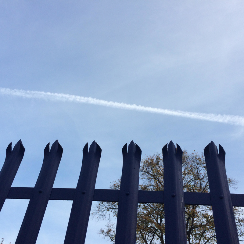
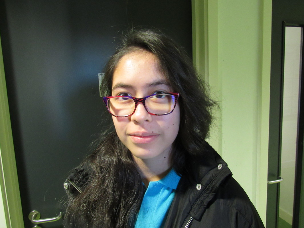
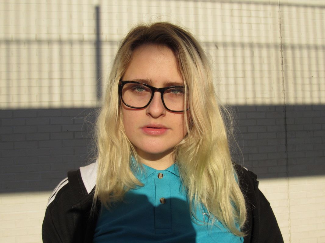
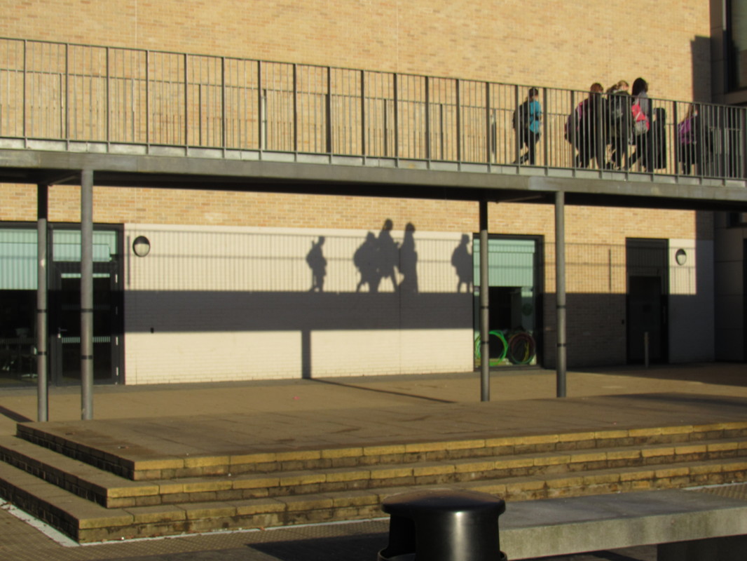
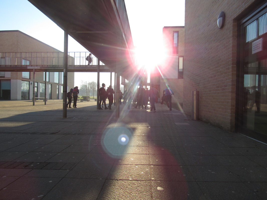
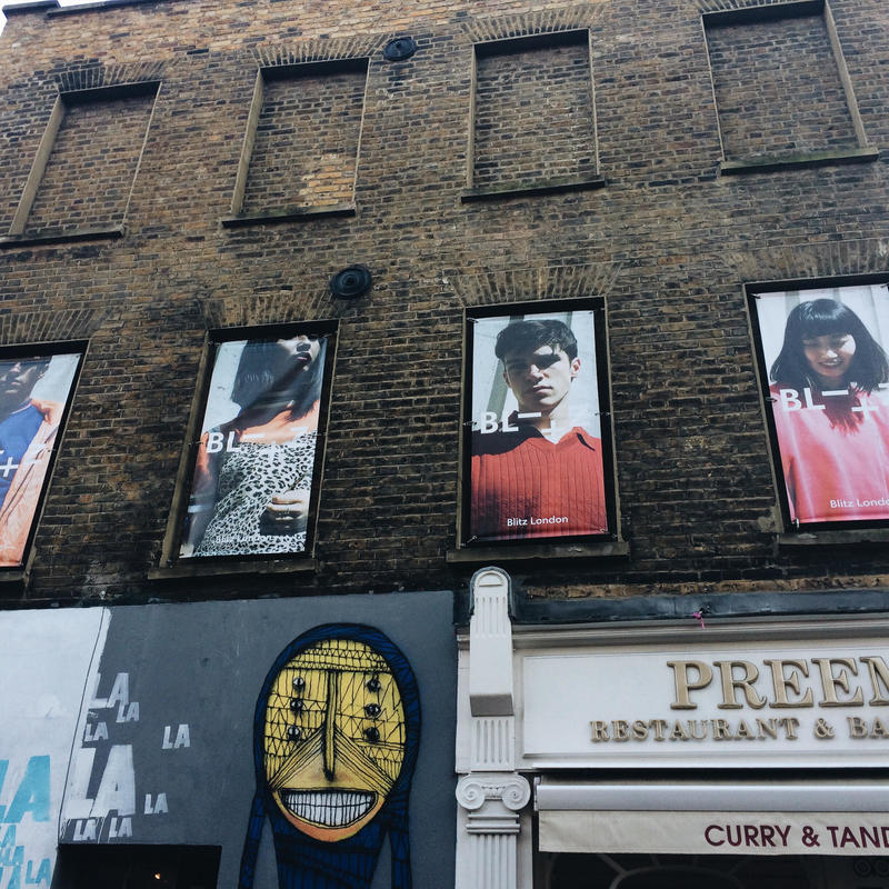
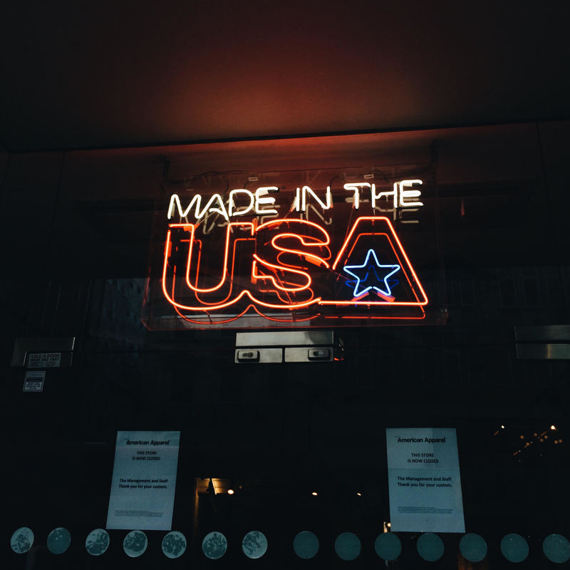
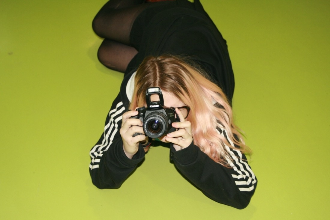
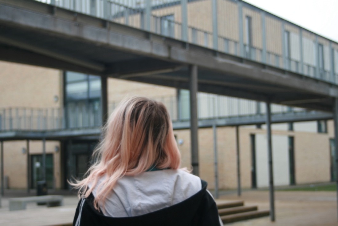
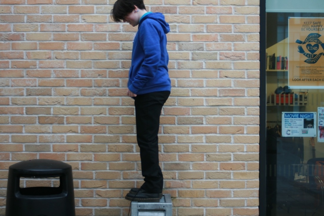
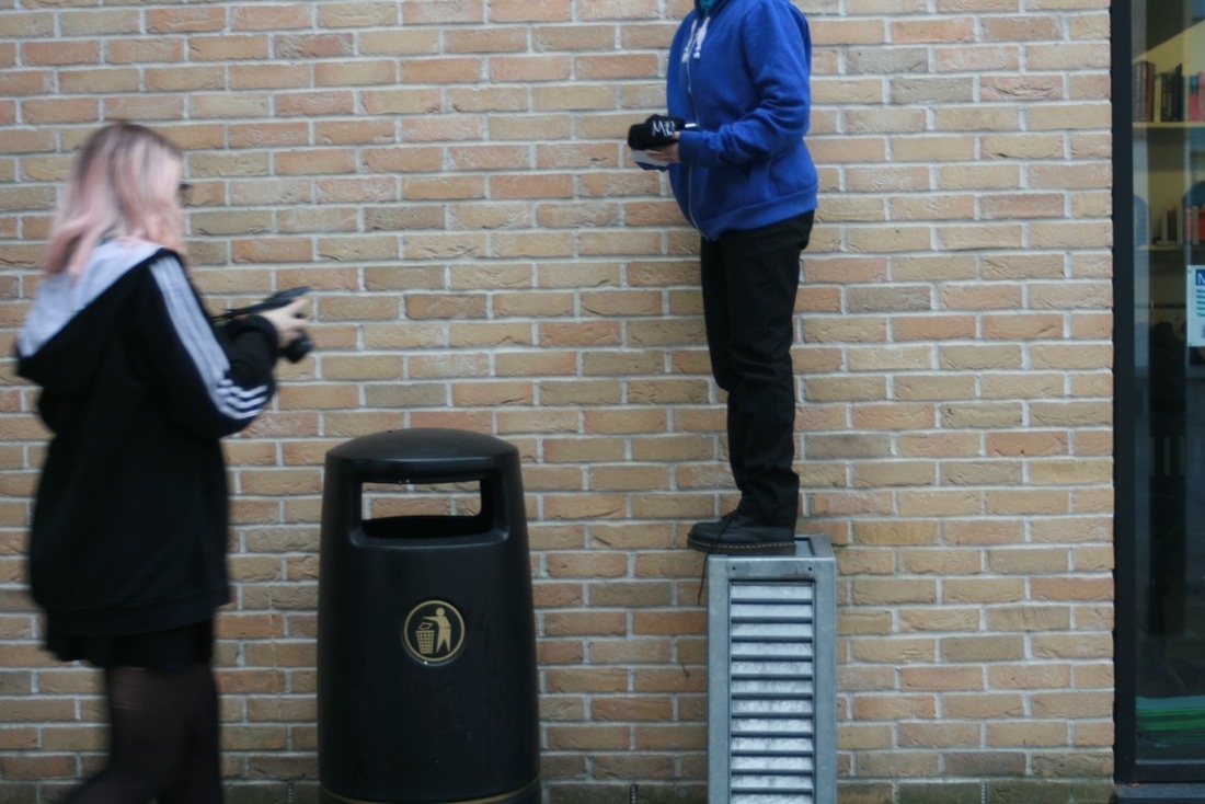
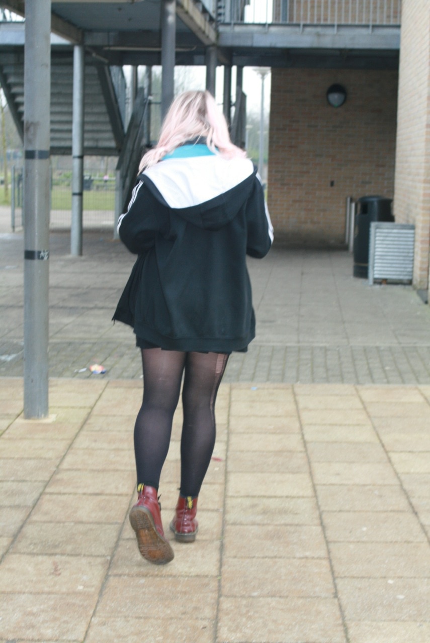
I think my most succsessful image is this one as I feel it gives a really retro vibe and is interesting to look at, I also like the people walking past as it adds a interesting aspect.
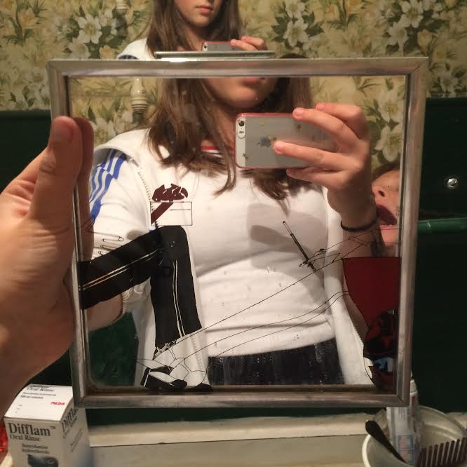
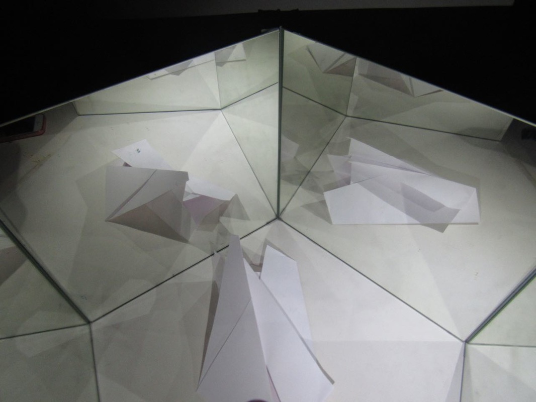
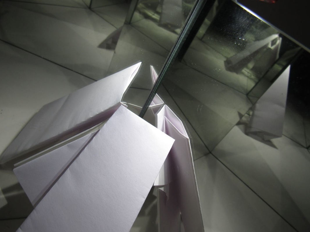
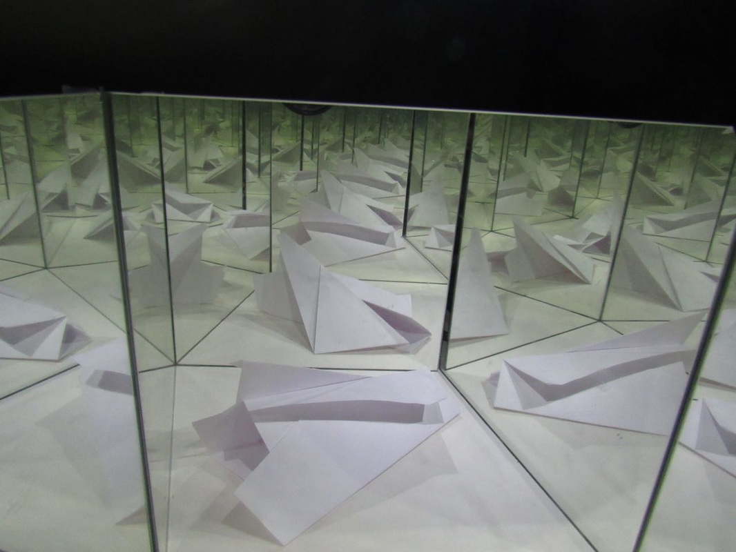
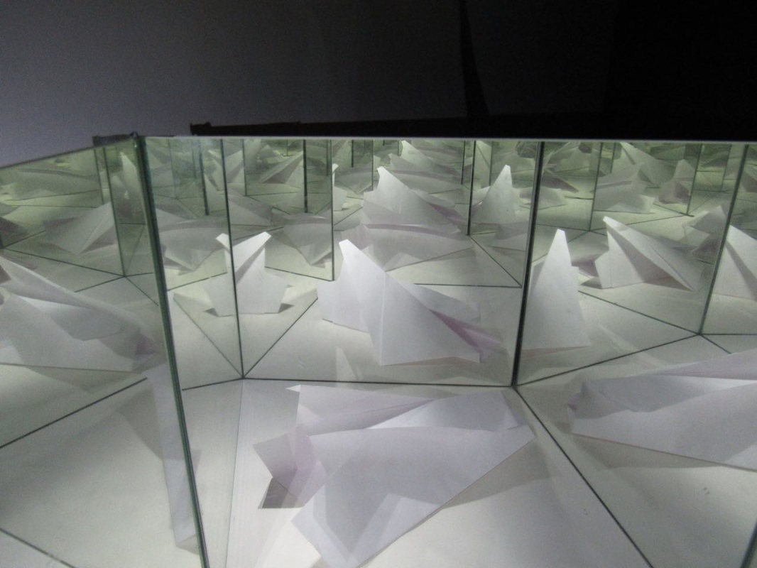
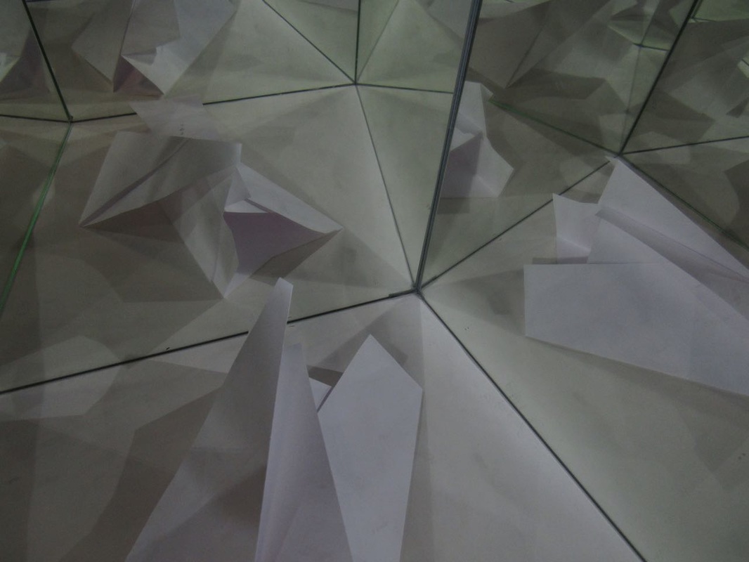
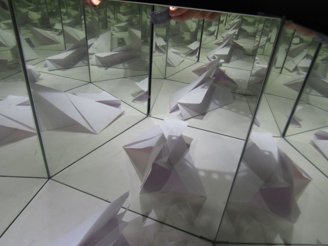
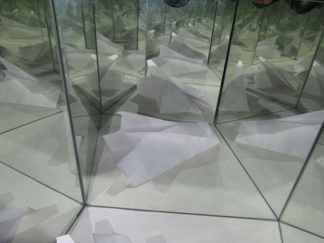
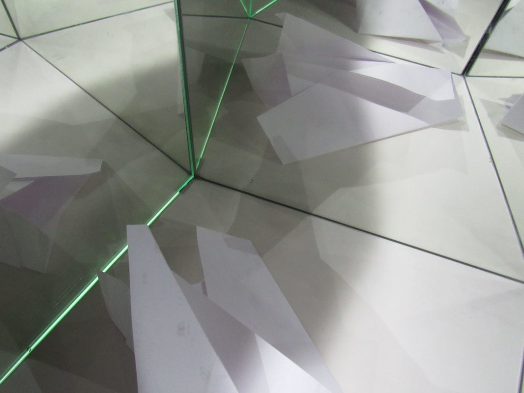
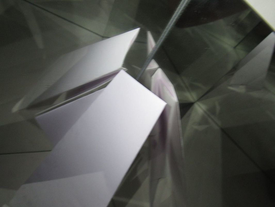
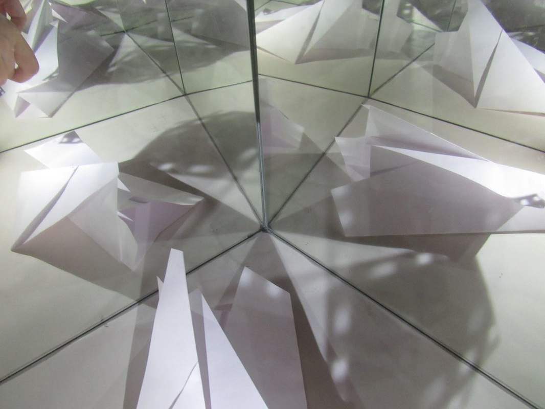
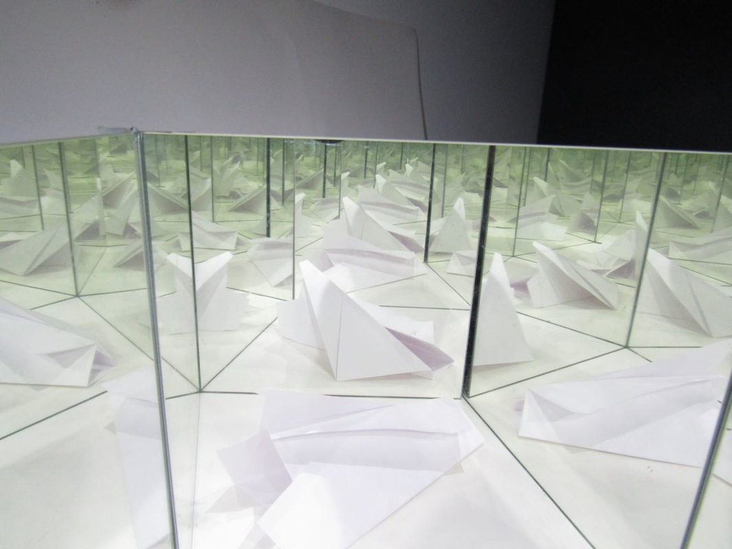
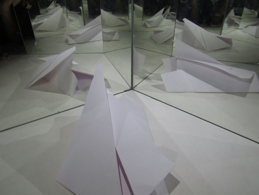
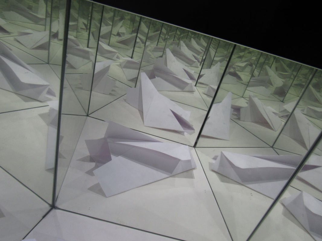
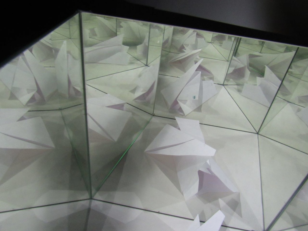
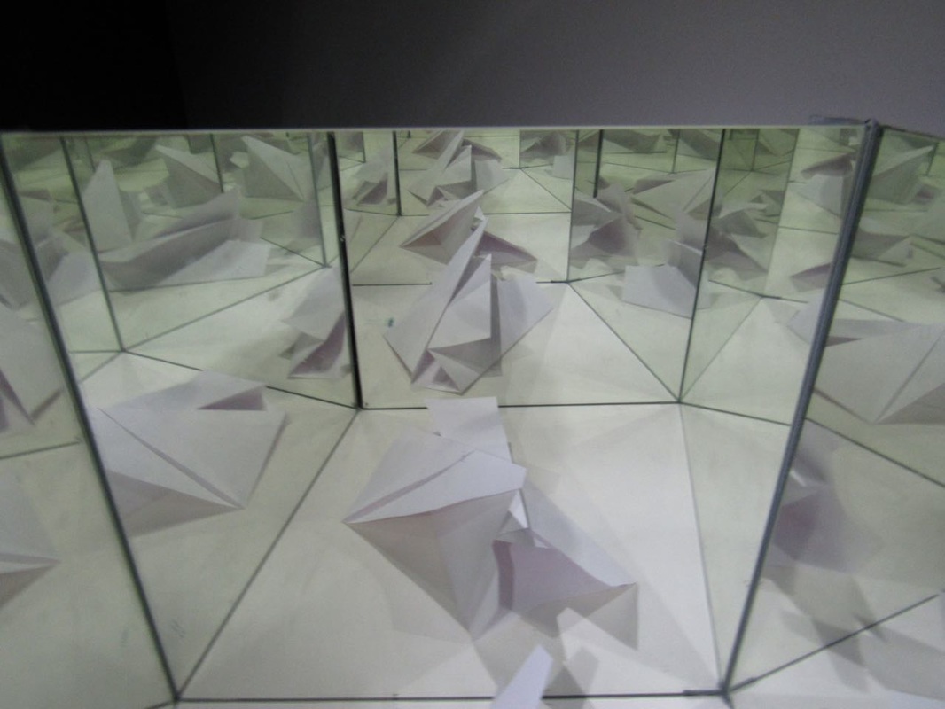
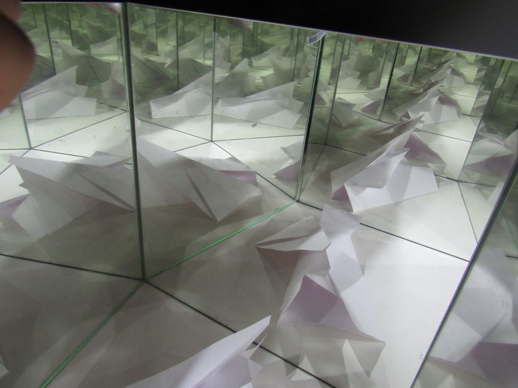
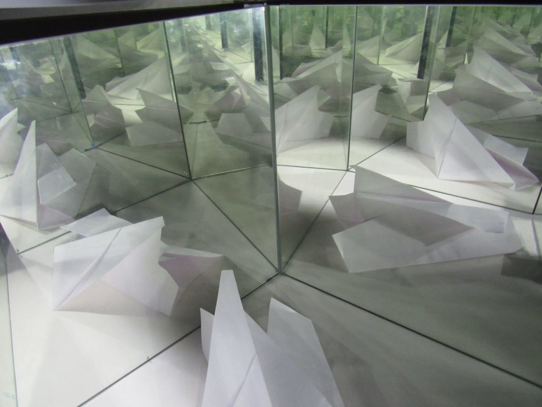
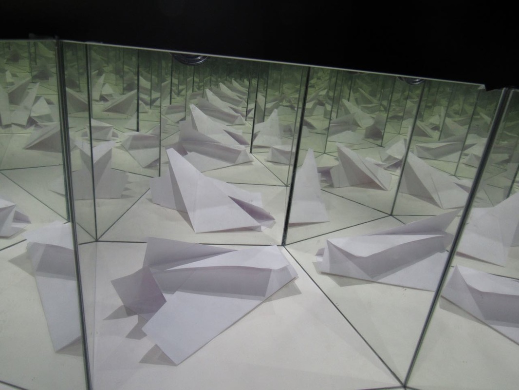
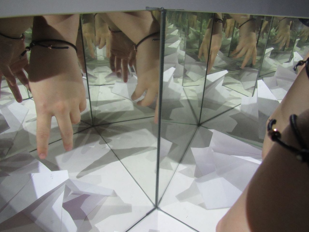
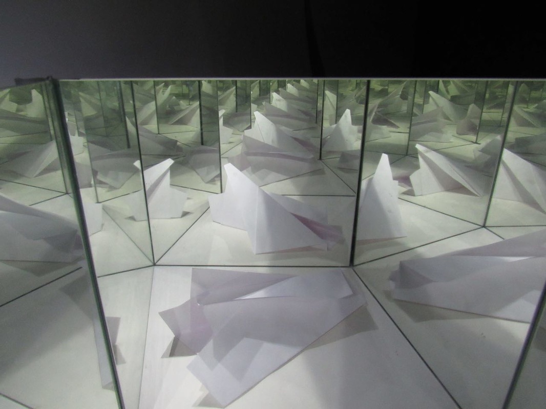
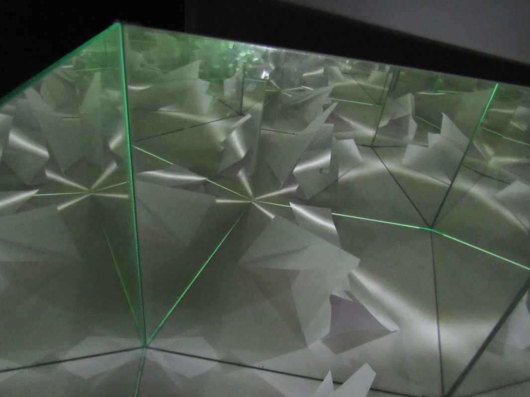
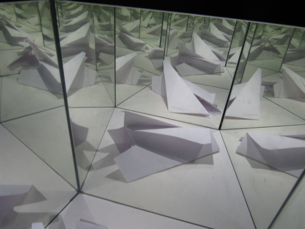
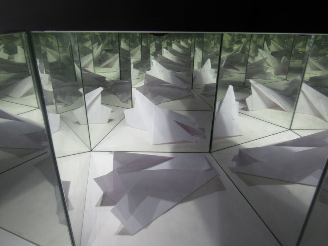
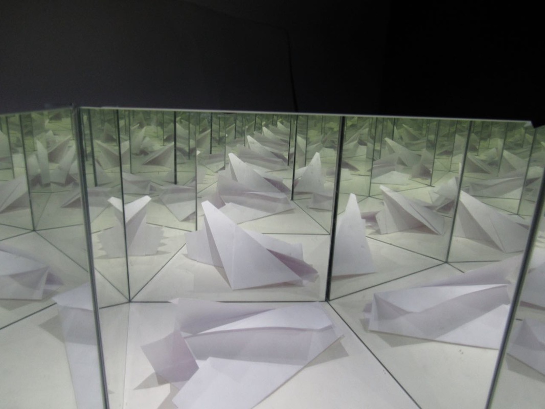
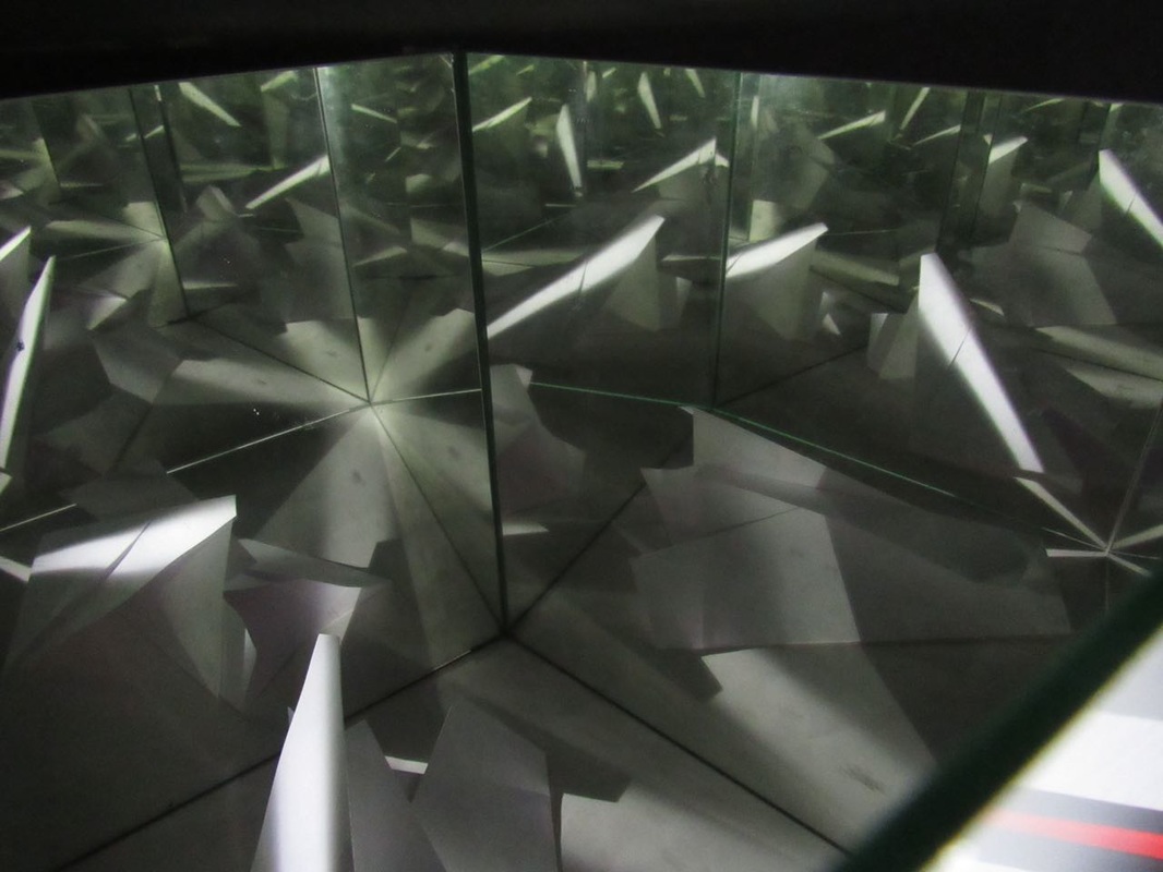
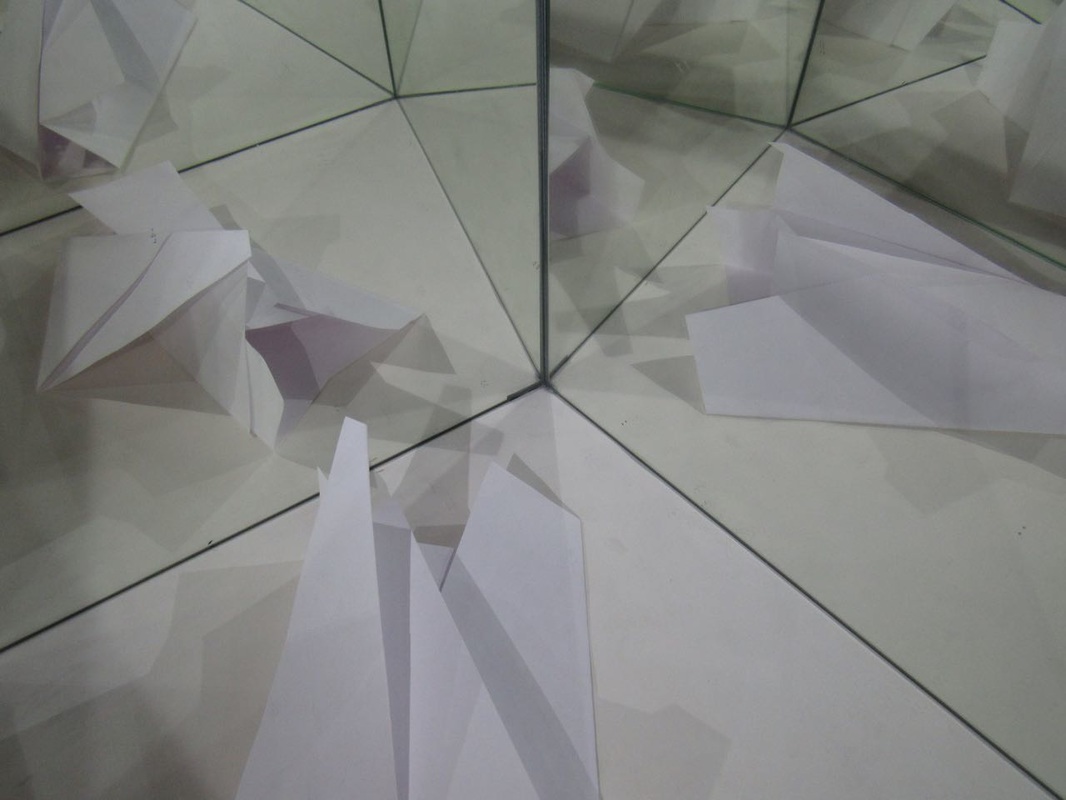
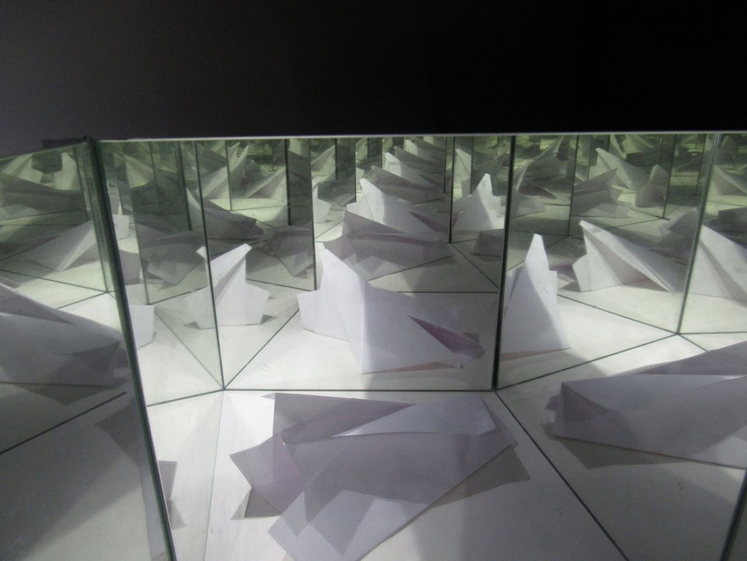
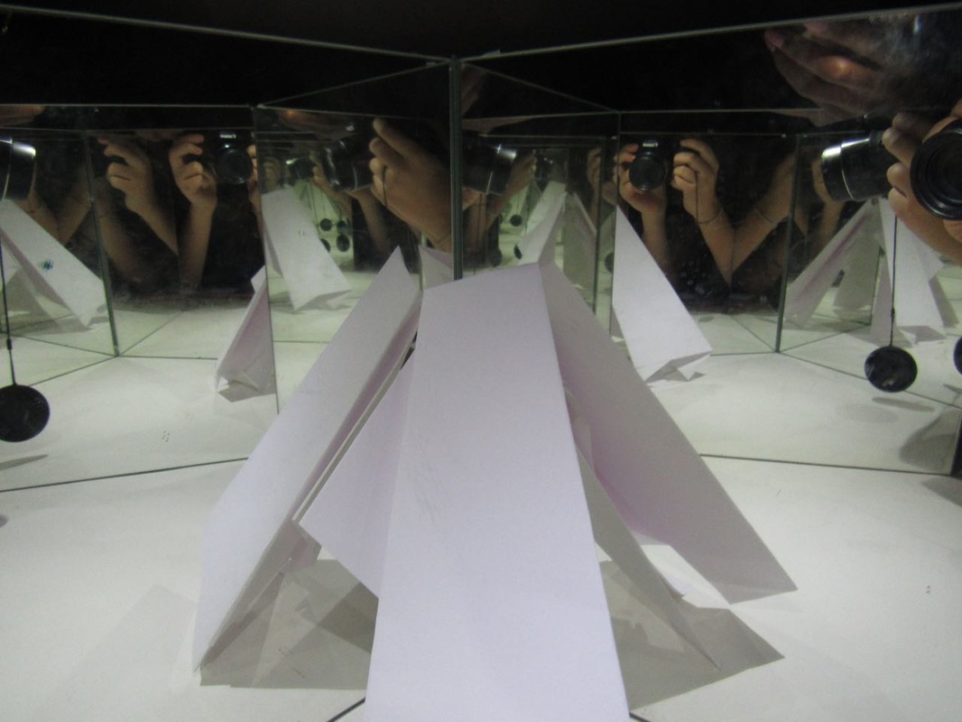
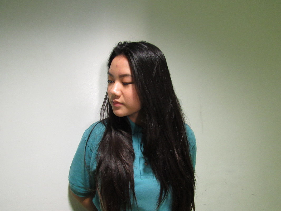
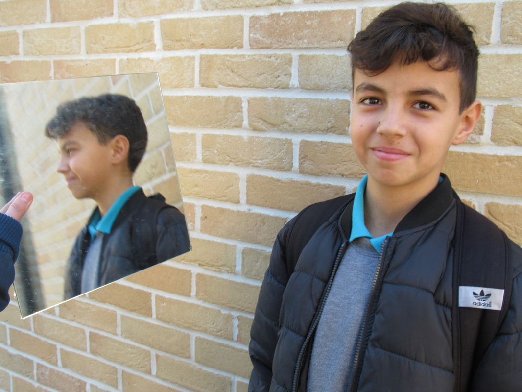
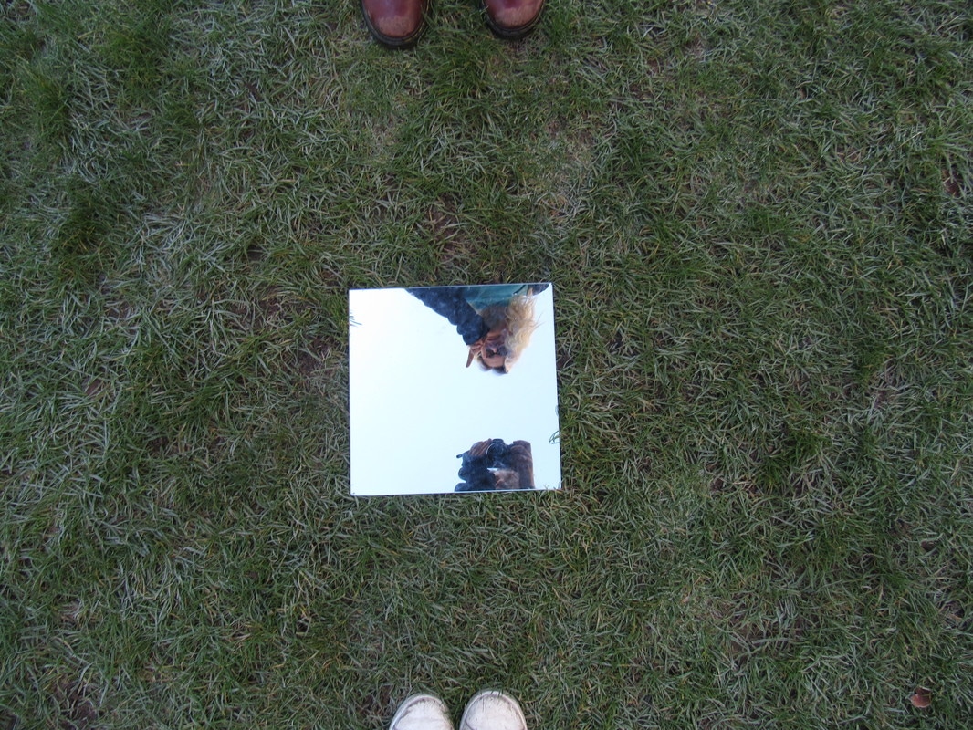
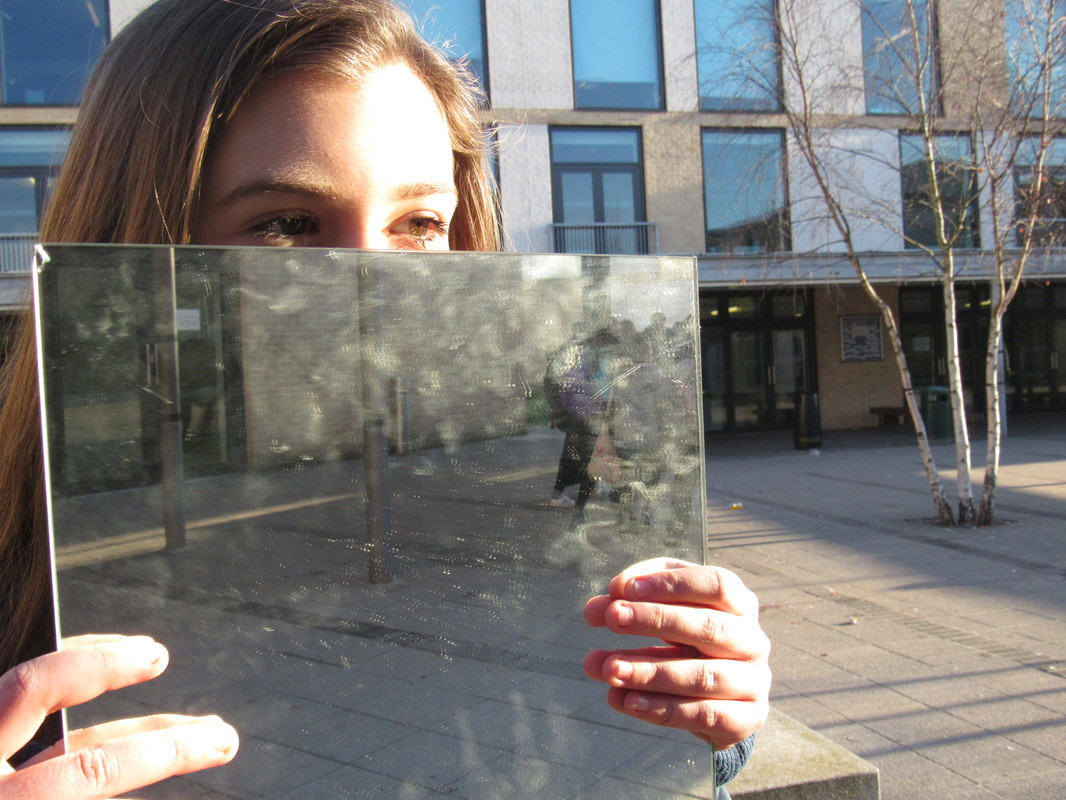
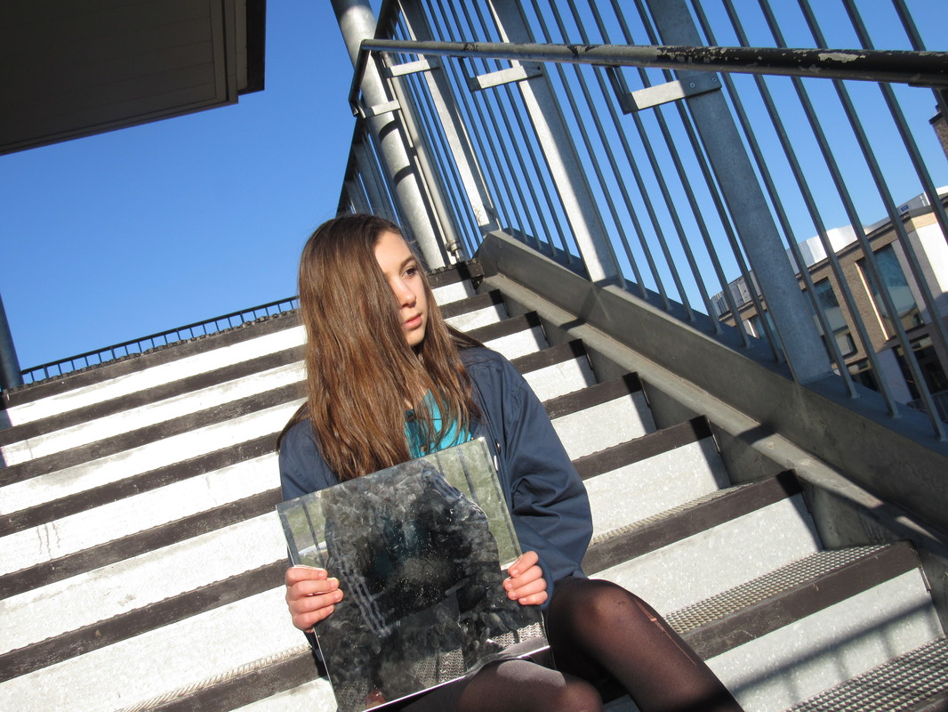
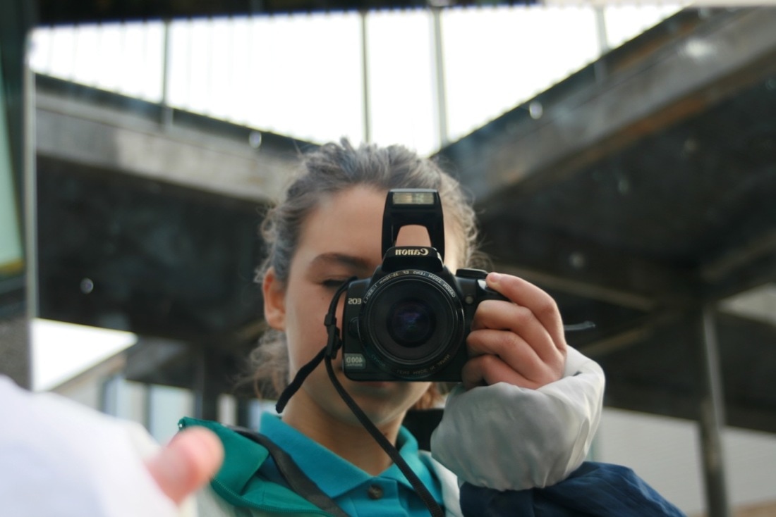
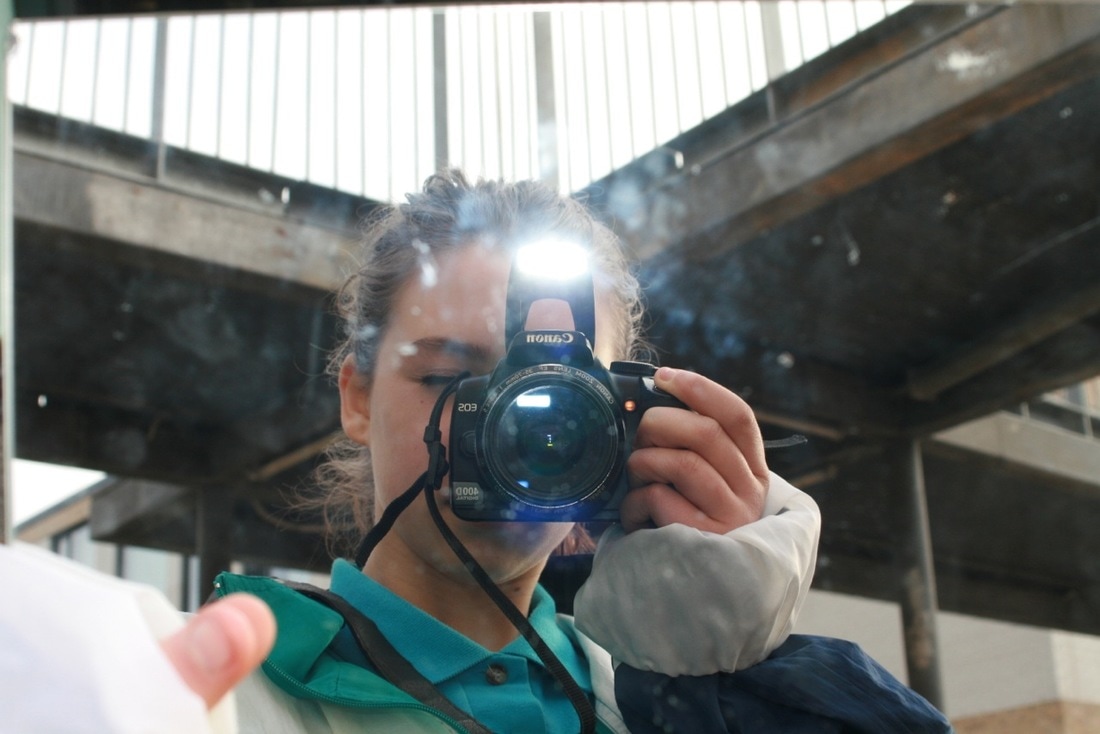
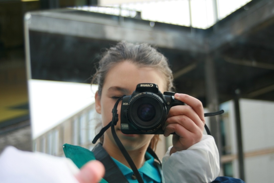
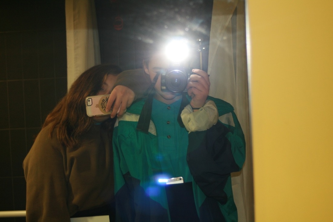
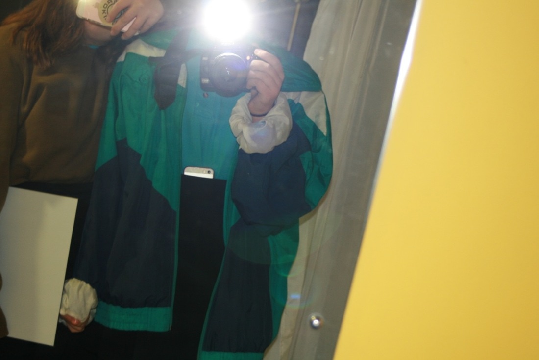
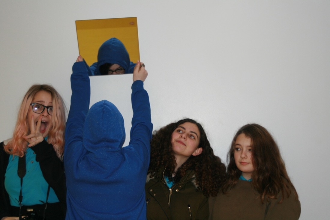
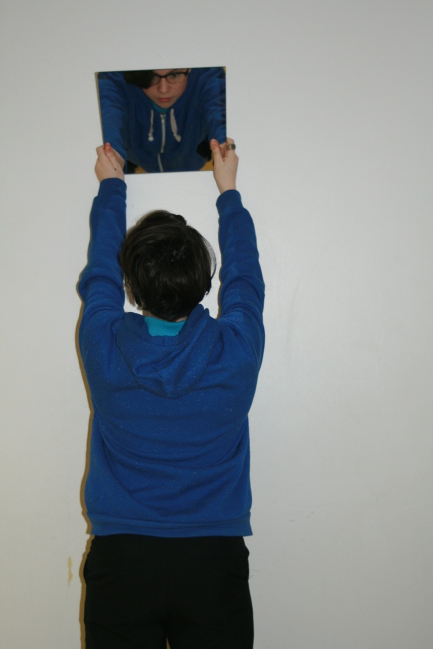
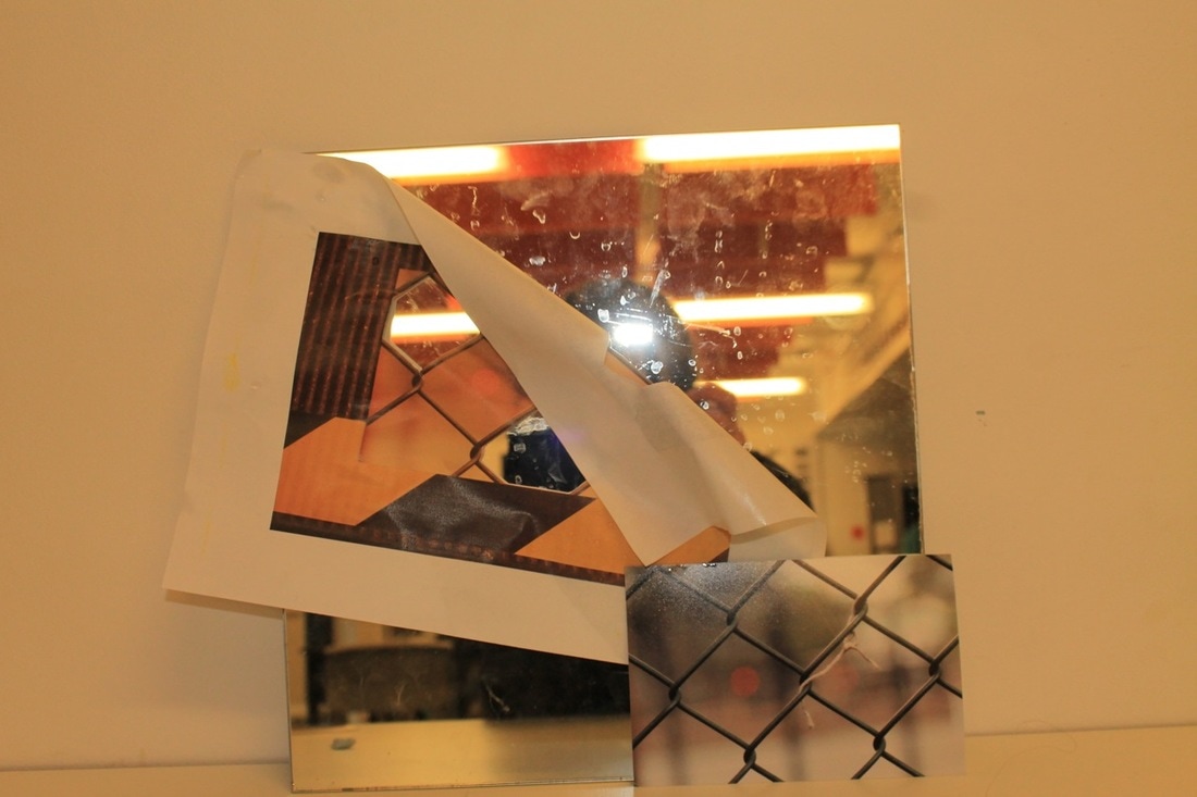
Using mirrors to explore edges.
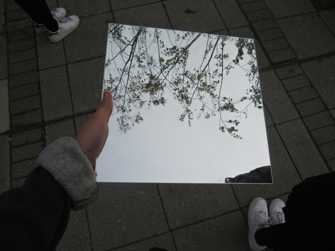

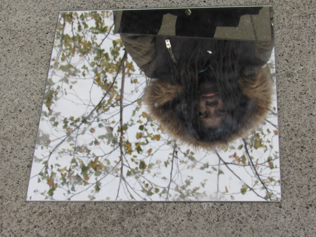


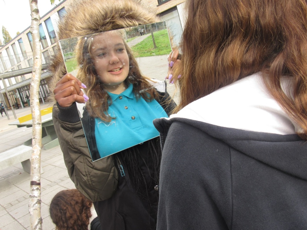
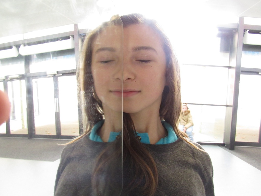
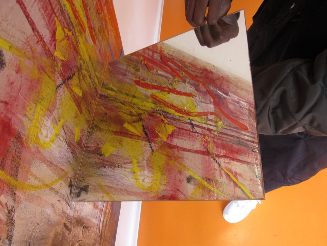
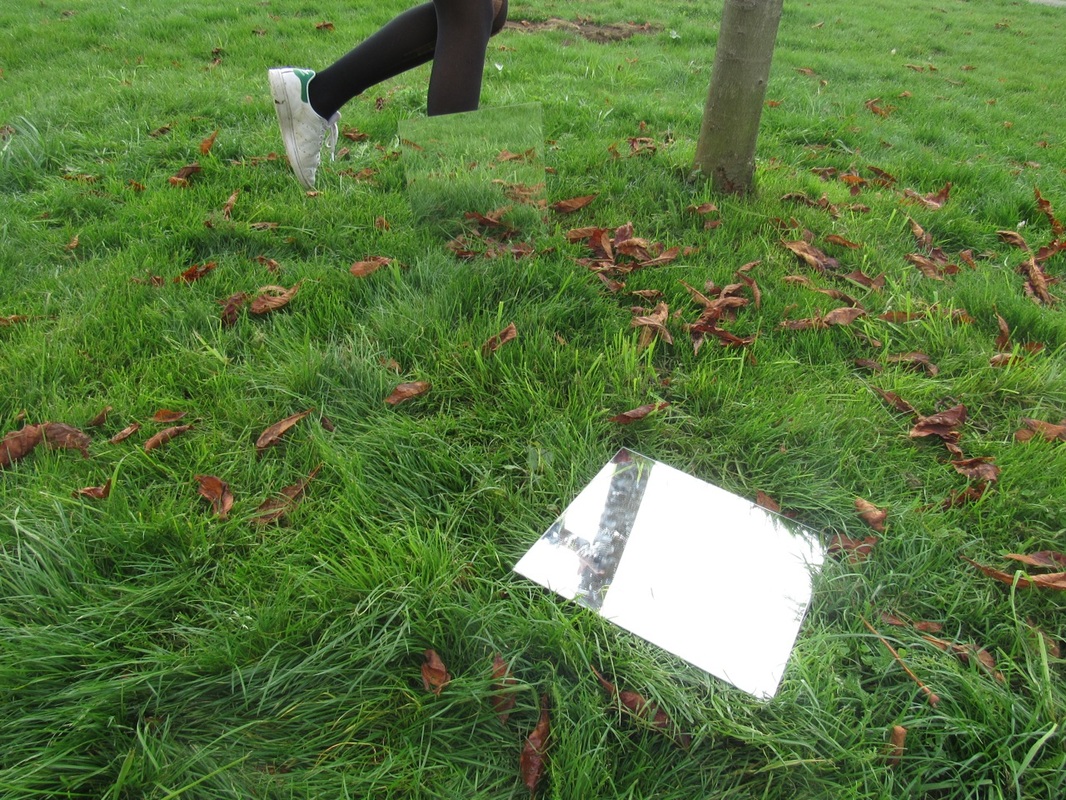
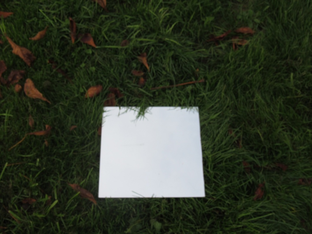
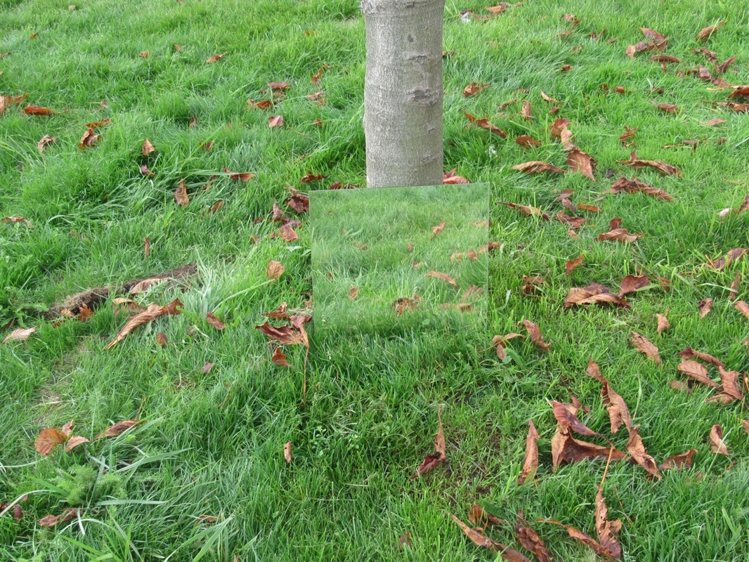
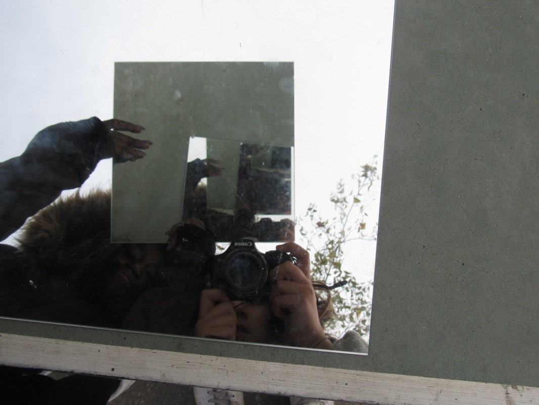
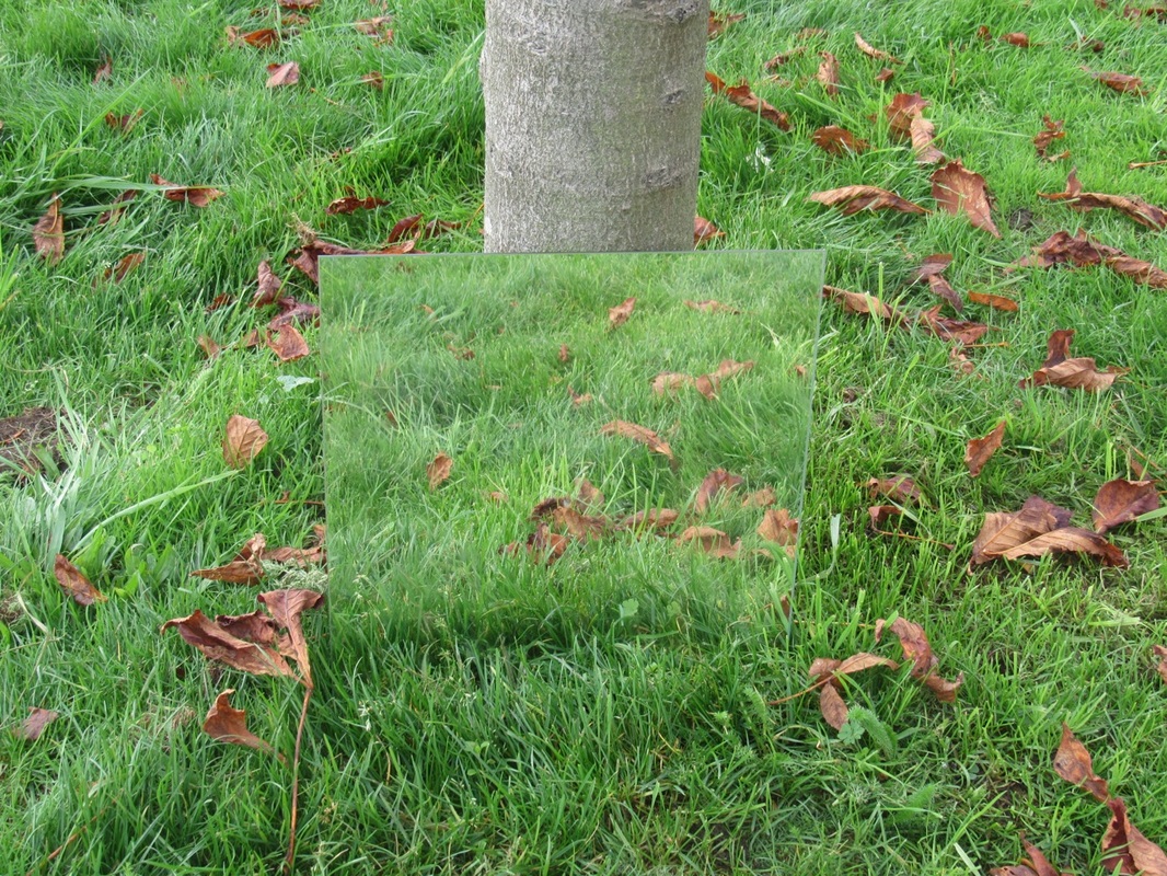
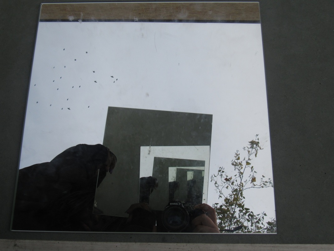
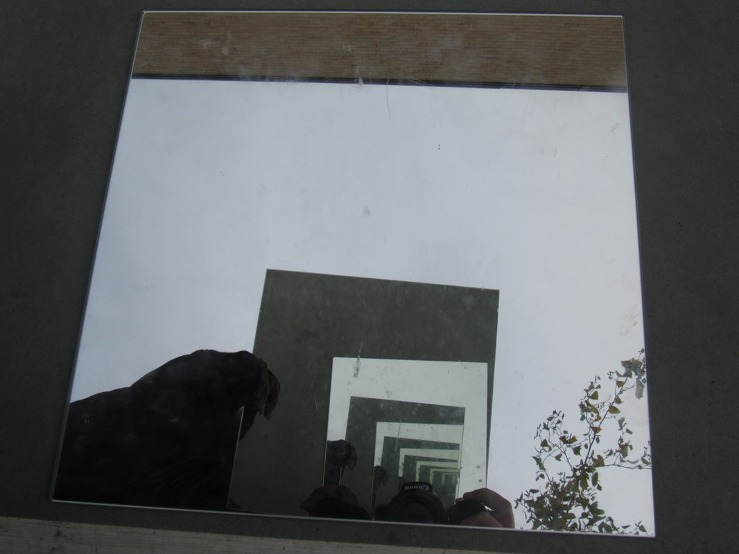
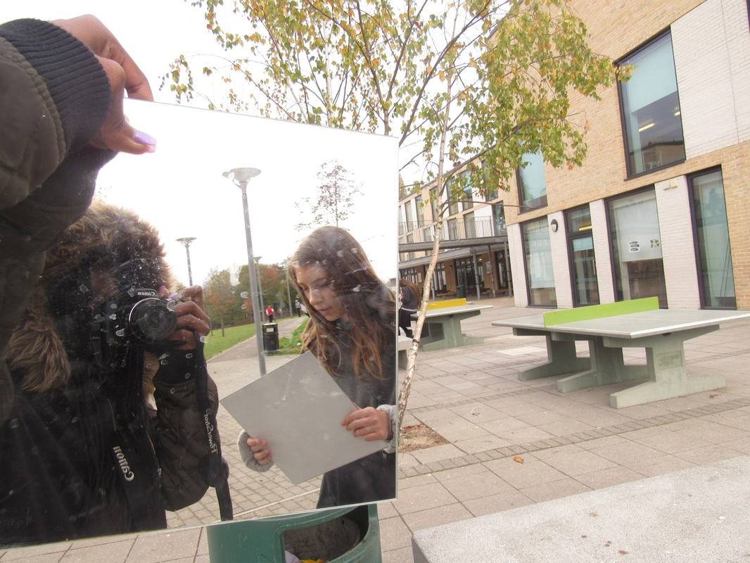
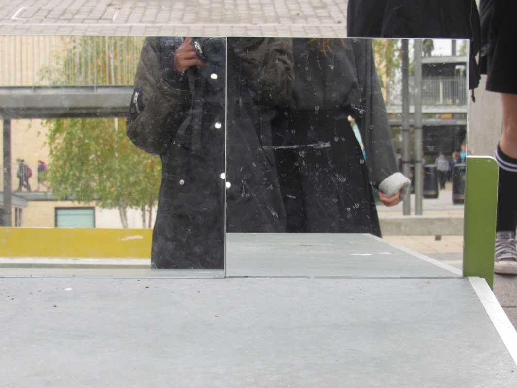

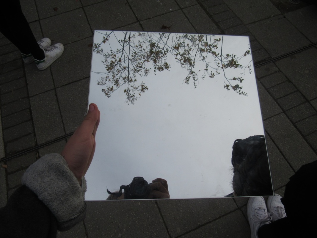
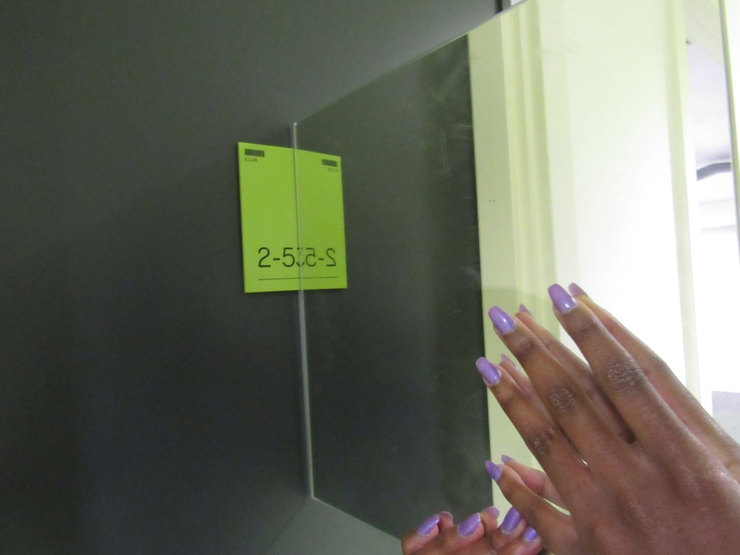
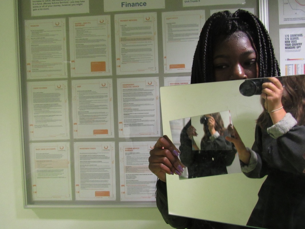
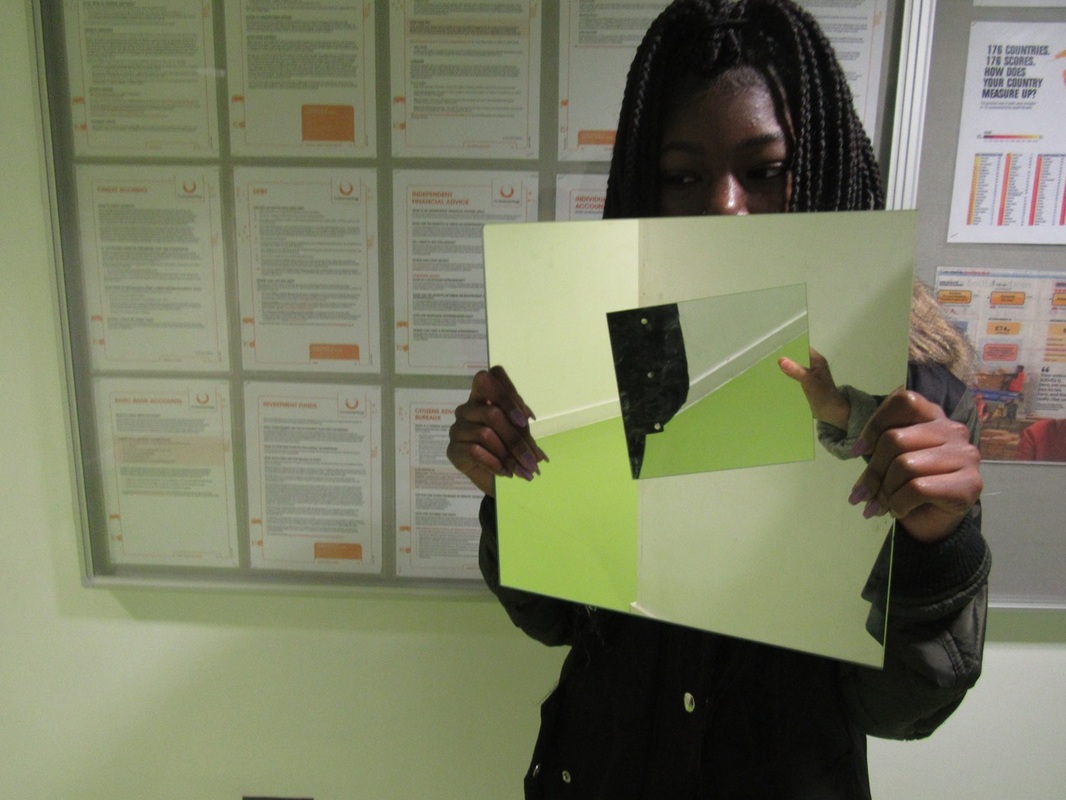

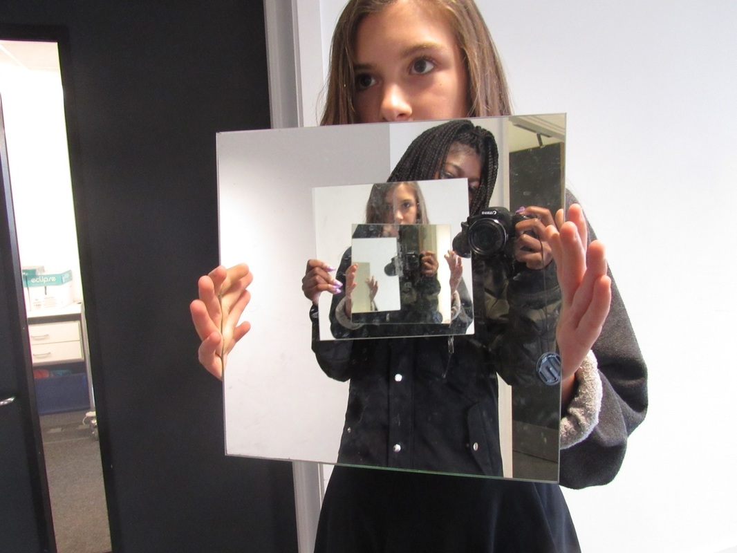
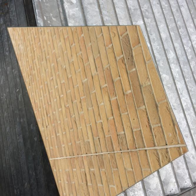
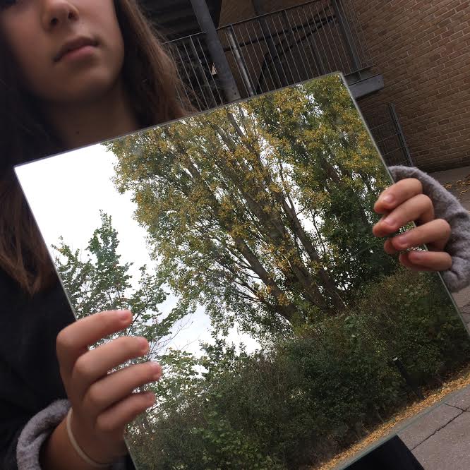
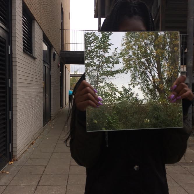

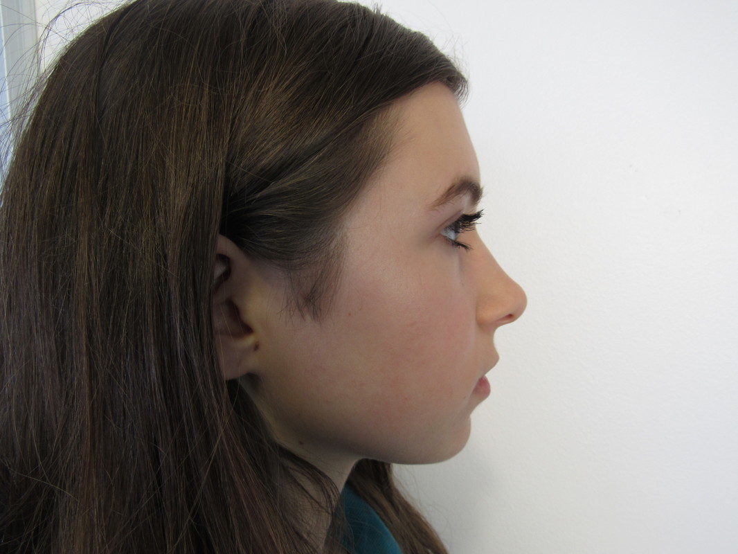
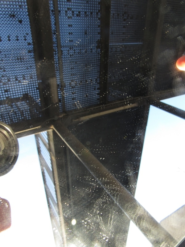
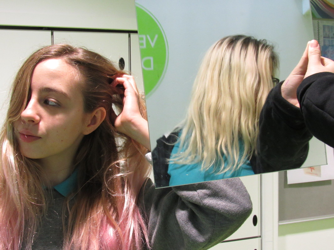
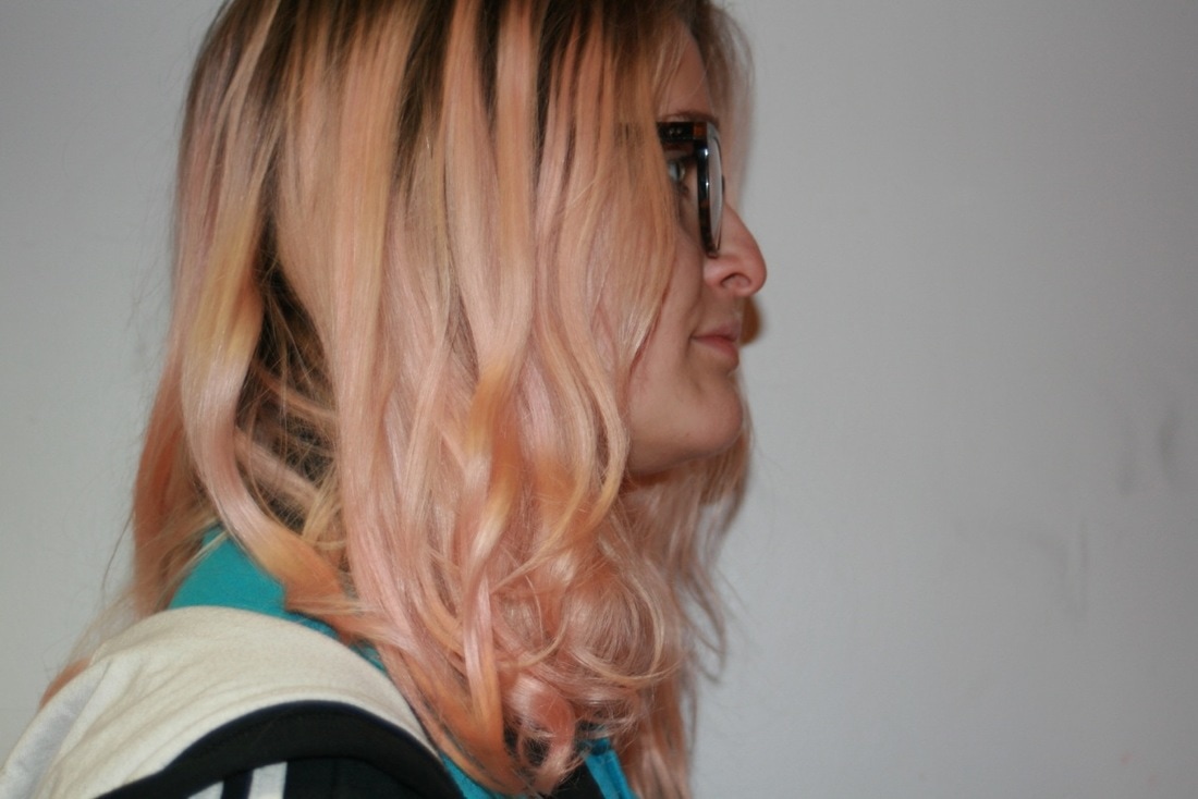
In this lesson we were given two square boarder less mirrors and a camera between my pair. We went out and tried to take pictures witch suggest illusions and trick the eye. We played around with the positions of the mirrors and what was being reflected on the mirrors - I experimented with resting the mirror on the subject meaning we made the object symmetrical, Me and my pair used this technique multiple times for example; We positioned the mirror down the middle of my face giving me a perfectly symmetrical face. I think the outcomes were very effective.
|
Evaluation
I have 4 favorite images from this task witch are shown to the right>>
|
|
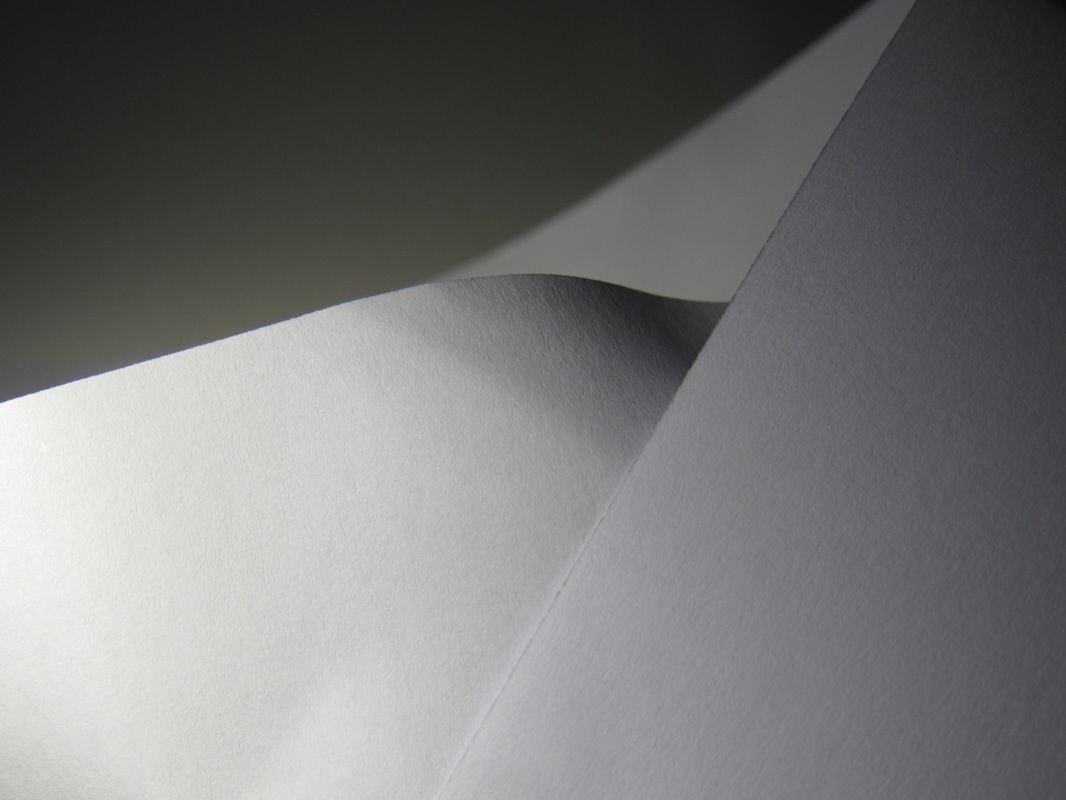
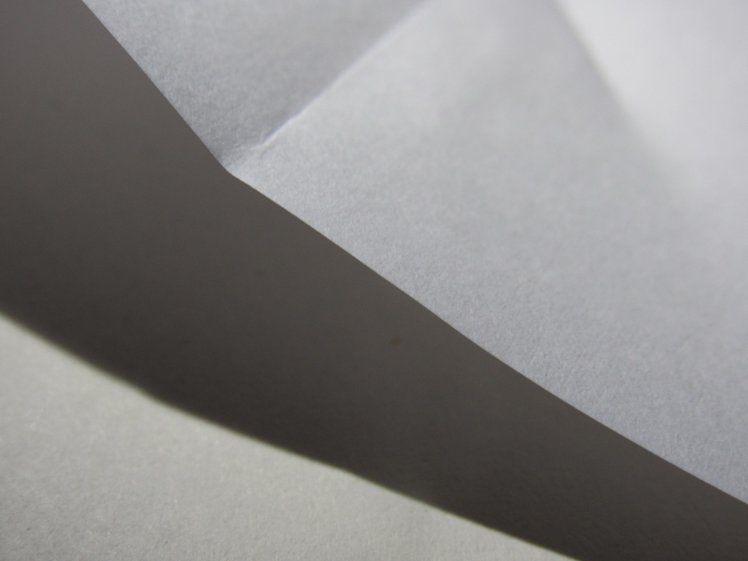
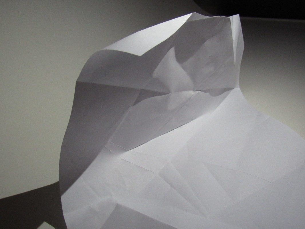
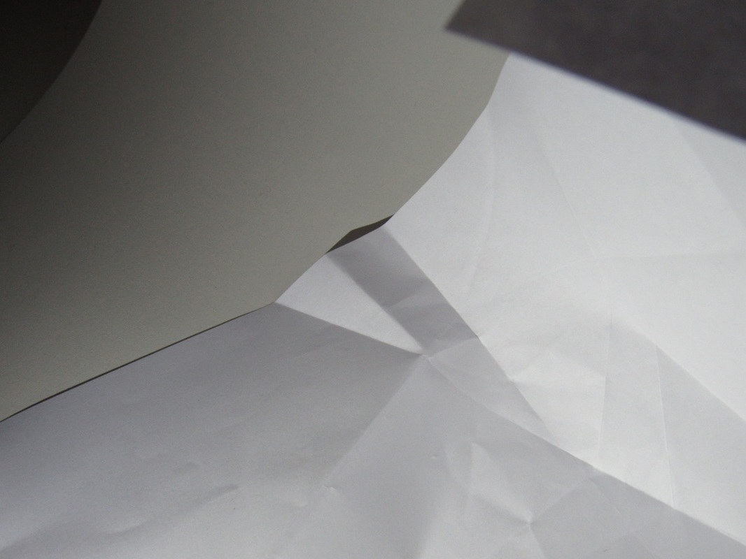
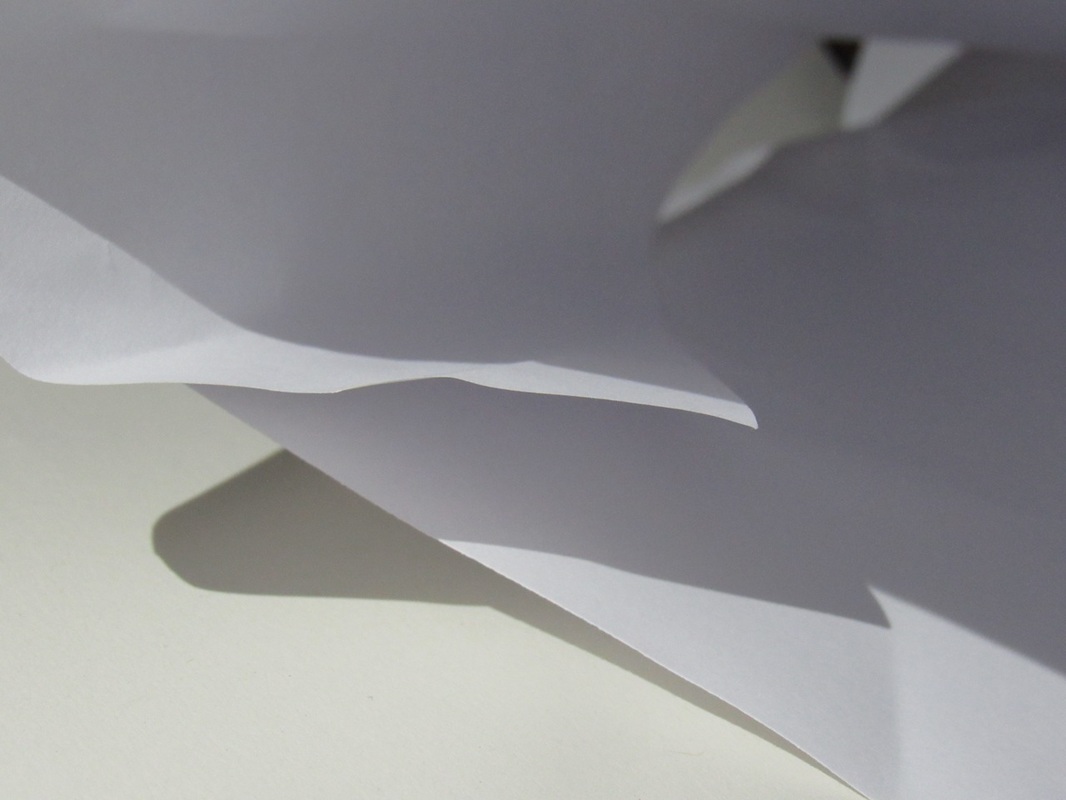
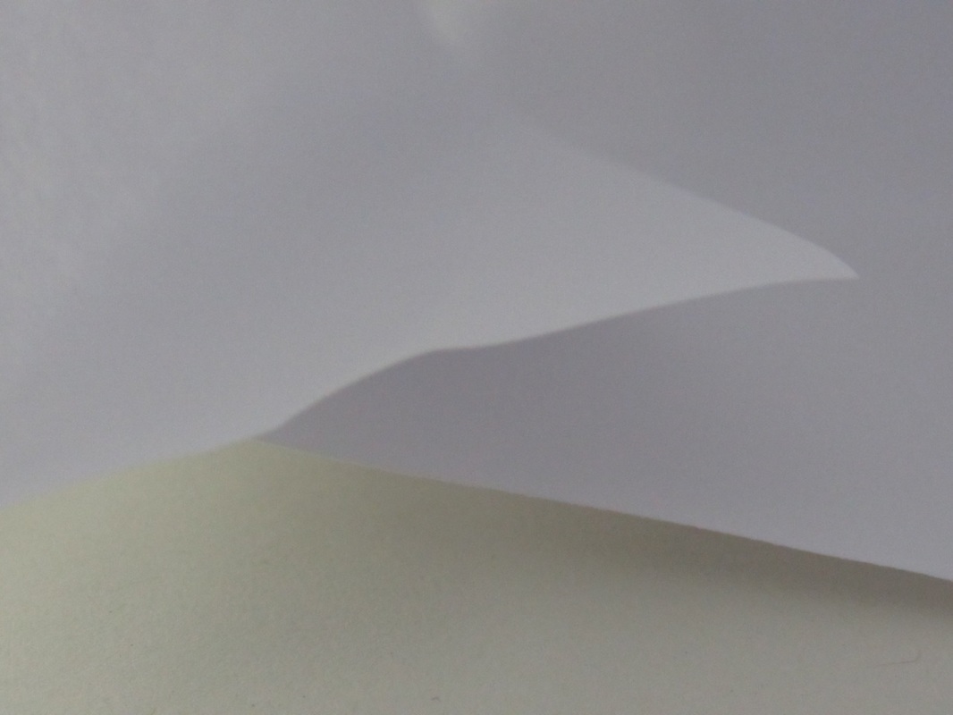
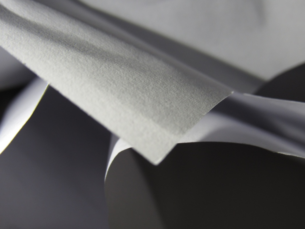
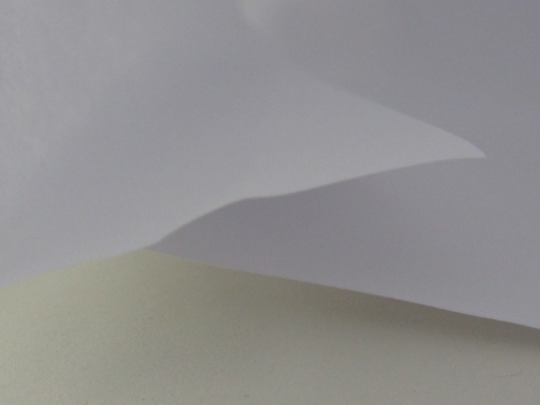
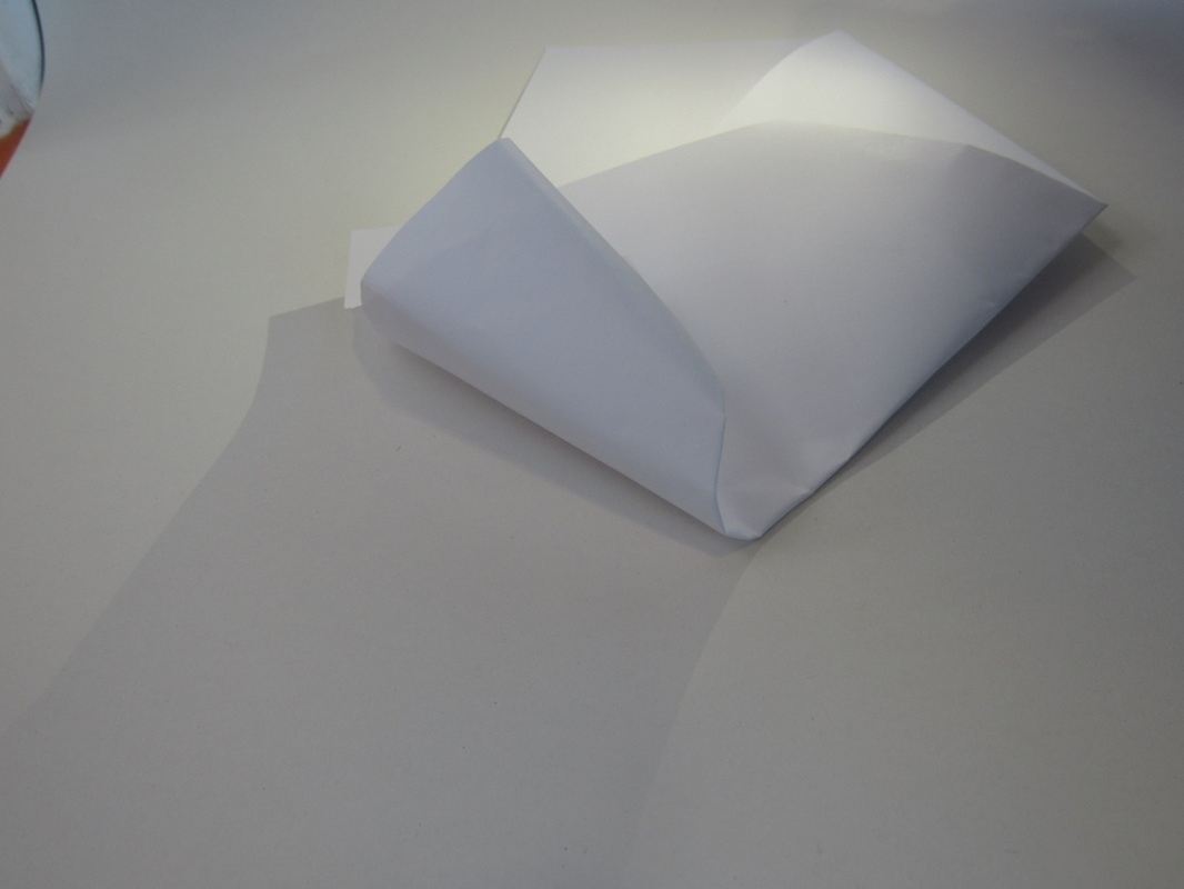
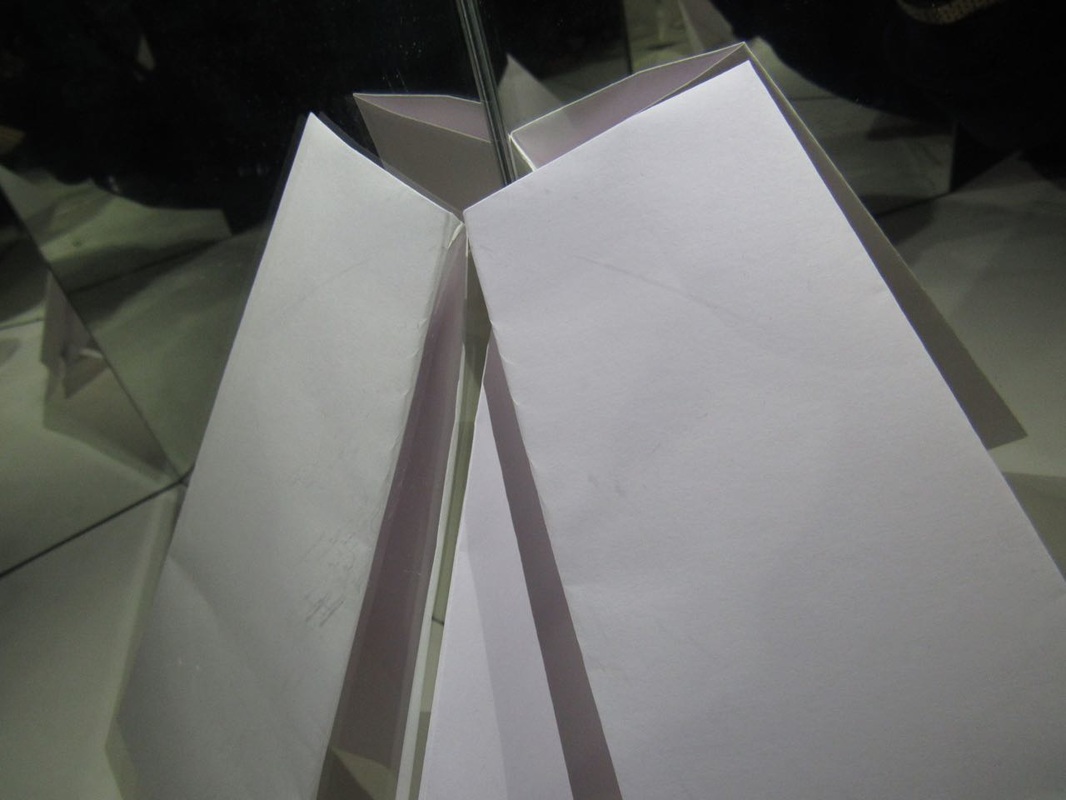
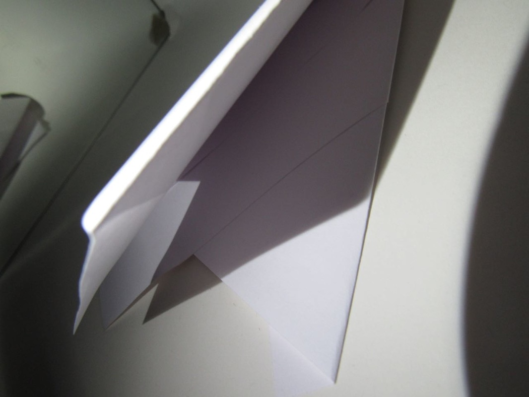
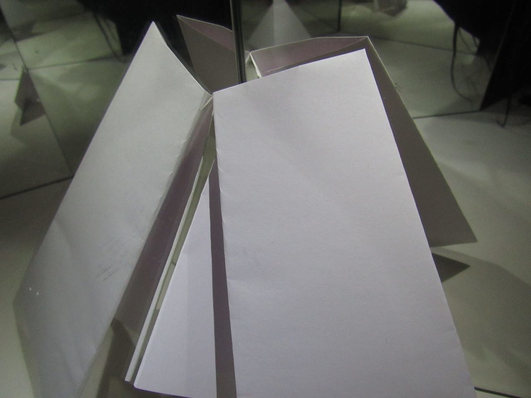
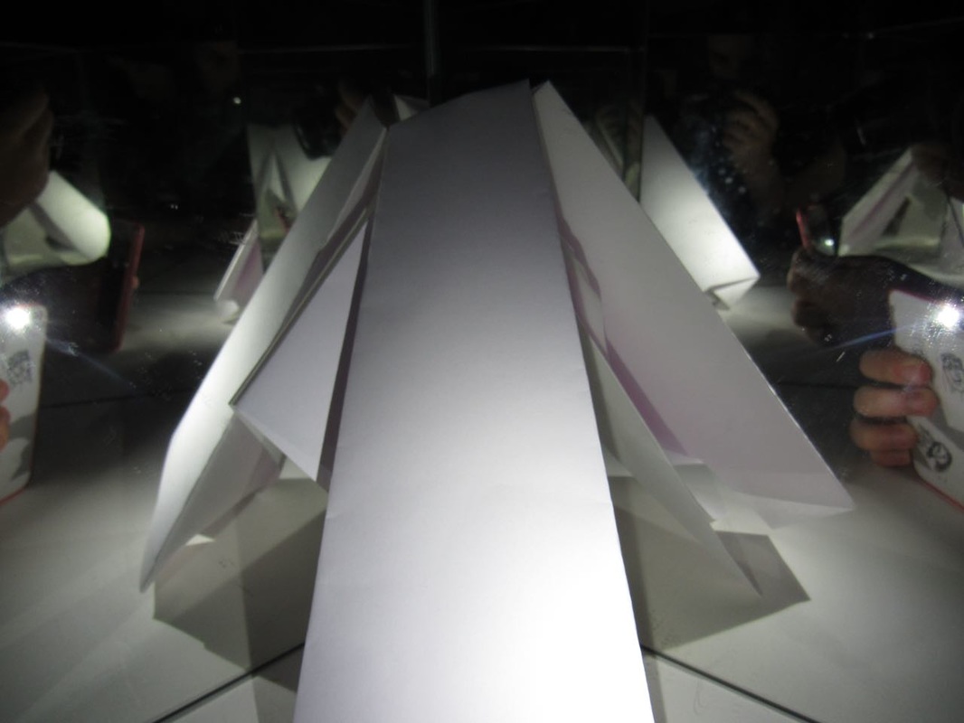
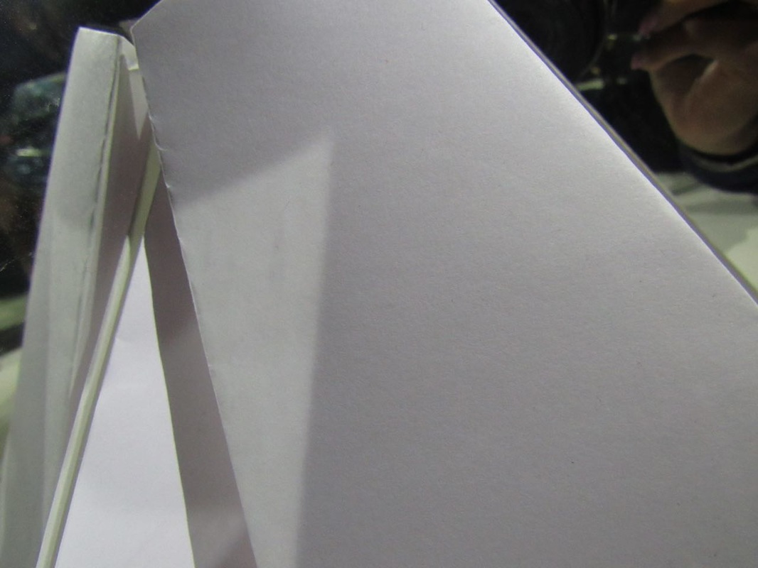
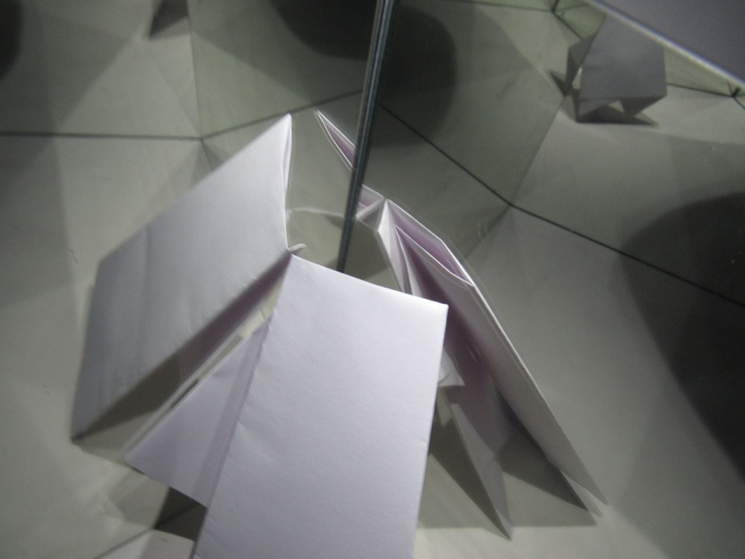
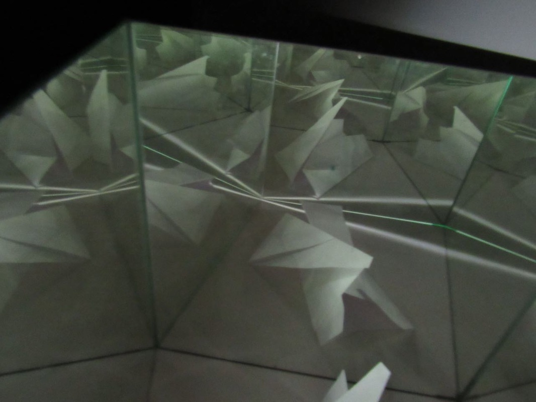
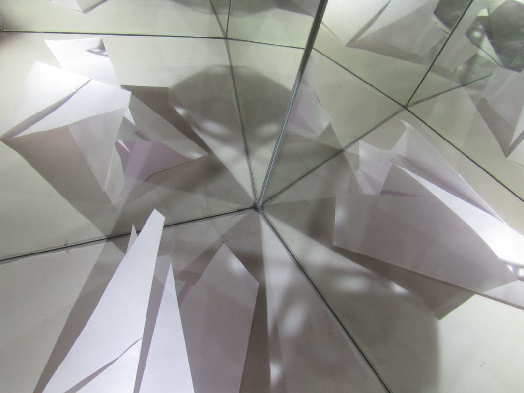
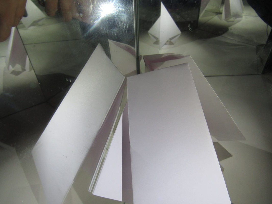
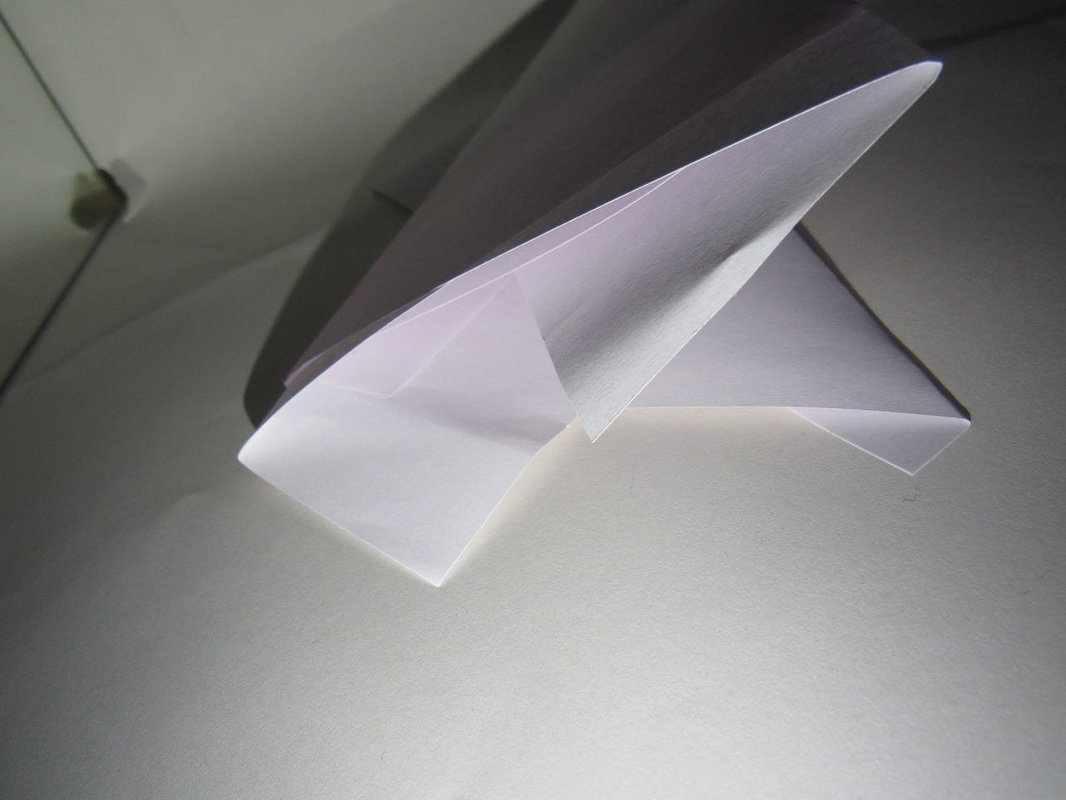
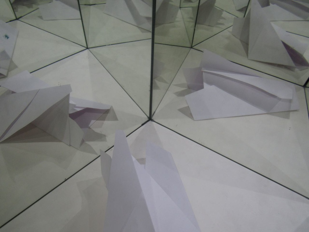
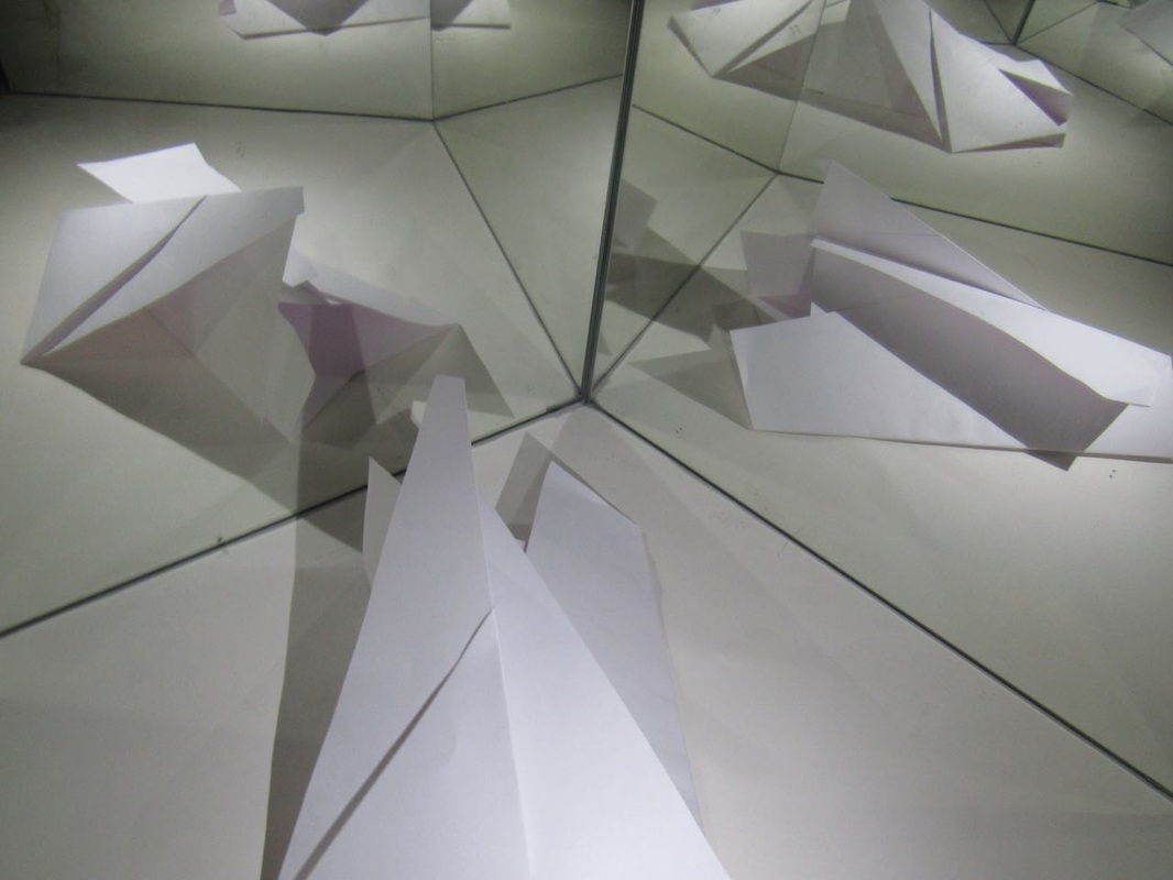
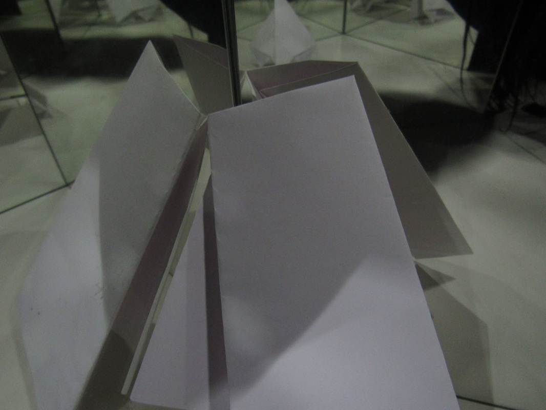
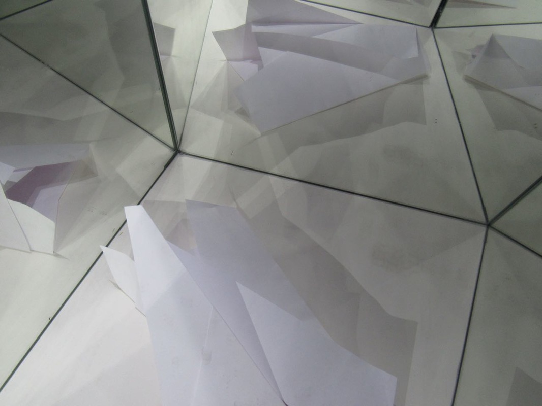
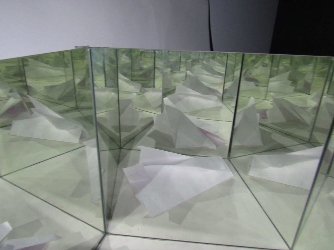
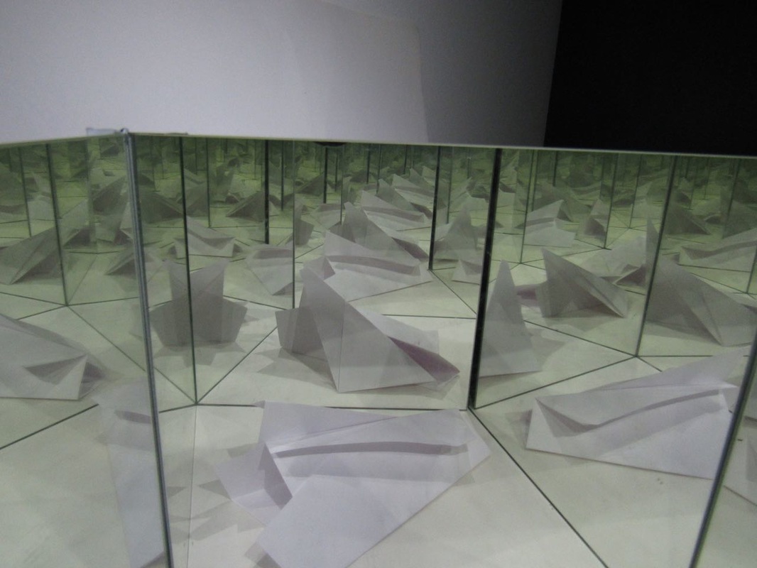
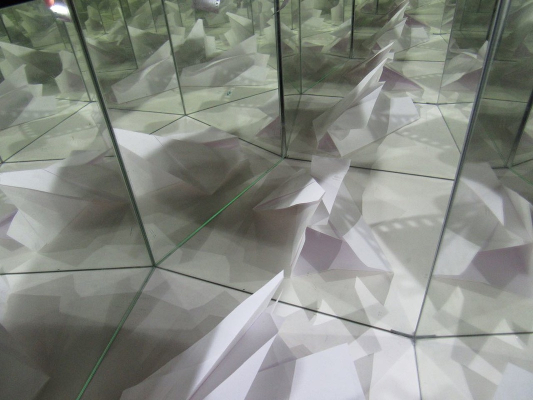
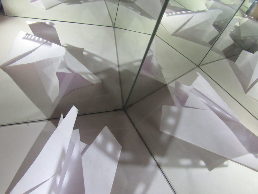
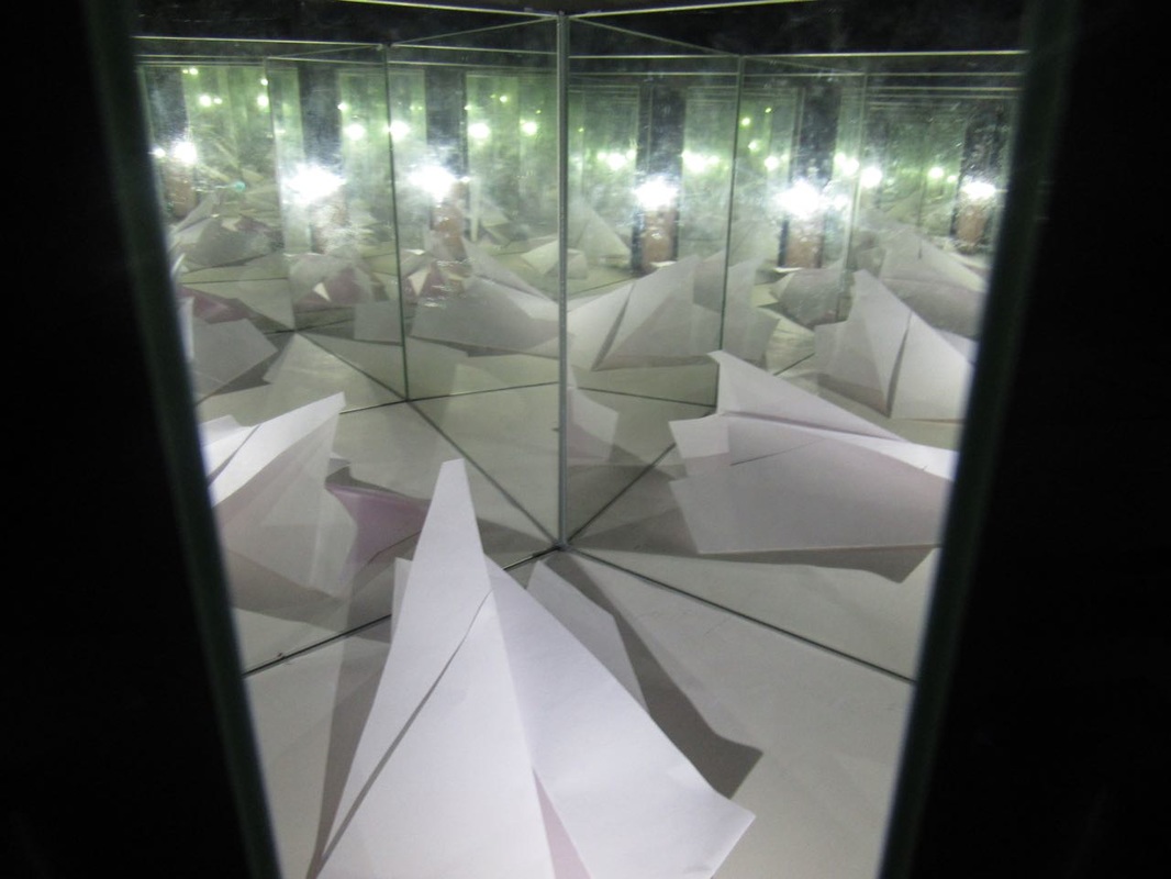
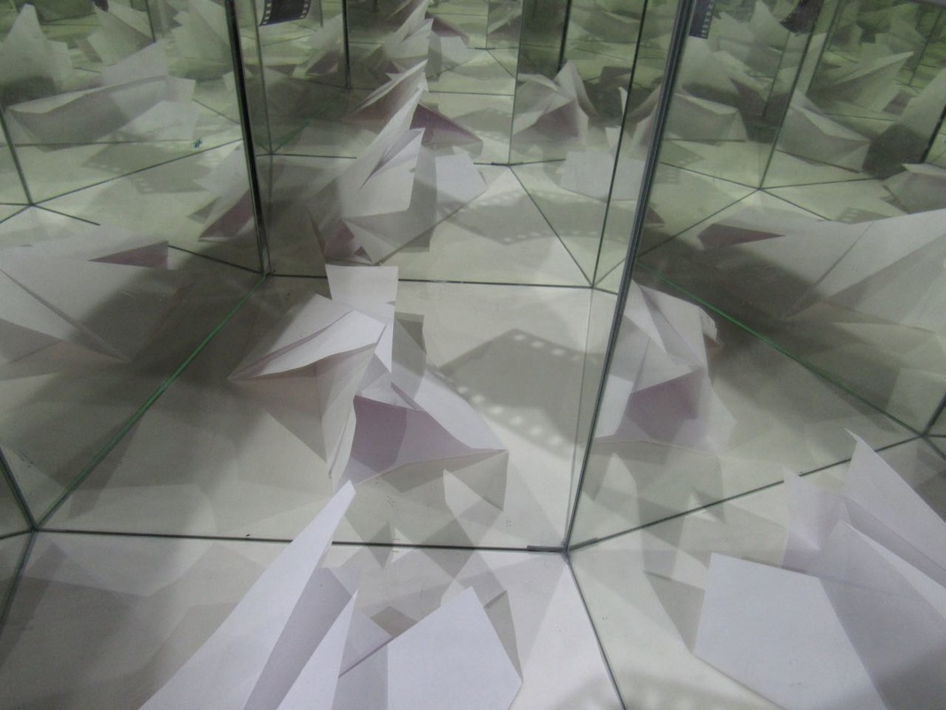
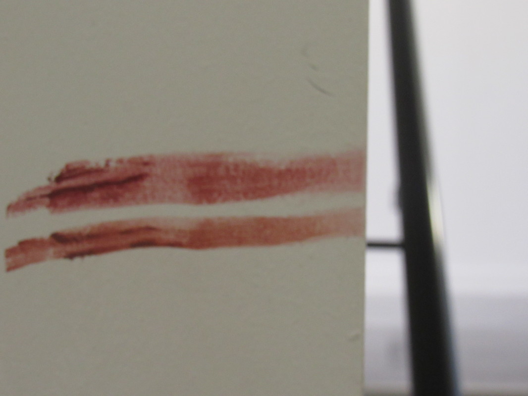
Paper abstraction.


|
I think this one was the most effective as its really abstract, has a lot of contrast between the highlights and dark tones and it picks up the texture of the paper. I also like that the paper fills the whole image and is really zoomed in witch makes it interesting to look at as you can't tell what it is very easily. I think it worked well as we took the photos in the dark room using a flashlight as the source of light meaning I had complete control over the light source meaning we could create shadows.
If i were to do this again i would try different angles with the camera and change where i put the flashlight. |
|
|
This two are my least favorite as they are fuzzy as i had the camera in the wrong mode and there isn't any contrast or shadows. I also don't like how you can see lots of the background in the images, And you can tell that its paper so it doesn't look abstract or interesting. The reason there is no contrast is because I was in the corridor at this point meaning natural light was stopping me having full control over over the places witch were exposed to light where as the other photos were taken in the dark room where the only light was the torch, my phone flashlight, so i could control where the light was and where i didn't want light was very dark and contrasted.
|
|
|
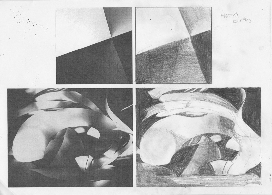
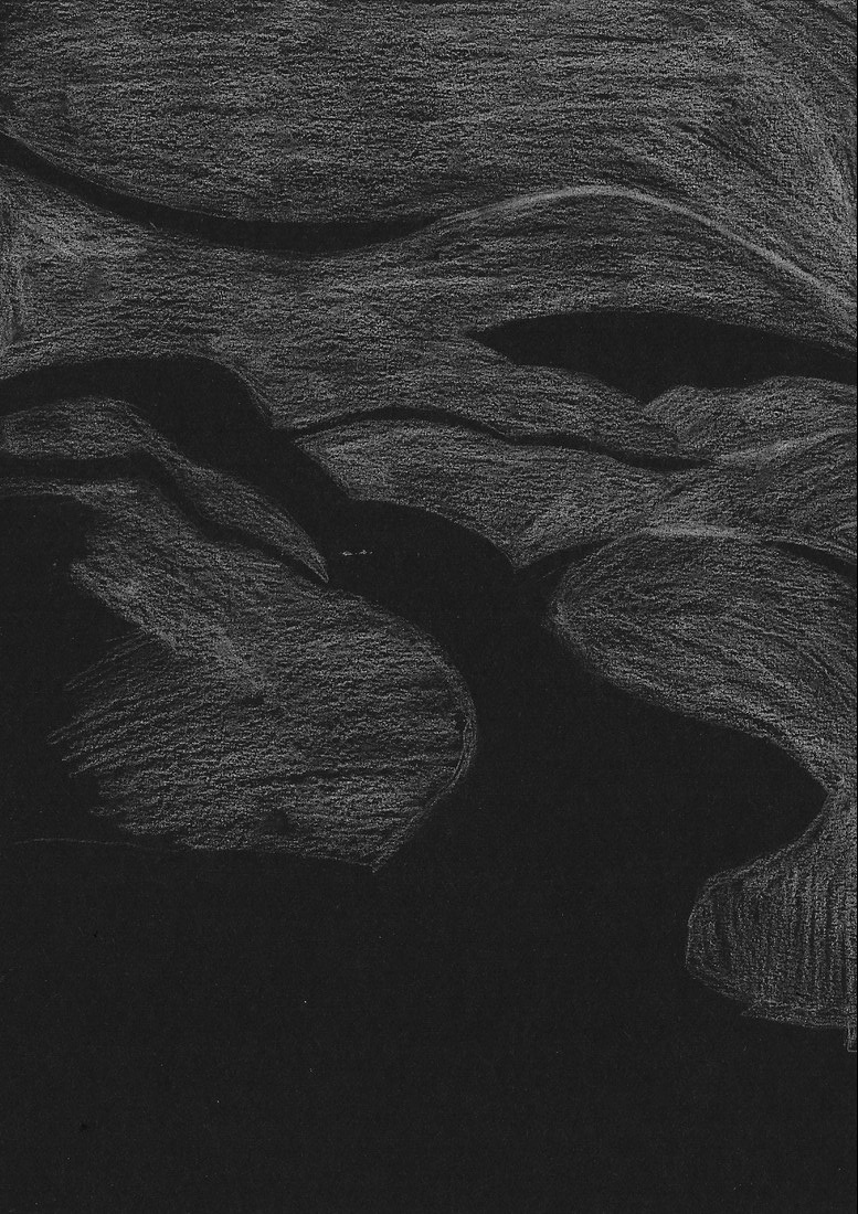
In this lesson we were asked asked to draw the images in the box next to them in the box's next to them. We did this as it meant we had to observe the photo in more detail then we would have done if we were just told to look at the images.
I think doing this will really benefit me when doing analysis of images as i will look a lot closer and see some smaller details i would have missed at first glance. |
|
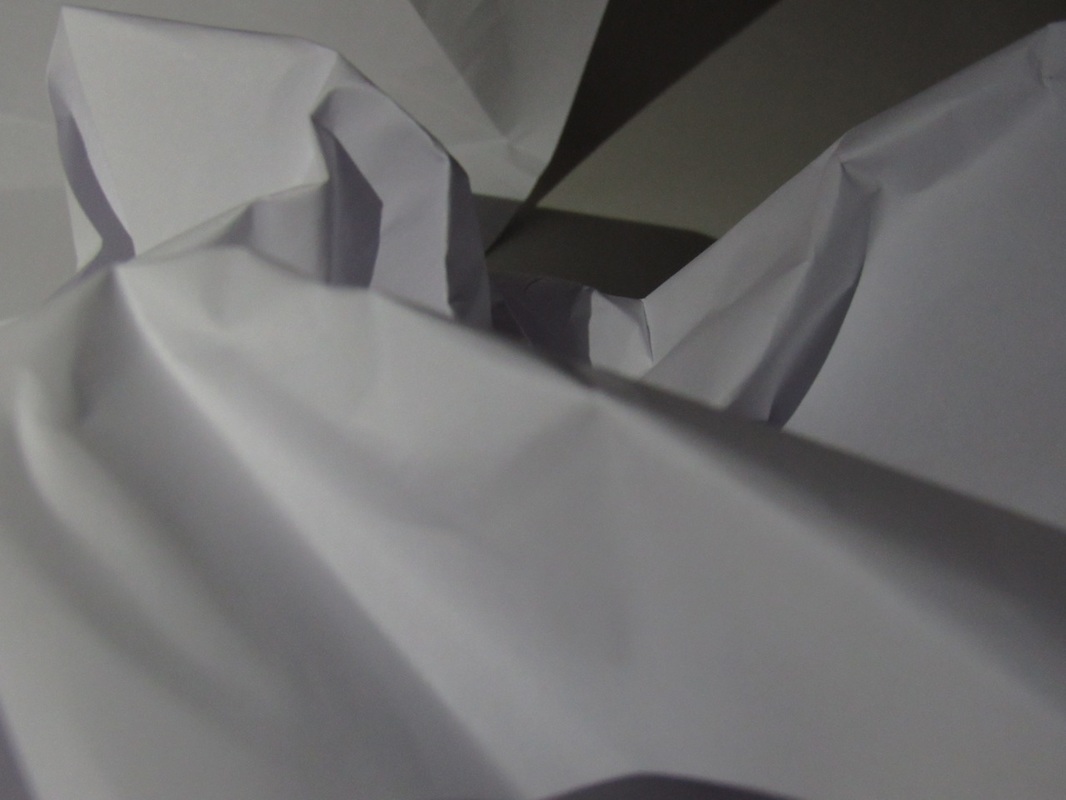
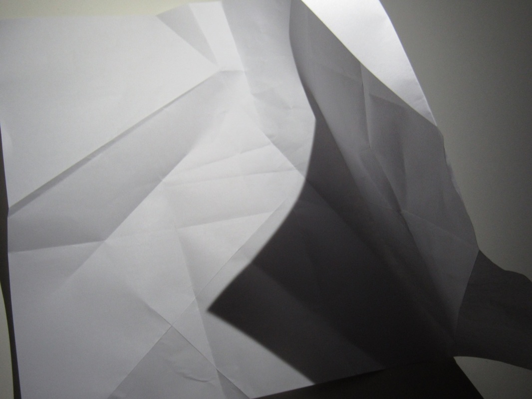
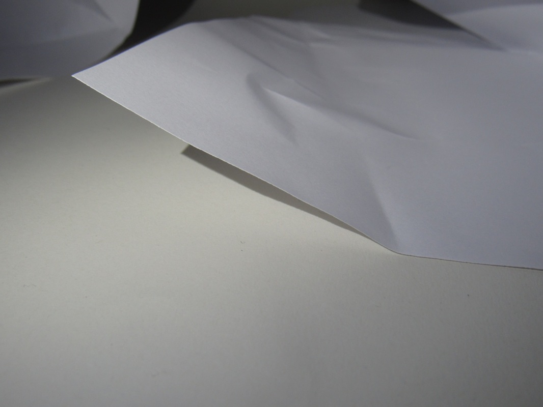
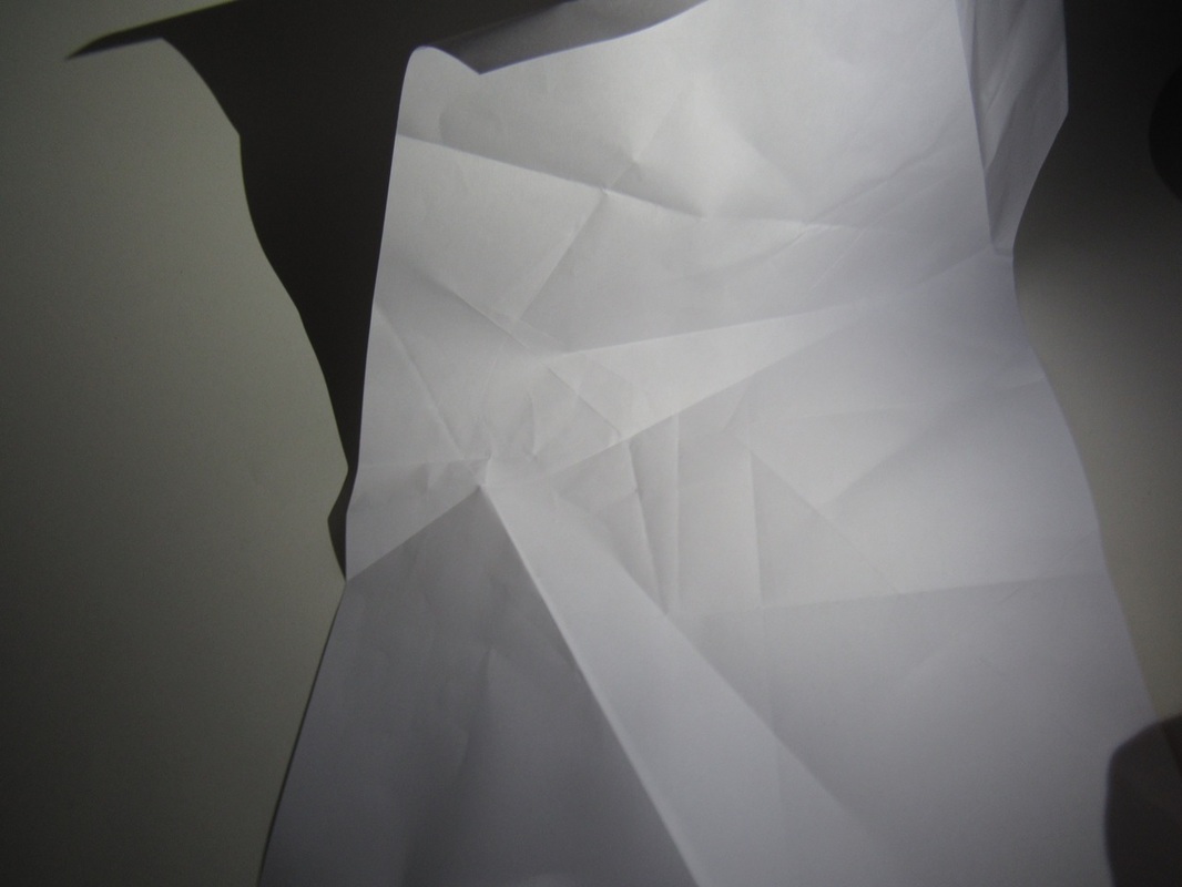
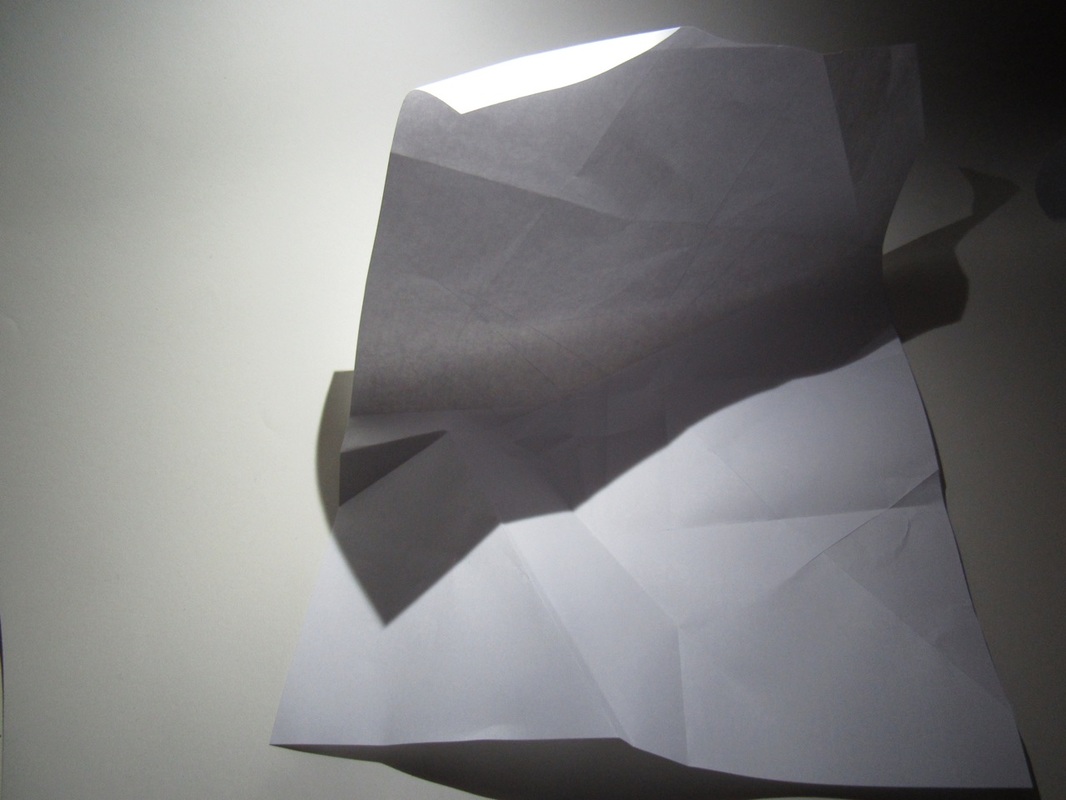
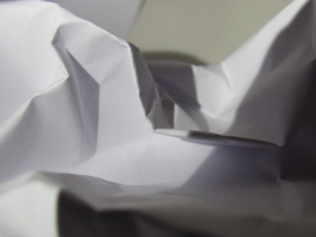
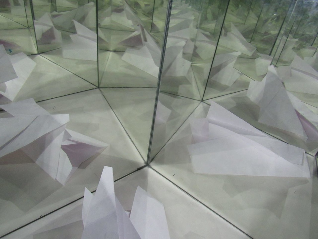
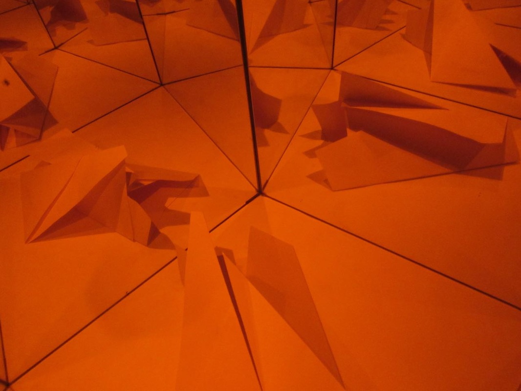
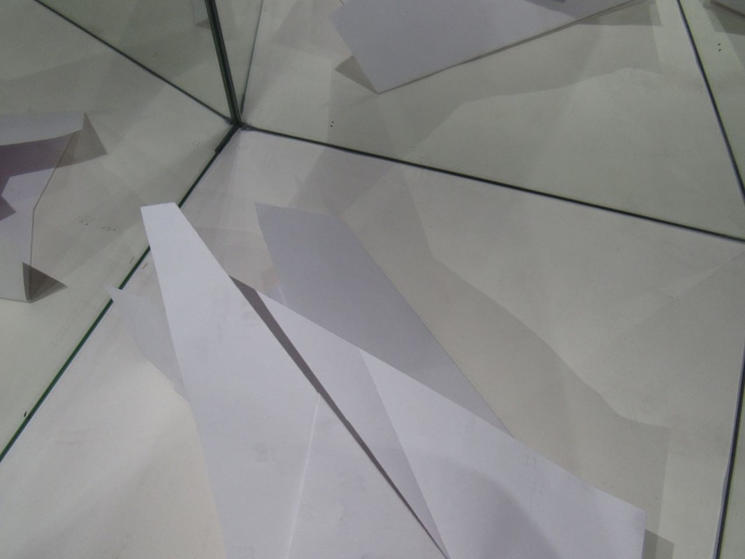
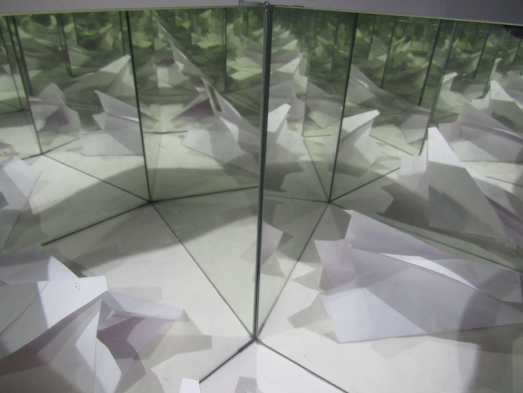
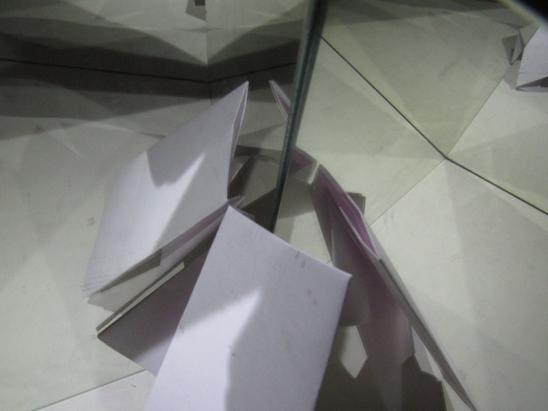
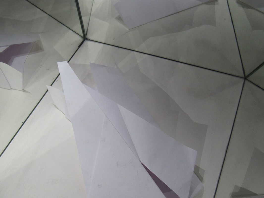
Paper abstraction 2.


|
Evaluation
My favorite image is image 1 as I like how the mirror reflection is there but you can also see the creases etc from the paper, I think the two aspects work well together. My least favorite image is image 2 as I find it very boring and plain also there are items in the background, the quality is bad and the folds and creases are not being made to stand out by the flashlight. |
|
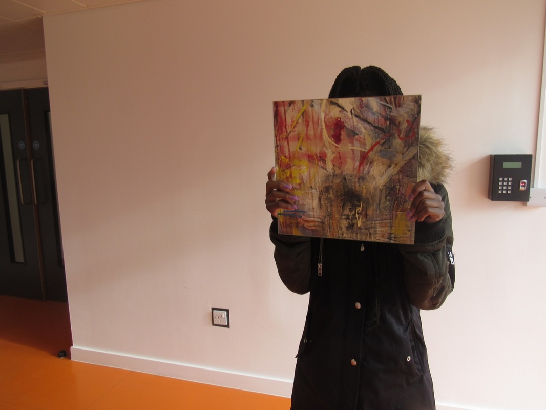
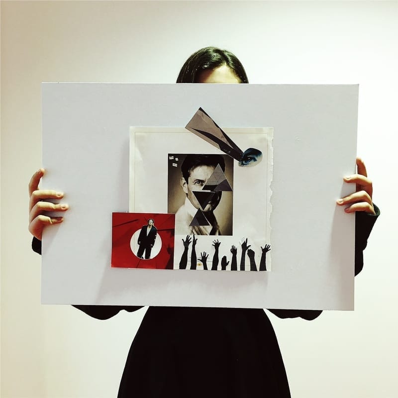
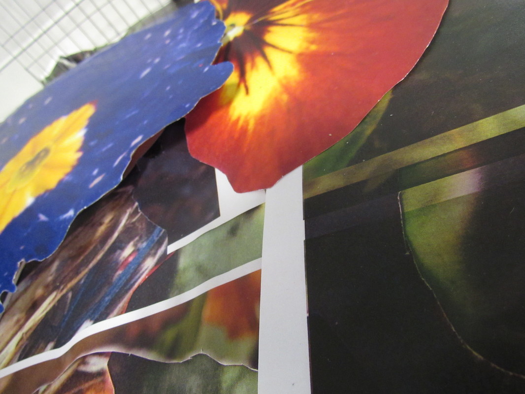
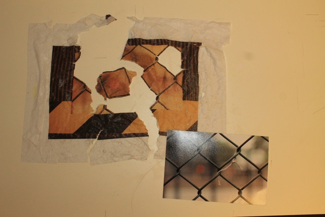
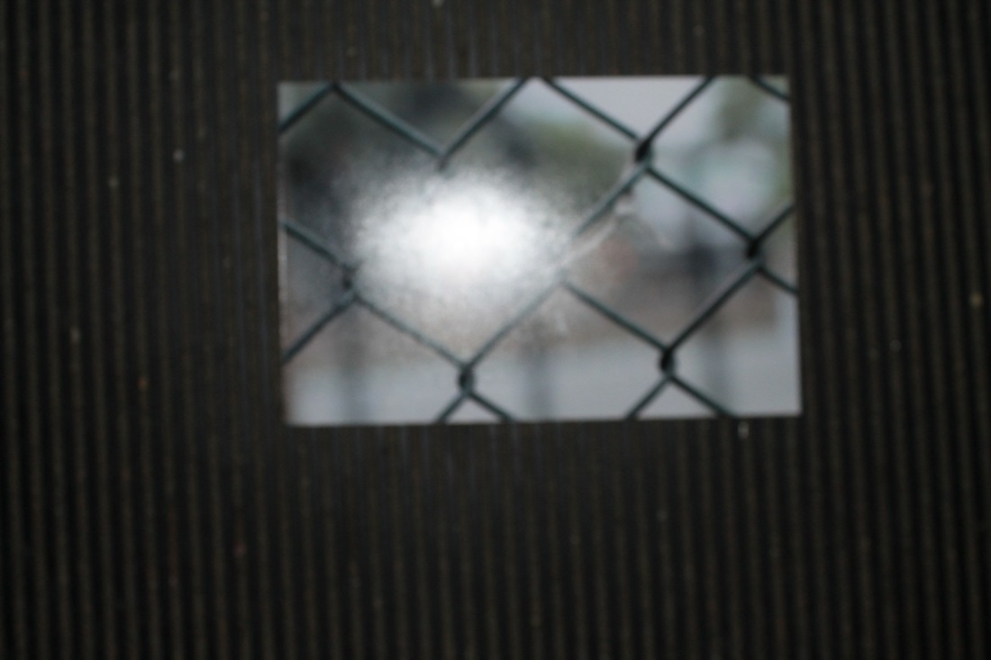
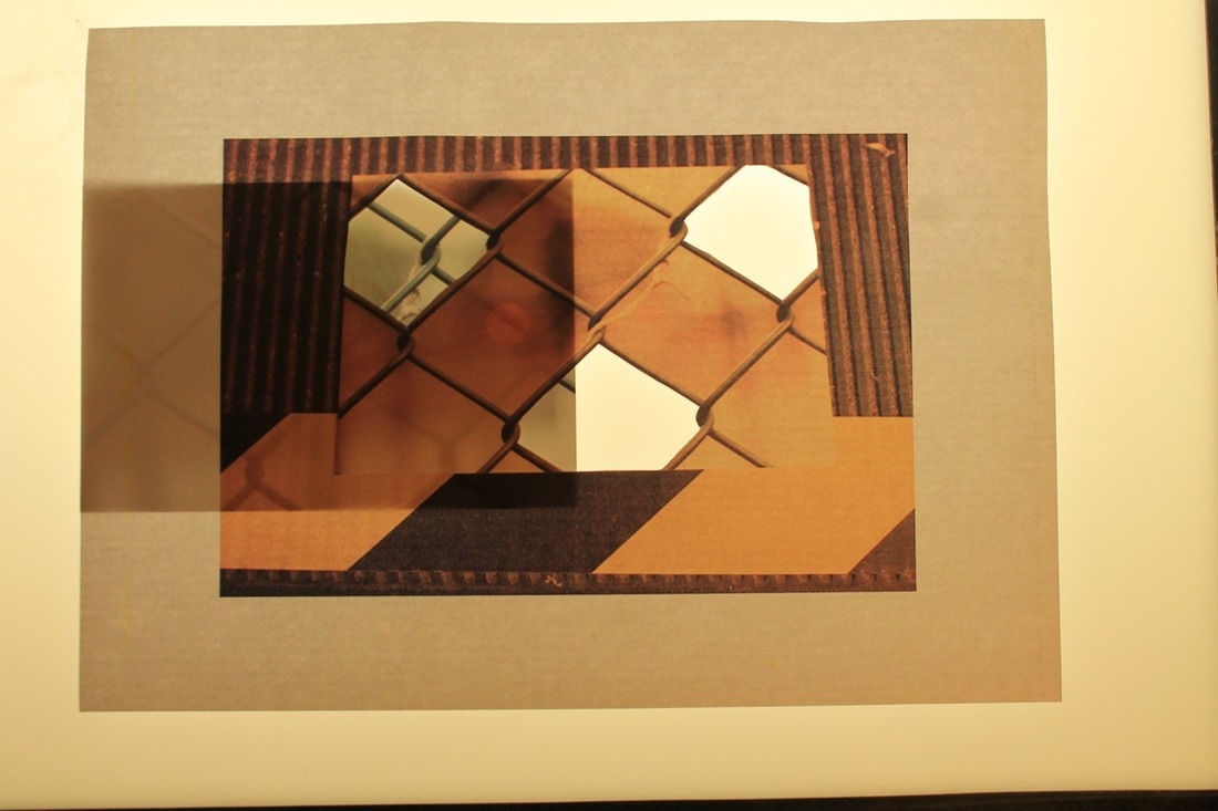
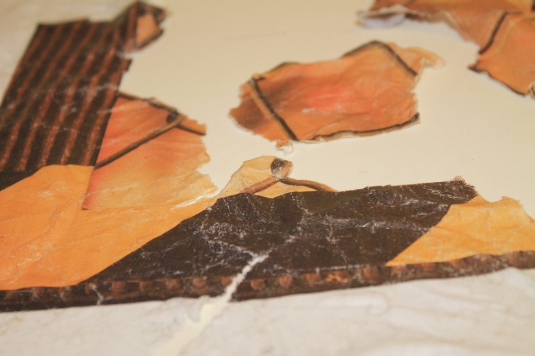
outcomei got some images from magazines and my paper abstraction photos and combined them to make a collage.
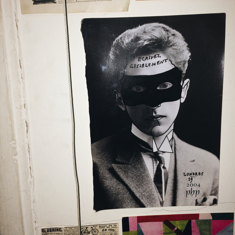
EVALUATION WWW: I like the effect the triangles in my final outcome has to the rest of the piece. It distorts his face and makes him look very secretive and mysterious. EBI: I used more of the images from my paper abstractions shoot. |
|
Concertina photo book.
|
Over a period of around 6 weeks we were asked to take photos on the theme edges and then make a concertina book and display the images we took. I decided to add a drawing of a Polaroid as the cover so when you open up the book it looks as if the images are coming out the bottom of the Polaroid, To continue this look i gave each image a white boarder witch was slightly longer at the bottom then the other sides.
I made the book by printing my images onto A4 paper then cutting it down so it was double a square and a little extra i repeated this step then folded them all in half and glued one half of the paper to another half of paper until i had all my images then I looked up a image of a old fashioned Polaroid and drew it and cut that out and glued the edge of my first image to the drawing and that's it. |
|
|
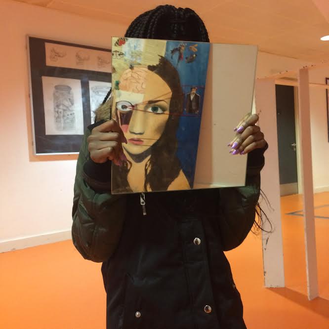
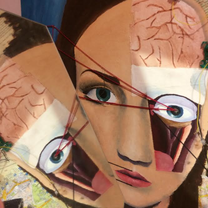
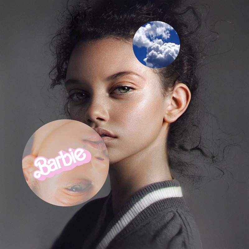
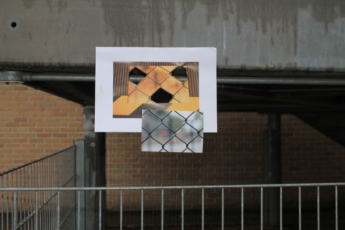
Today we experimented with photo clipping in Photoshop.
I found a portrait of a girl online and practiced 'cutting' holes in the image to reveal a layer underneath, I then messed around with the images underneath the main image until i had a image i'm remotely satisfied with. I also added a png from online for an extra touch. |
|
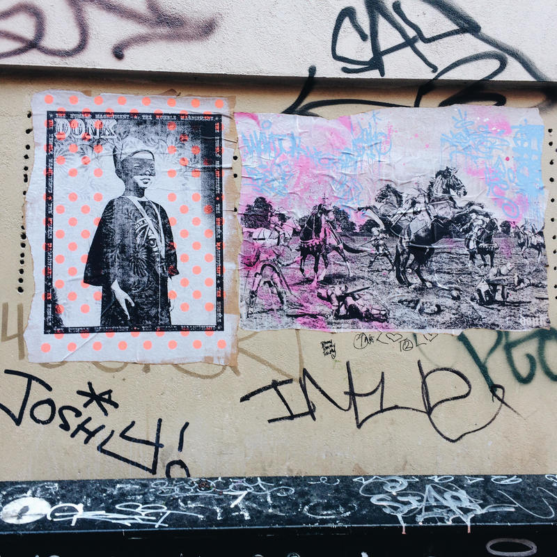
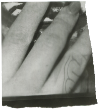
In Robert Frank's 'sick of goodbys' the image seems to be created from two photos which have been placed on top of each other vertically. The first half is a off white colour with a slight vignette affect as if the image was over exposed around the edges. The right edge seems to have been smudged so it has black lines of different lengths going horizontally. The photo is also specked and has some imperfections, I think this was purposeful. The image also looks as if it was cut or ripped than stuck onto another surface as it has a think dark shadow around the main part of the image. The image shows a hand holding a figure which appears to be moving. It also includes graffiti of the words 'sick of' it looks as if the photographer has painted that on the photo. The photo also has what seems to be engraved in to the surface. The bottom half depicts a large sheet of metal or possibly a mirror with a smaller framed mirror leaning on it. The background is dirty White bricks which is contrasted by the black background to the left of the mirror. The large sheet of metal has a blurred reflection of the skyline. It also has been graffitied with the word 'goodbys' . On the right there is a triangular shadow. The photo is all black, grey and white. This contrasts Lorenzo Vilturis' 'red #1' at first glance as it has three main bold colours; red, blue and orange. The background is split into three sections, the top one is orange, the largest section in the middle is a bright blue, the bottom one is a off white colour. In the foreground there is a composition of different objects such as bricks, flowers, berries and spaghetti balancing surreally on other objects.this is positioned in the middle of the image. Because of the three sections it makes it look as if it's a college but when you look you realise it's not.
Despite this seeming to be very different to the first image there are quite a few similarities which may not be noticed at first. The similarities I could find were; the images are the same shape, they are also both very abstract, the photos are both divided into sections. The 'red #1' image seems abstract as the objects are balancing on each other in a very unrealistic way. 'Sick of goodbys' seems abstract as it uses a lot of reflection in the image. Another similarity I found was the use of geometric shapes.
The photographers have used space differently, 'red#1' has a small depth and the objects seem close to the camera and close to the backdrop, where as 'sick of goodbys' has a much larger depth and in the reflections the depth of Field is infinite. I think the difference in the depths of these photos determines the main focus of the image with a large/Infinite depth of field there isn't one main focus. As there are reflections and things behind other things etc where as the image with a small depth of field has one main focus which is the structure in the centre of the image.
In my opinion the most interesting aspect of red#1 is the two contrasting back drops as it creates the illusion of a collage. The most interesting part of 'sick of goodbys' is the reflection of the skyline in the large mirror at the bottom. I think using mirrors and reflection creates an illusion and makes it more interesting but also more confusing, maybe the photographer intended to make the photo confusing as it represents his feelings and emotions from being sick of goodbyes.
If Robert Frank was here today I would ask him lots of things, I would ask him what has left him feeling 'sick of goodbys'. I would also ask him if the entire image is a reflection, I would ask him if anything inspired him to create the image.
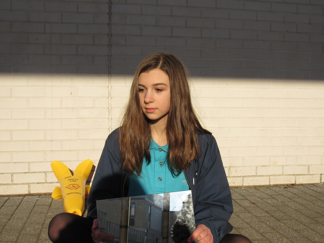
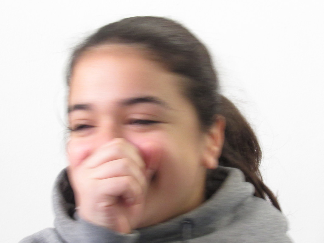
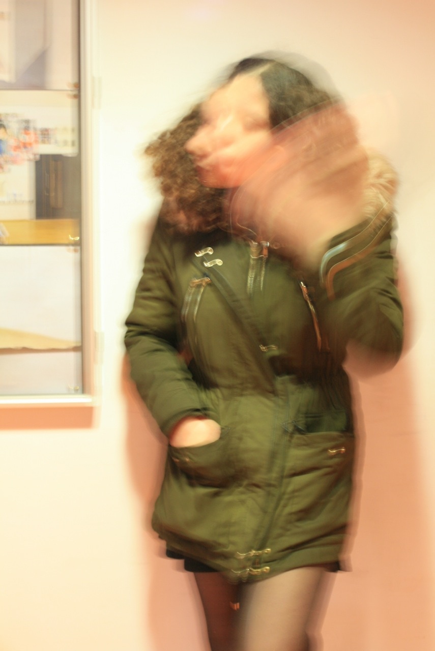
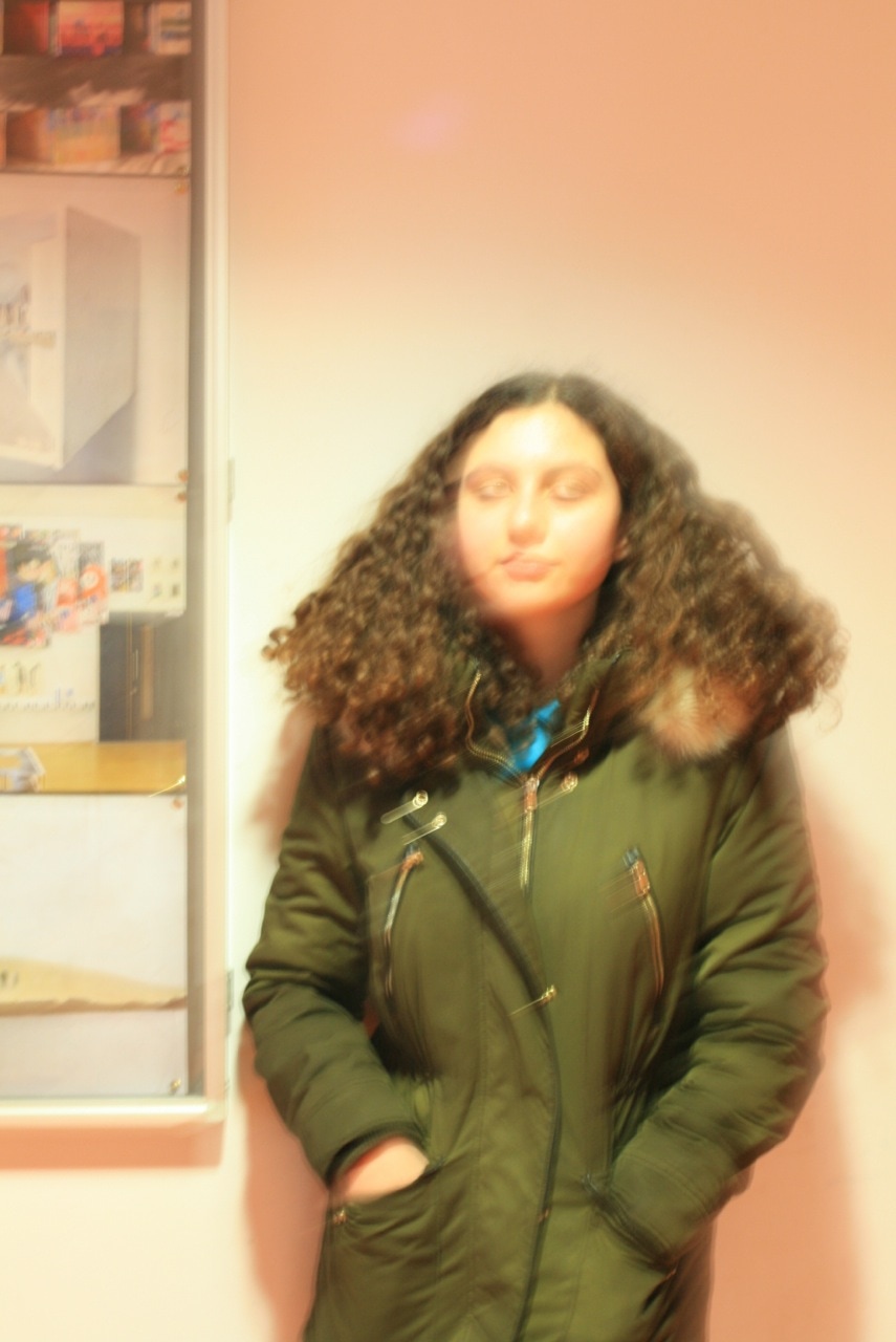
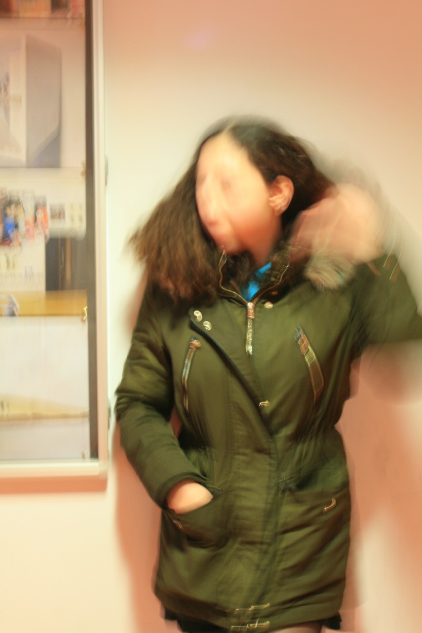
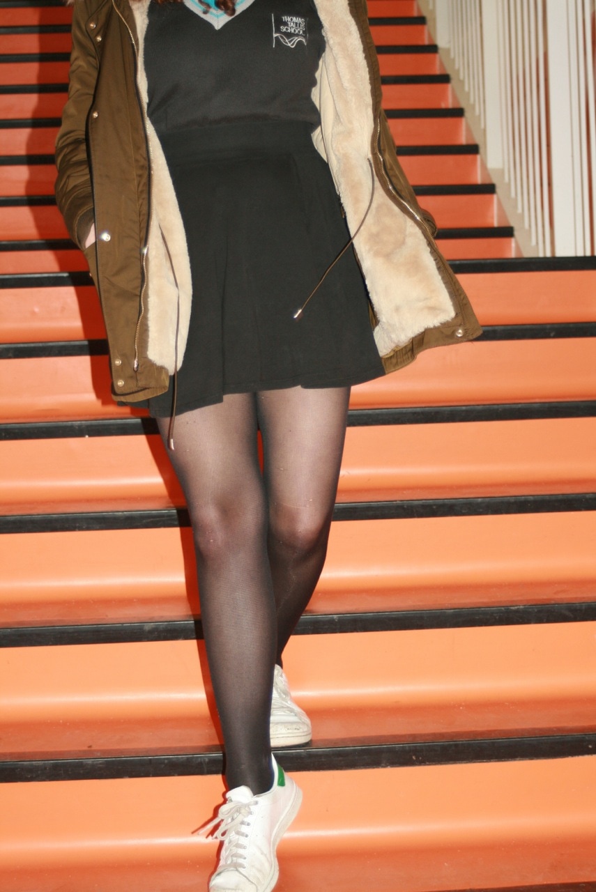
this is my first photo shoot


|
Evaluation
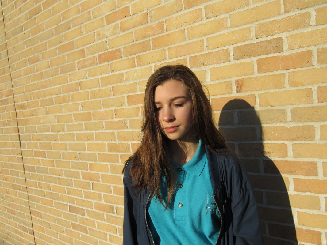
WWW:I like the photos when the lighting was very golden as it brings out the highlights in the photo, it also makes the image look smooth and gives the image a happy mood. Some examples of these images are to the right |
|
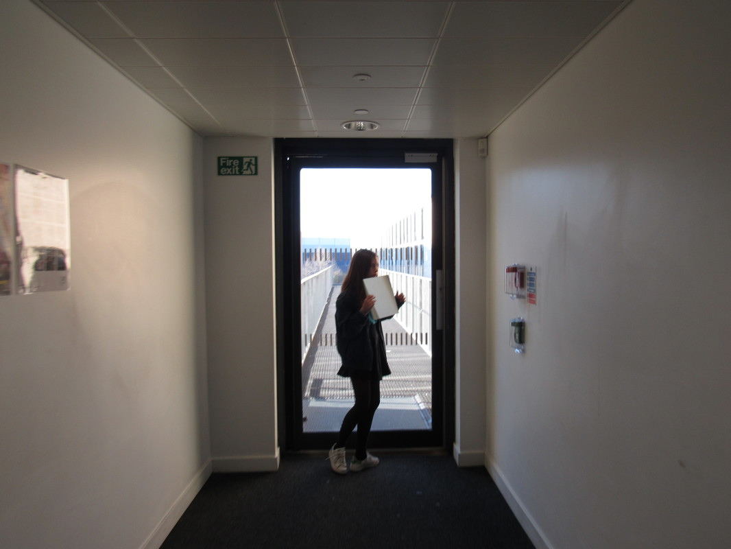
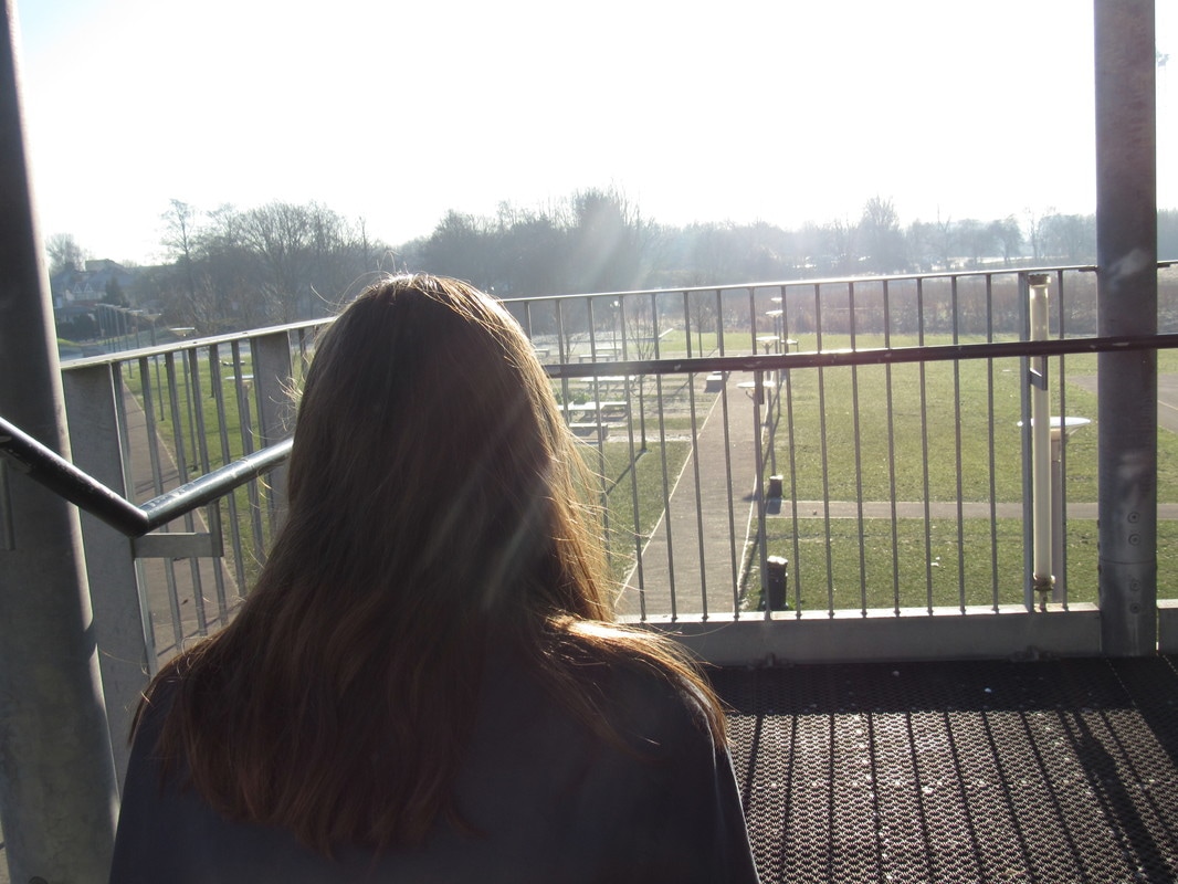
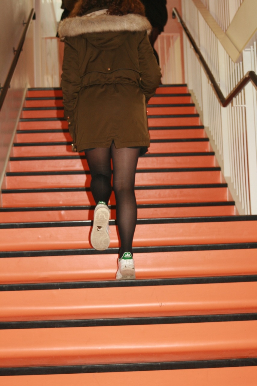
In class today we started to think about our own personal out come. We had freedom over how we spent the time, I choose to go out and take some photos to act as basis for my final out come. I took lots of images in 2 sets of photo shoots on different days as I need a wide array of photos to expand the possibilities. I had a go at making a mini outcome at home with pics art witch is shown above as im considering using photoshop or something similar to make my outcome.


Evaluation
|
WWW: I like the images with contrast or interesting colours such as image 1 which has interesting shadows and high contrast because of the flash. I like images 2 and 3 as they look crisp and i like that effect. I like image 4 as it looks very pretty and eye pleasing.
EBI: I used interesting objects, poses, backgrounds etc to make the images more original and unique as they look quite basic and unoriginal. |
|
cover work/research
|
Randy Grskovic experiments with digital style and collage. I think their work links to edges as where the images contrast or overlap there are clear edges, there are also edges in the photograph. I may take inspiration from this artist as i may collage my images for my final work.
The image i am going to look into in more detail is number 6. The image has a hellish kind of photo of lava and red rock but then its contrasted with cut outs of seats and a photo frame this contrasts the backdrop and makes it very different. |
|
photography assessment
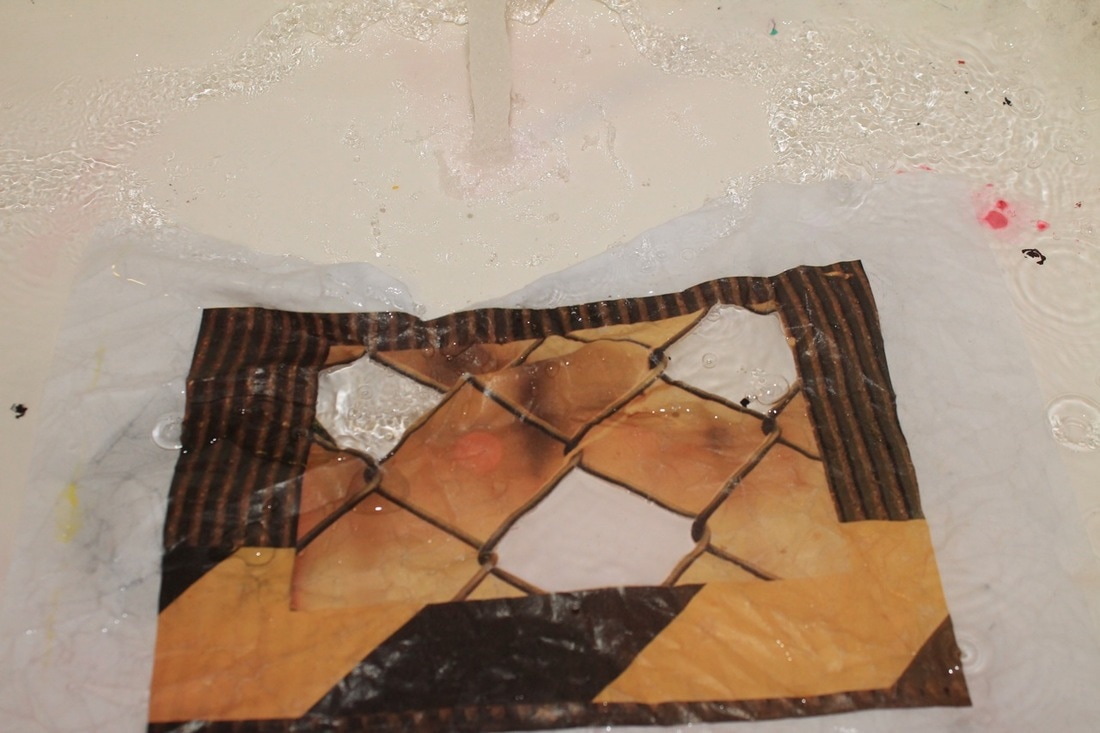
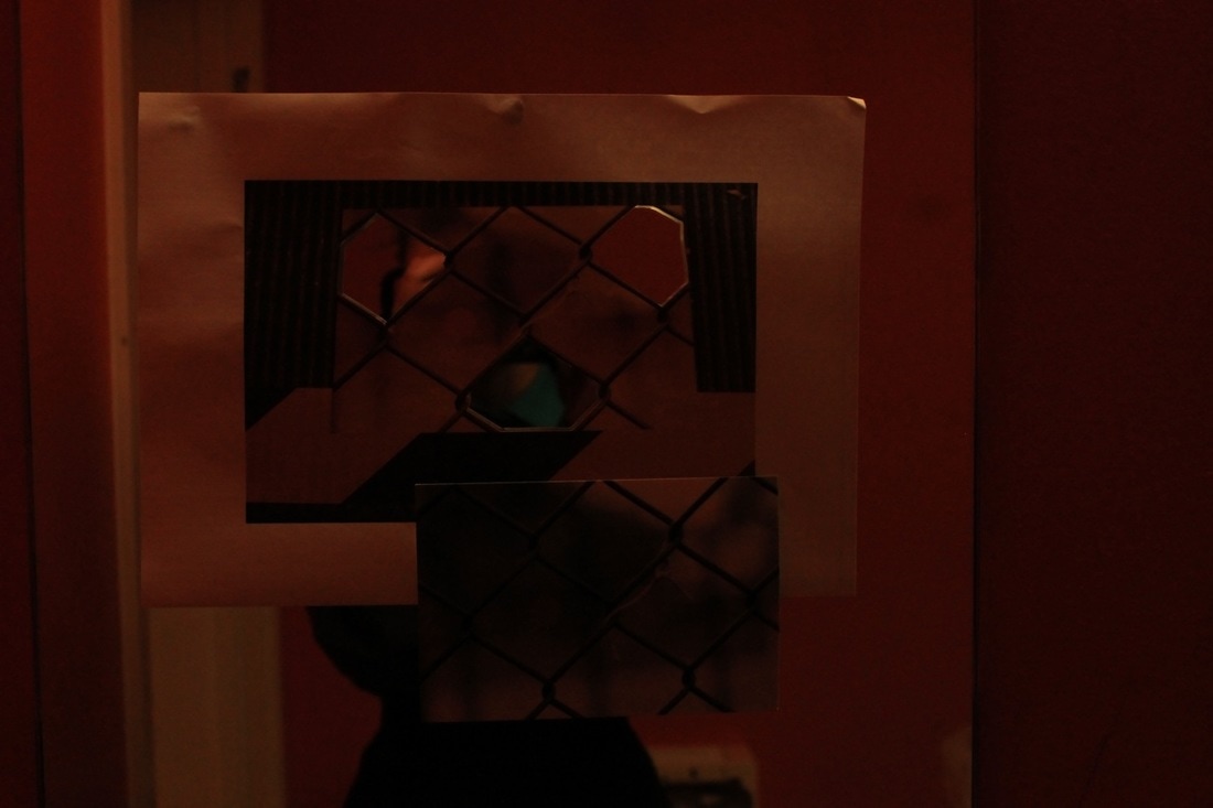
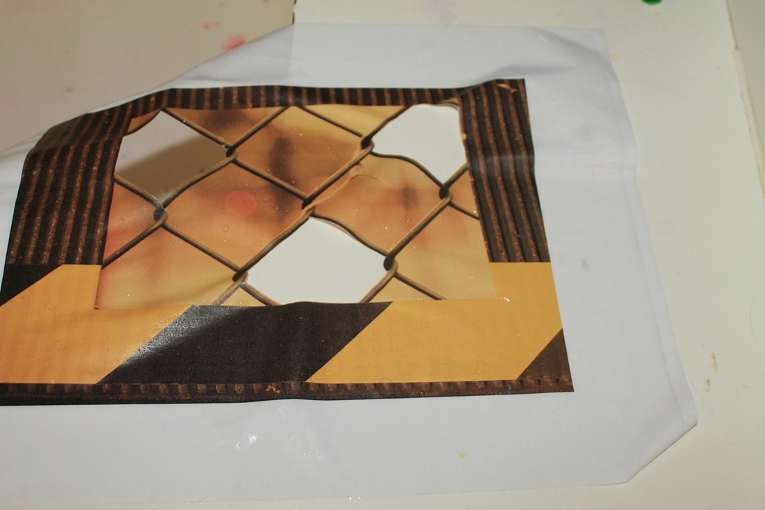
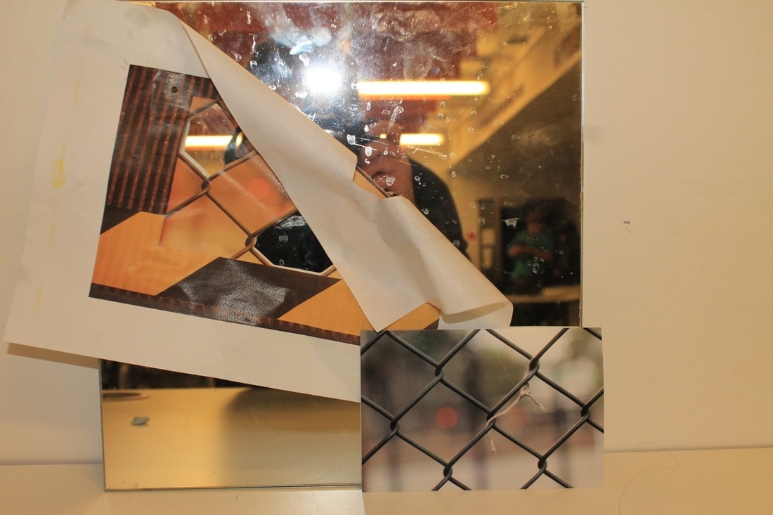
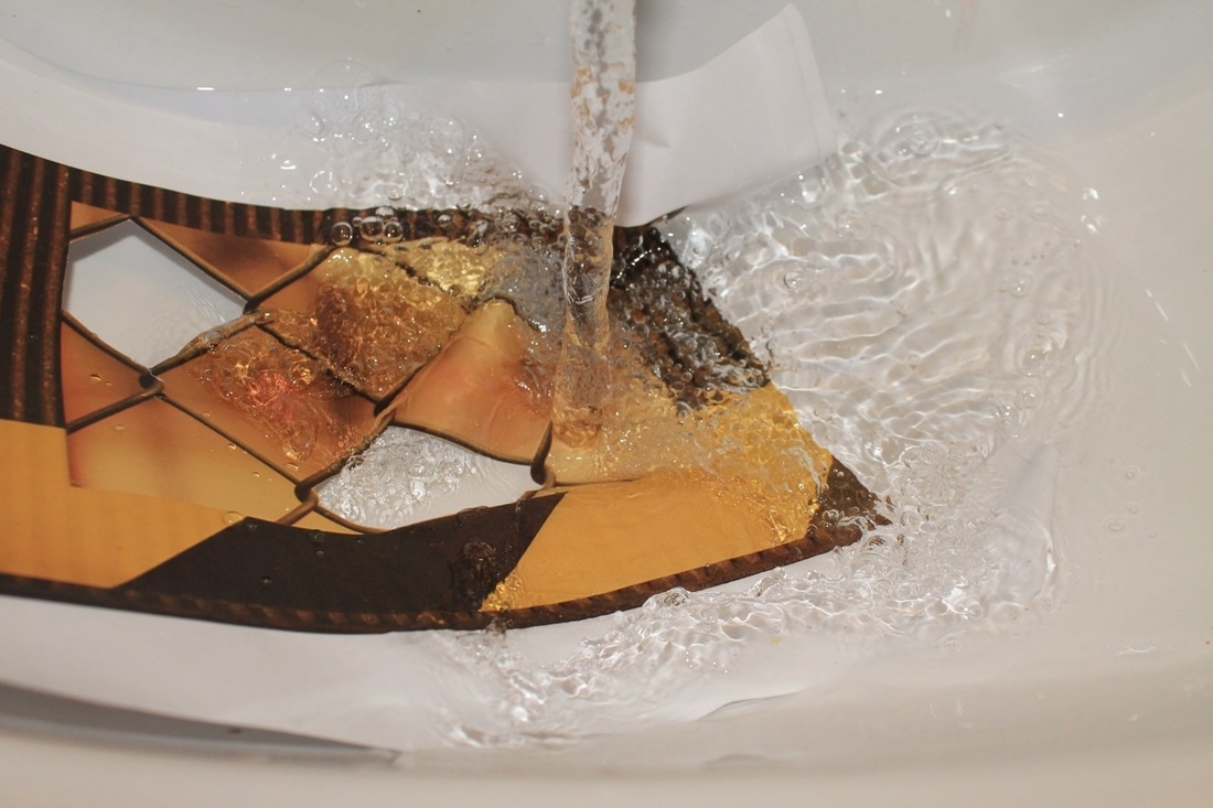
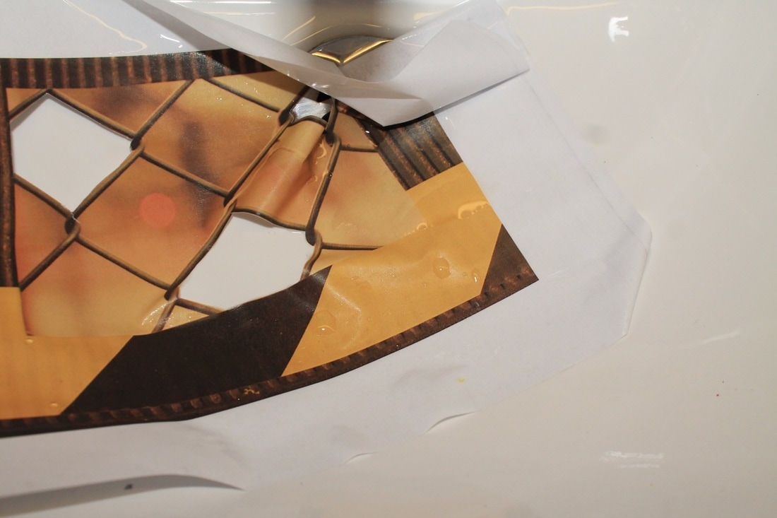
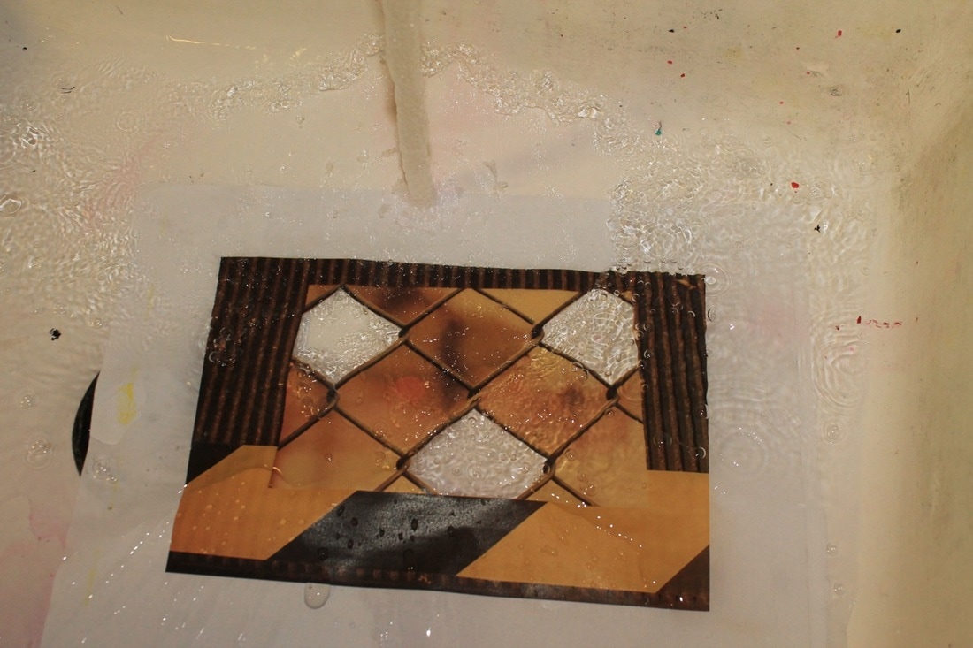
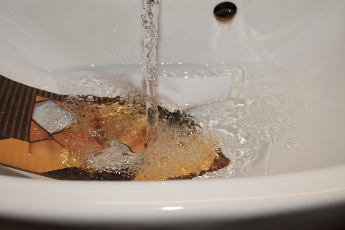
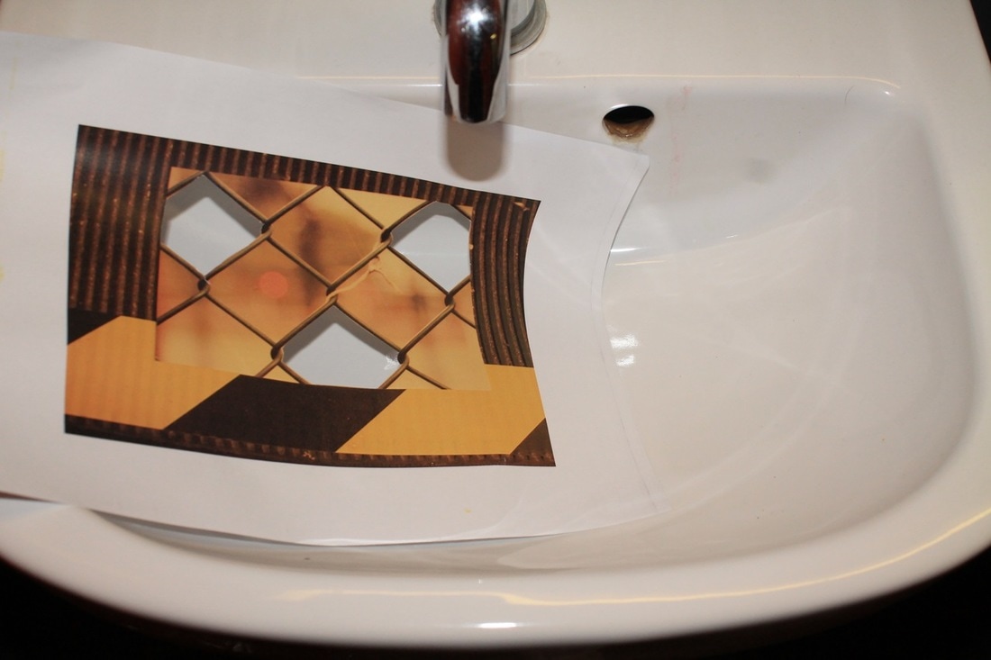
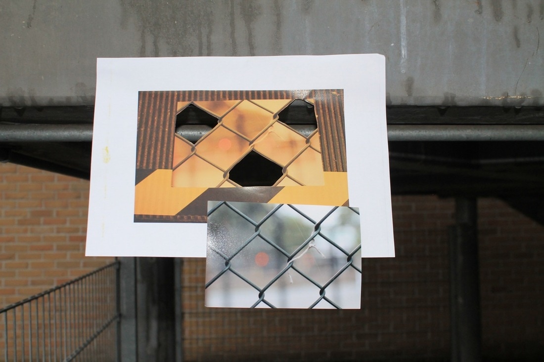
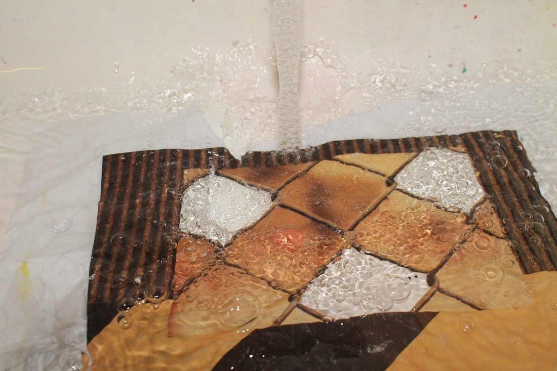
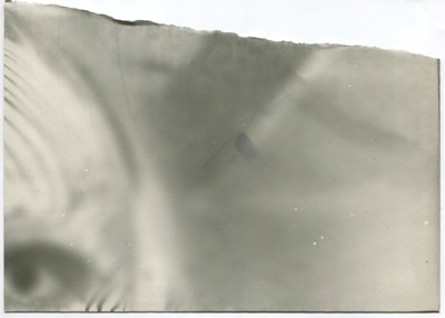
In this task we were given an image which has already been made and we had to use this photo in other photos by rephotographing it. This is based pin an artist called ... .
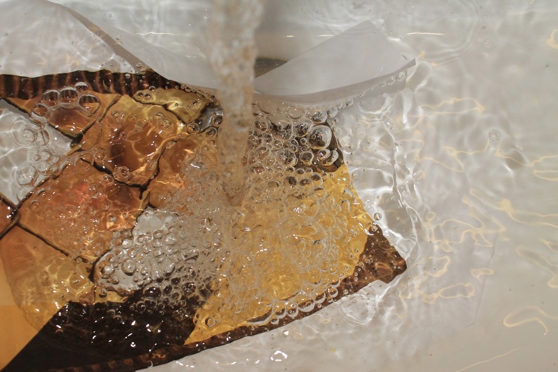
I decided to re-photograph the photo then print that out an re-photograph that photo. I done this so i could destroy the image. As i could do this i put the image under a tap and photographed it with flash so it gave the image intresting reflections and you could see the ripples and bubbles of the water which i like.
I decided to re-photograph the photo then print that out an re-photograph that photo. I done this so i could destroy the image. As i could do this i put the image under a tap and photographed it with flash so it gave the image intresting reflections and you could see the ripples and bubbles of the water which i like.


Evaluation

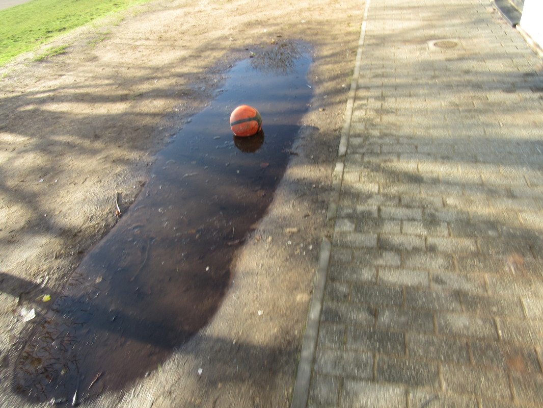
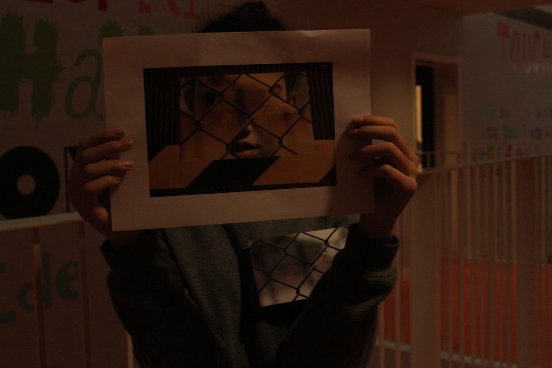
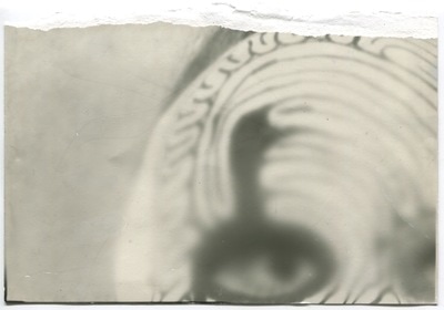
The task was to select an image from the pile on the table and rephotograph the image in 5 different locations as imaginatively as i could.
www: I think i came up with some imaginative ideas. My favourite images are this one as i like the the subject of the image and i also like how the flash makes the water glimmer and you can see all of the ripples in the water.
If i were to repeat this task i would try to use more imaginative ideas and i would also focus the camera better as I'm not very good at focusing.
photoshoot
I lost most of the images from this shoot but the ones left are here.


|
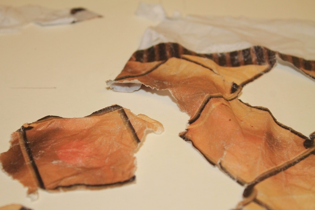
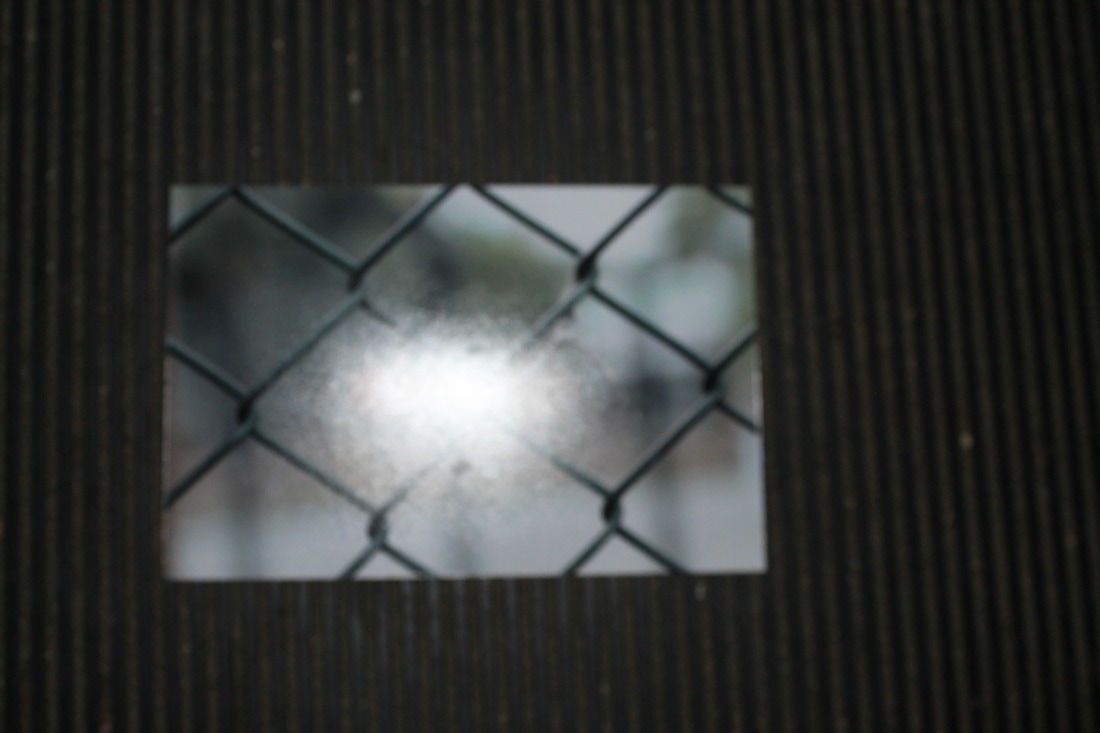
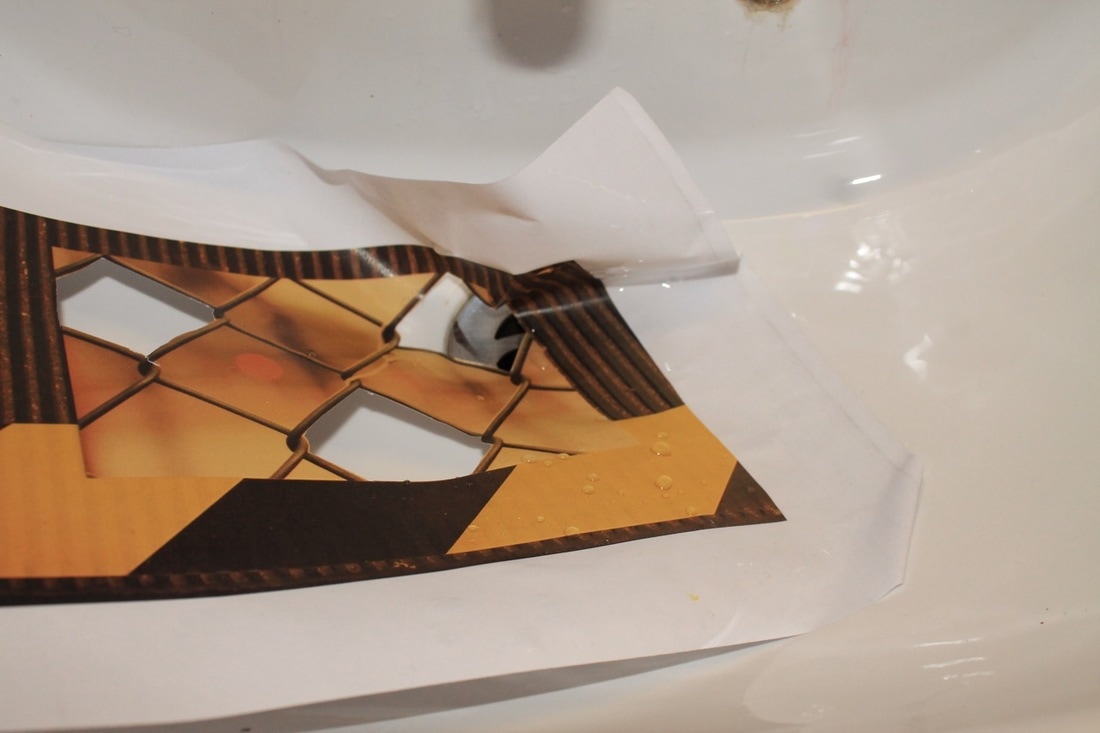
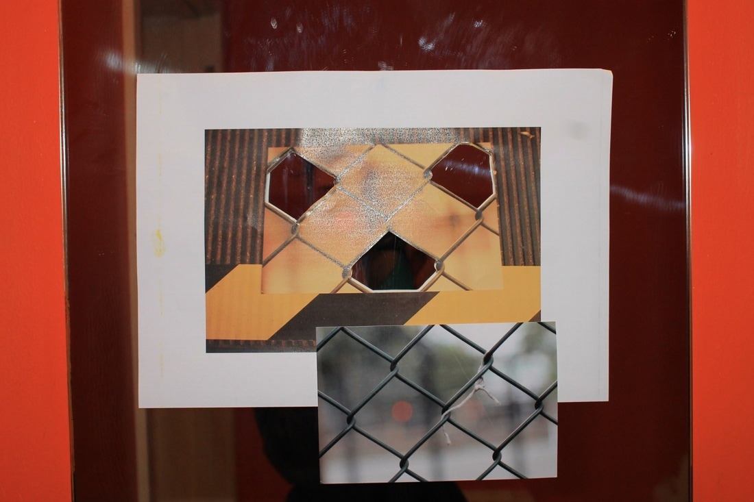
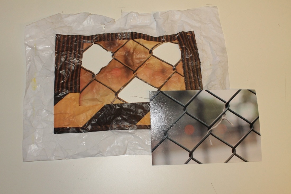
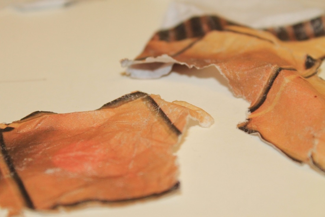
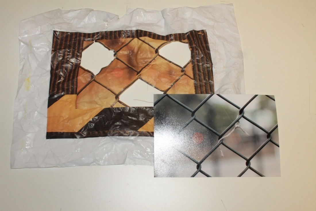
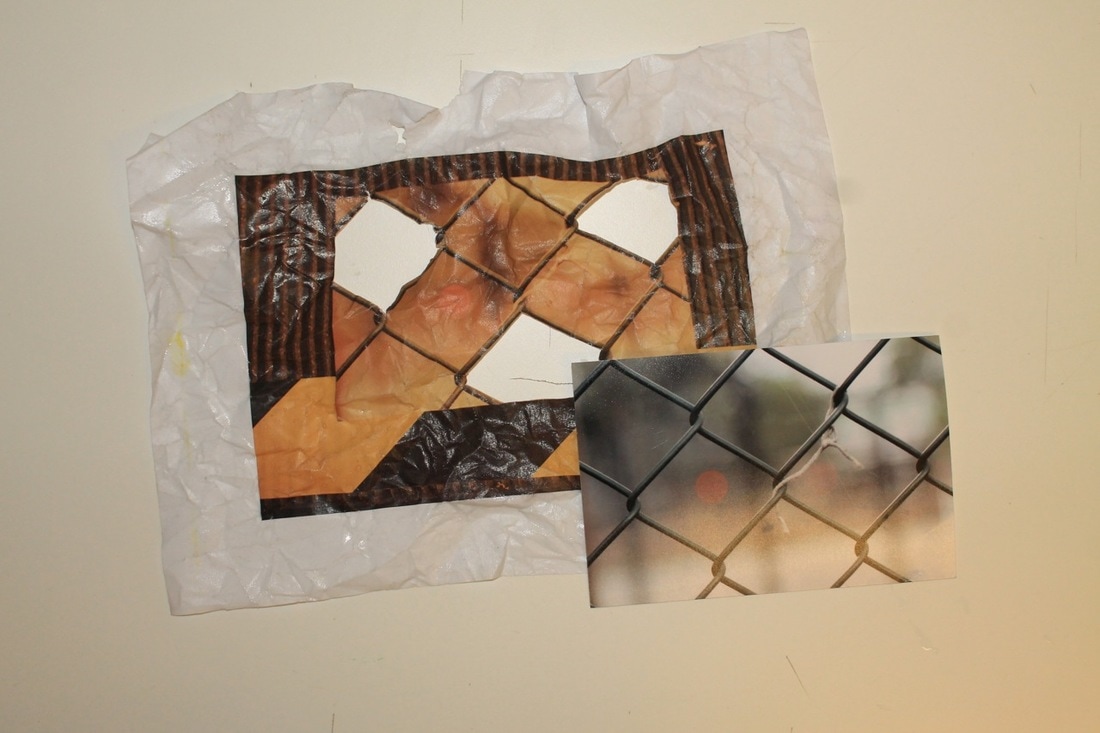
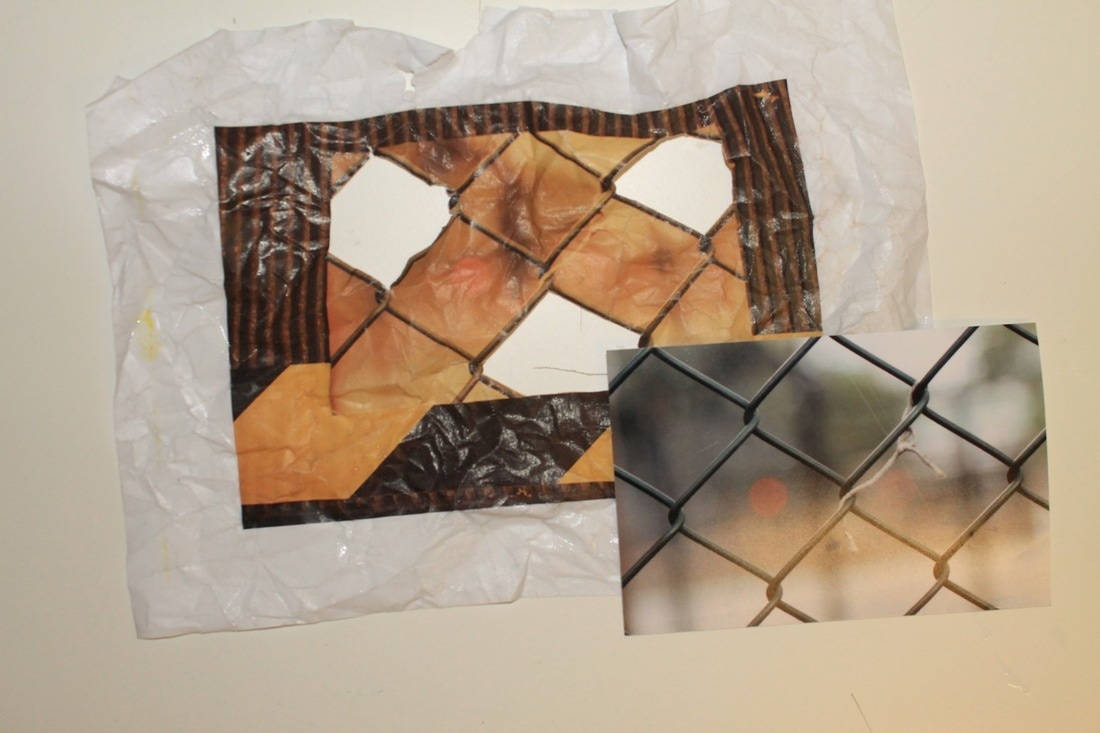
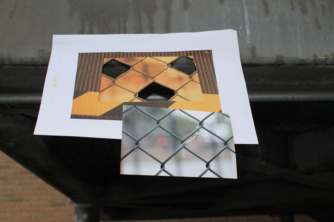
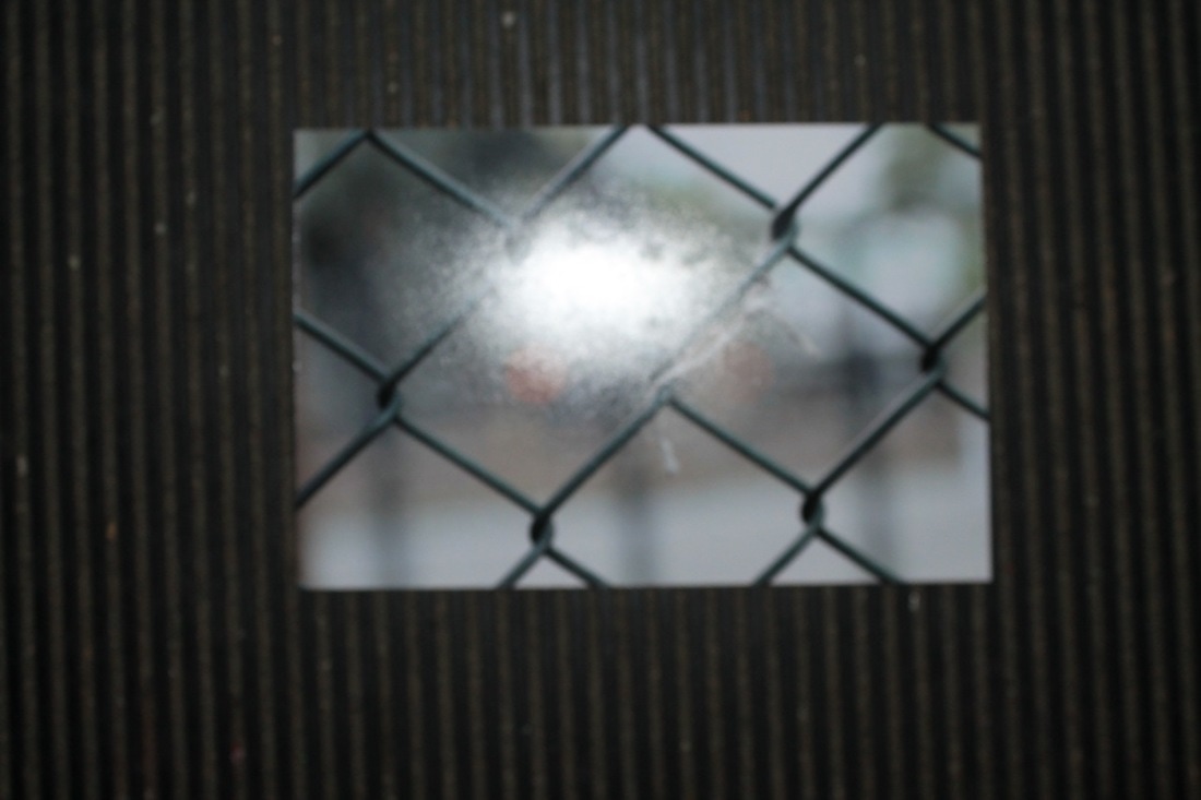
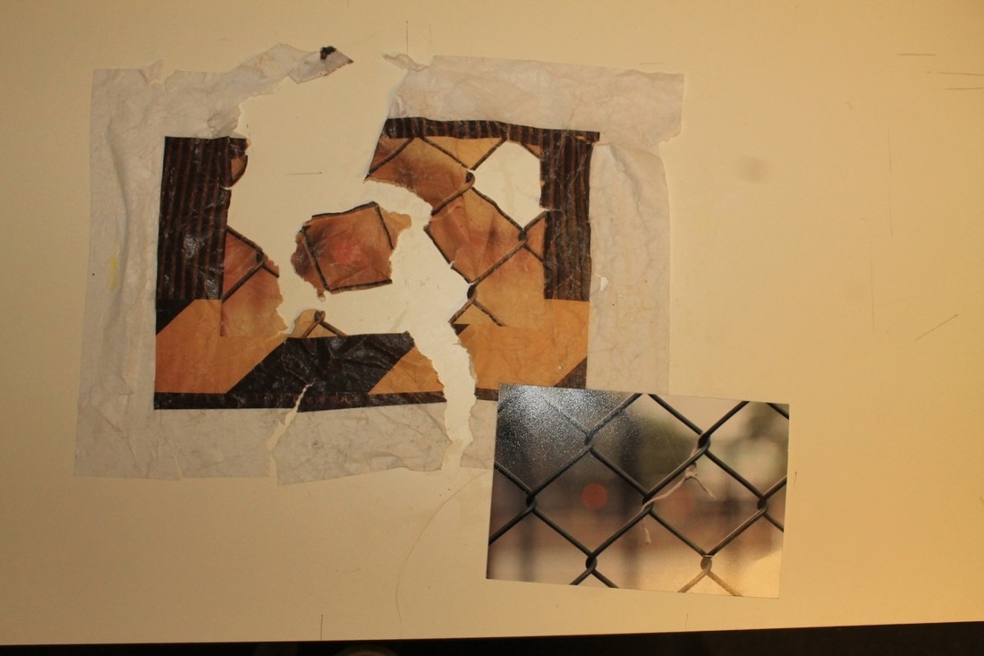
In this lesson we were given a bunch of photographs in different sizes, some tapes, some circle cutters and a cutting knife and mat. We were told to make a book witch was a creative as possible, some images of my finsal book are to the side. This task was a competition and i won along with callum... yay. In my book i decided to make holes and put strips of coloured tape over the holes witch created a nice effect.
|
|
1st final outcome
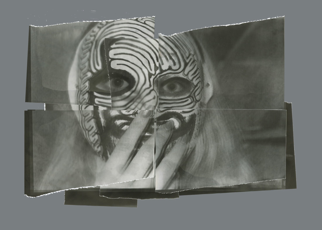
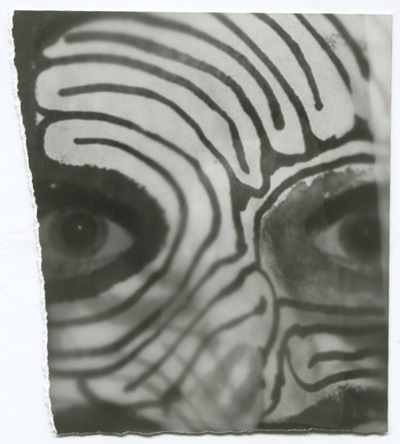

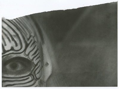


I got an image of kate and flipped it and put it black and white and negative then i printed it on A3 paper and went into the dark room and put the image on the photo paper witch id previously ripped up i did this multiple times so i had different bits to work with.
|
whilst in the dark room i used old
negatives to make this cyanotype. |
On friday we went on a trip to photo fusion and the tate, We saw Dafna Talmor's work in photo fusion and had a chance to talk to her. We drew a picture of the light areas of an image we liked with white onto black paper to help us observe the work more.
Theres a link to Dafna Talmor's work here.
Theres a link to Dafna Talmor's work here.
|
|
|
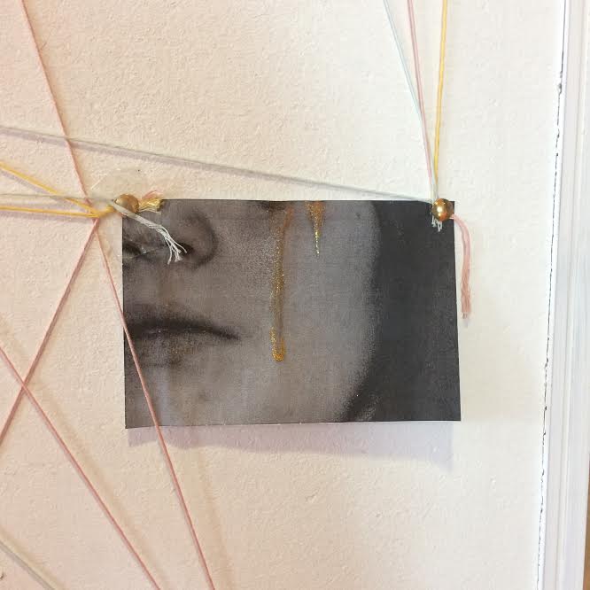
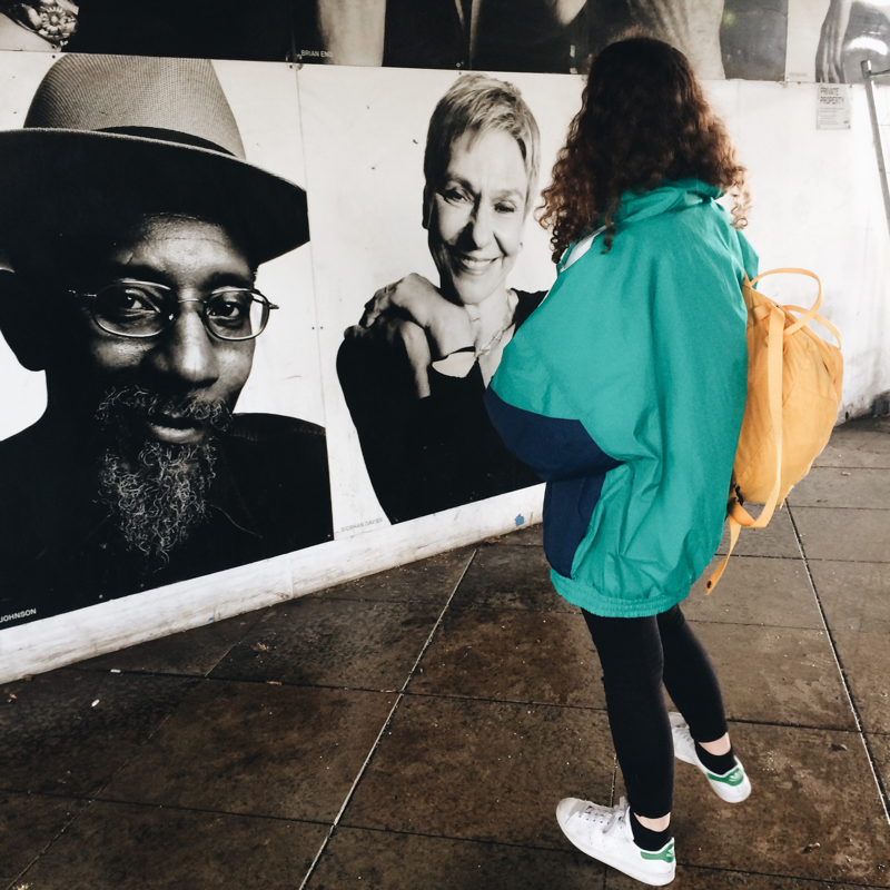
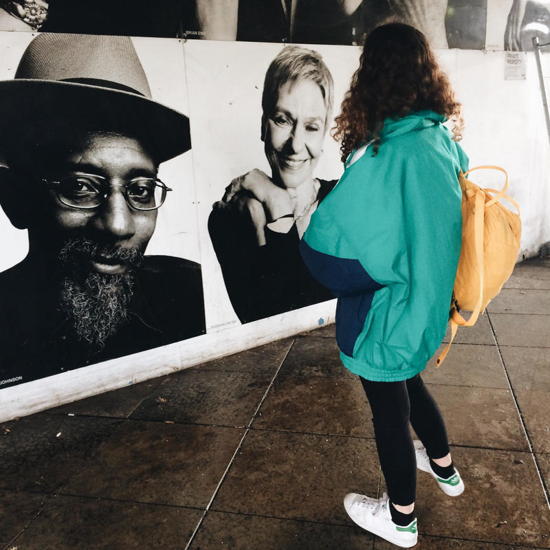
at the tate we saw Elton John's photography collection and wolfgang tillmans exhibition too. I liked thee images in particular, i like them as they were very simple but very beautiful i also like how two of them have a deep meaning behind them. There was another image witch i liked which was picture of a face but half the face had been ripped of and a drawing was put in place of the missing space however i couldn't find the image.
|
|
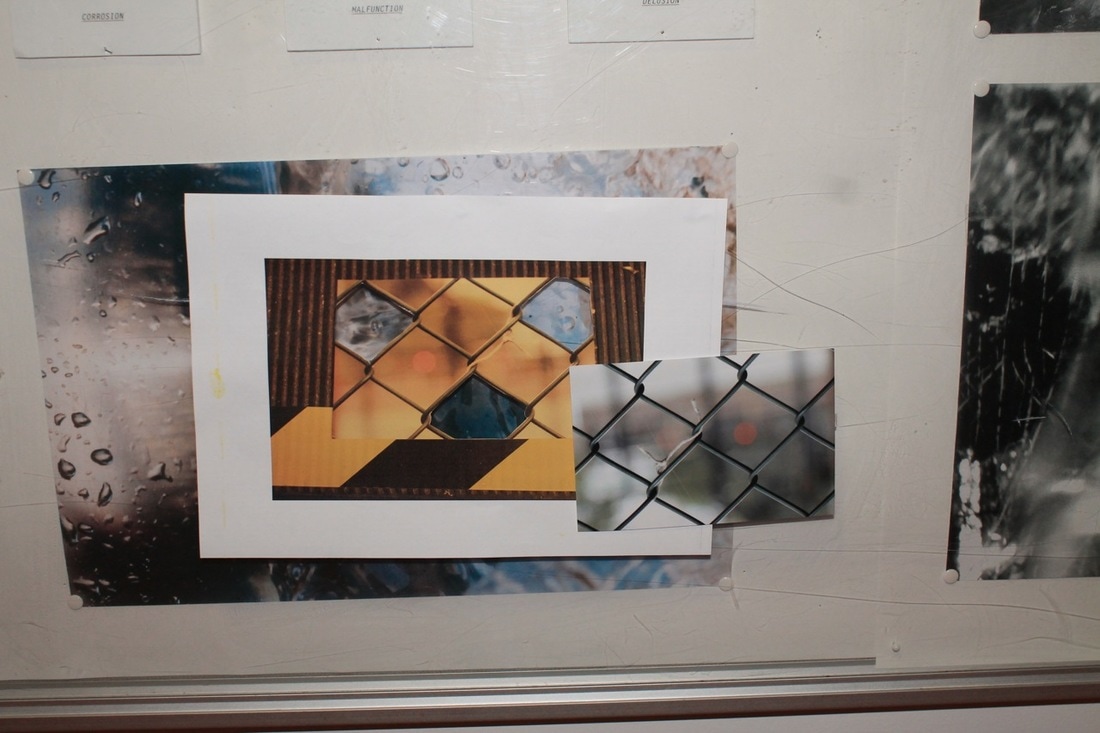
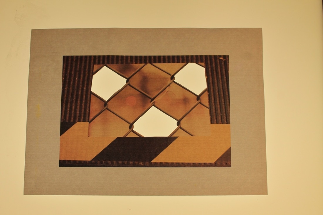
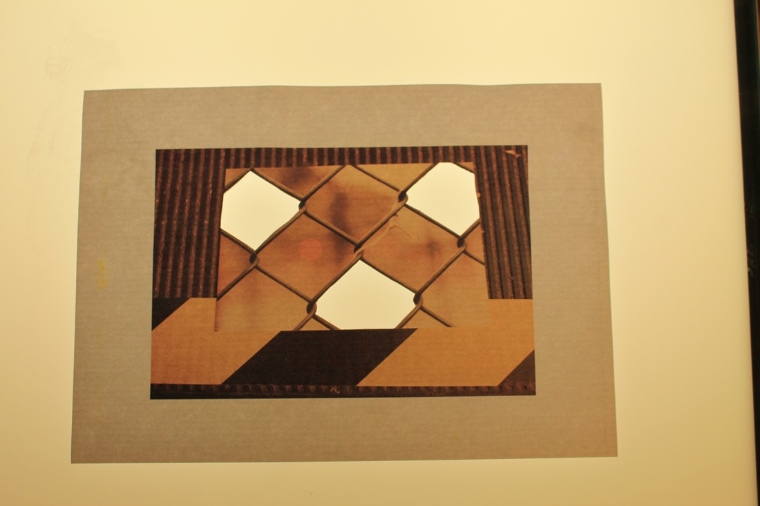
2nd final outcome
for this i edited multiple images as if they are glitches then printed them out small as if there pixels, i may put them into a shape put at the moment I've just mounted them on to a board. Some examples of images I've made are here.
