|
Anna Atkins was a botanist around in the 19th century. She was the first person to famously use cyanotypes, She used this type of photography to capture the plants she was studying as before the invention of the cyanotypes botanists would have to hire a artist to draw the subject however artists draw their interpretation of the subject meaning it wasn't exactly life like, where as the cyanotypes can capture a to scale image of the subject. Anna Atkins made a book witch was illustrated with cyanotypes this helped other botanists learn about the plants and their shapes. some of examples of her work are to the right >>
|
|
Cyanotypes are a type of cameraless photo witch is made by stopping light getting to certain places on the canvas. They were invented by John
Herschel in 1839. To make the image you coat your canvas in solution of iron compounds witch are activated by the sun, when the chemicals on the canvas react with the ultra violet rays in the sun it makes the canvas a dark blue colour and the places witch are covered stay a white colour meaning you get a negative image with really high contrast.
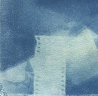
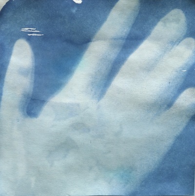
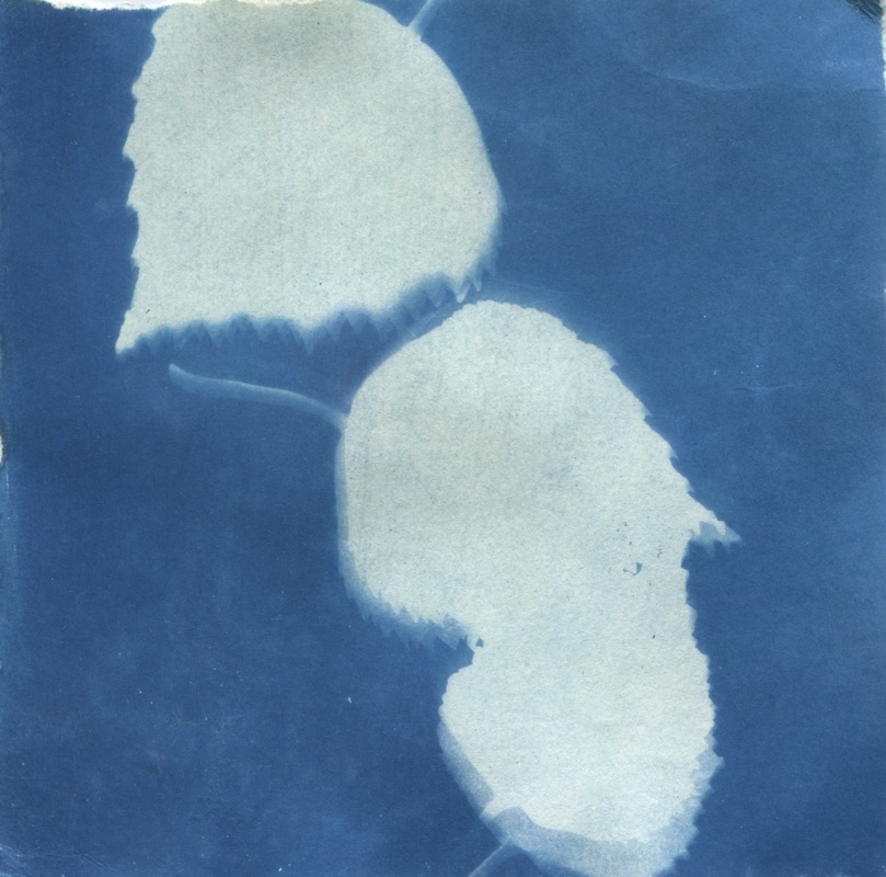
Last lesson we tried to make some cyanotypes ourselves, I did three different ones developing our techniques as we went. My first on is the one on the left, I don't think that the image worked to well for multiple reasons firstly the white space is all jumbled together and you can't make out the different shape within the image also the image didn't have as much time to develop as the wind blew away the objects blocking the light so the white space is tinted blue ad the dark blue isn't as dark as it could be so the negative and positive shapes merge together. my second attempt was my hand witch is an improvement from my first image as the white space is clear and light however the photo isn't perfect either and needs improving still. Some things i dislike about the photo is that my ring finger and middle finger are touching so it looks like one giant white blob, Also where the shadow from my hand makes a slightly lighter blue shape around my hand. My final photo is the one on the right the subjects of my photo is leaves i spaced the leaves in a diagonal line across my image i like this the most as the contrast is really high and the effect of the shadows work well around the leaves. I choose a very minimalist componsition and i think it works well as it makes it very clear. If i repeated this task again i would expose the image to the light longer so that the contrast is really high i would also use more interesting objects maybe layering objects witch let some light through with opaque objects to give the image light, mid and dark tones.


