Introduction
|
Abstract is something that doesn't resemble real life, it may be a distorted version of reality which is unclear or unrecognisable.
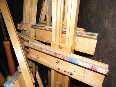
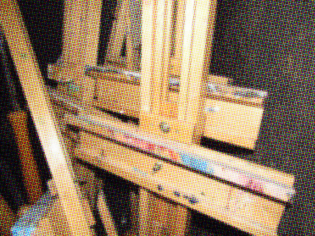
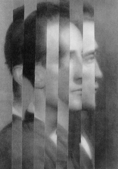
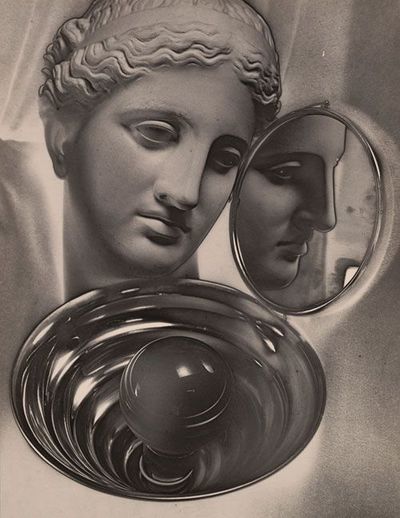
My personal project is on abstraction which is a trend of photography and art which breaks our ideas on physical objects and creates it's own reality through its use of colour, tones, lights and darks etc. Some photographers who experiment with abstraction are Aaron Siskind and László Moholy-Nagy, there work can range from extremely abstract and unrecognisable to not very abstract.
|
|
Formal elements
|
Focus:
Light: Line: Repetition: Shape: Space: Texture: Value/Tone: |
Which areas appear clearest or sharpest in the photograph? Which do not?
Which areas of the photograph are brightest? Are there any shadows? Does the photograph allow you to guess the time of day? Is the light natural or artificial? Harsh or soft? Reflected or direct? Are there objects in the photograph that act as lines? Are they straight, curvy, thin, thick? Do the lines create direction in the photograph? Do they outline? Do the lines show movement or energy? Are there any objects, shapes or lines which repeat and create a pattern? Do you see geometric (straight edged) or organic (curvy) shapes? Which are they? Is there depth to the photograph or does it seem shallow? What creates this appearance? Are there important negative (empty) spaces in addition to positive (solid) spaces? Is there depth created by spatial illusions i.e. perspective? If you could touch the surface of the photograph how would it feel? How do the objects in the picture look like they would feel? Is there a range of tones from dark to light? Where is the darkest value? Where is the lightest? |
Formal elements within photos.
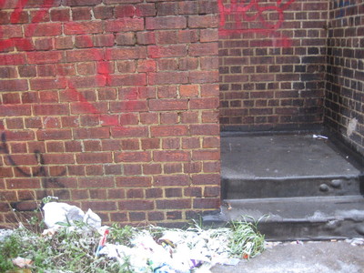
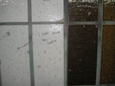
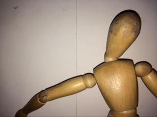
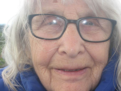
These photos demonstrate an exaggeration of one of the formal elements, if you hover over an image it will display which formal element its showing.
First experiment with abstract photos.
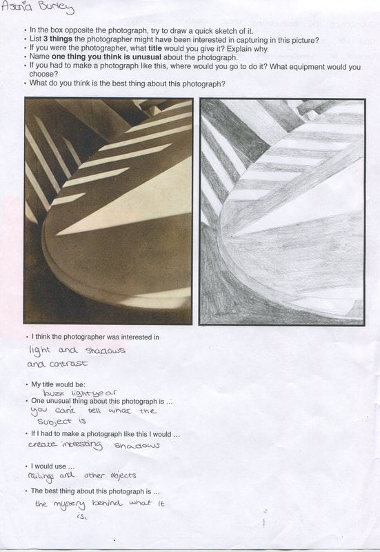
Paul Strand sketch.
The image in the print out is by Paul Strand and is entitled Abstraction, Twin Lakes, Connecticut'. It was made in 1916. We drew a sketch of the photo in order to look at the image in more detail and think about the lights and darks, tones, shadows, use of line, focus etc. We then answered some questions about the image.
Investigation of context of abstract photos, 1900's
abstraction photo book
Research
|
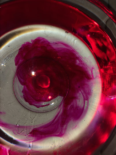
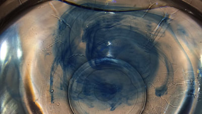
I began by looking at WolfGang Tillmans work, who I discovered through going to the tate, amongst many other things Tillmans takes photos of ink in water. I liked this idea and so i looked into it more. (Images 1,2,3 and 4)
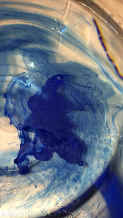
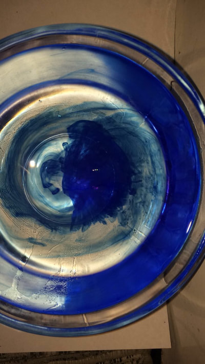
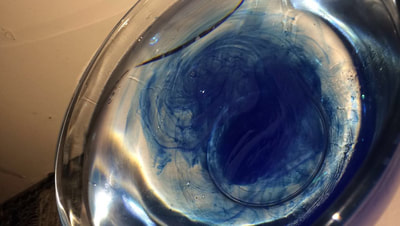
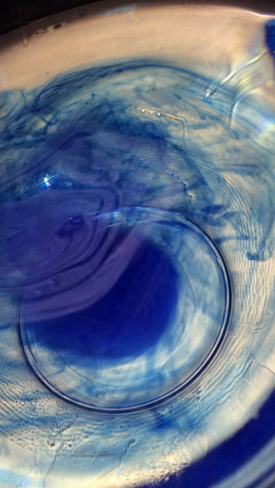
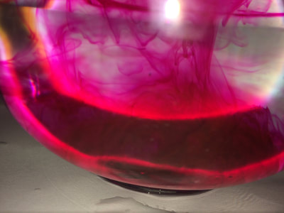
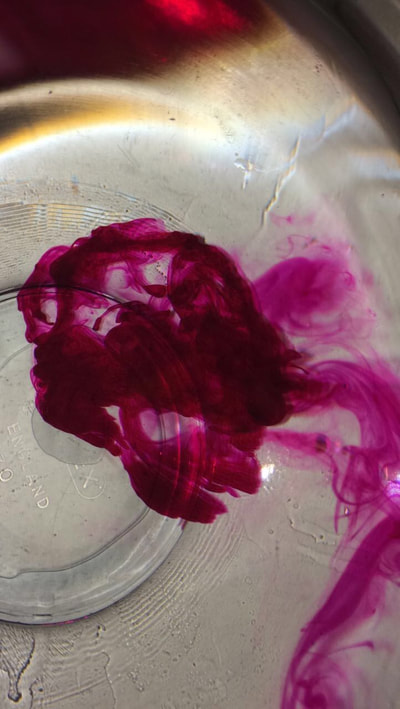
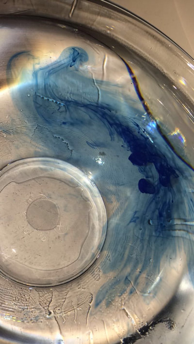
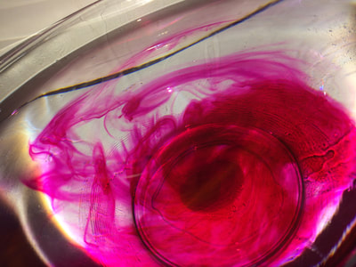
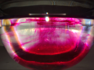
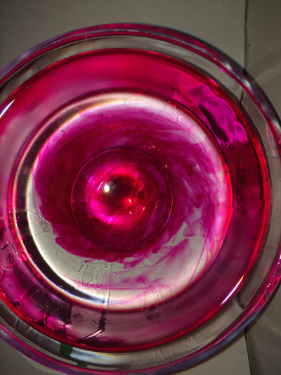
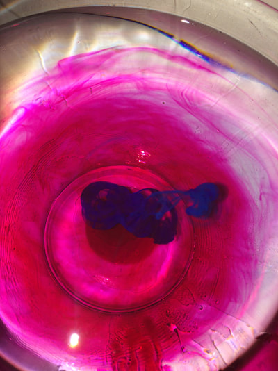
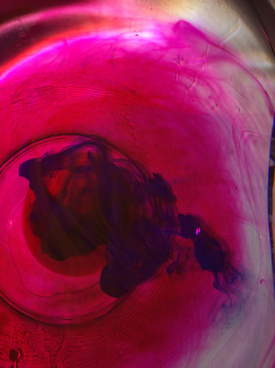
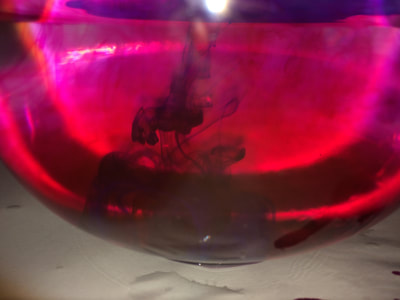
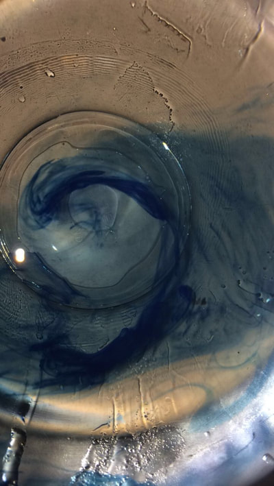
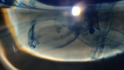
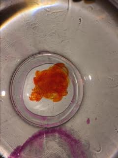
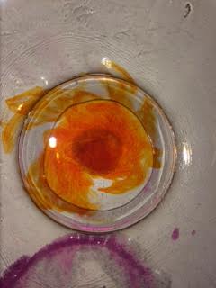
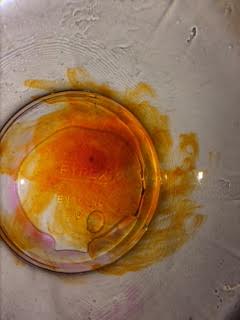
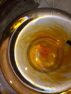
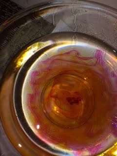
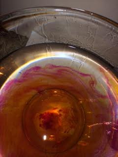
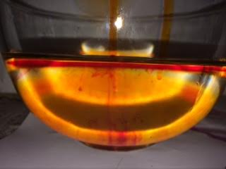
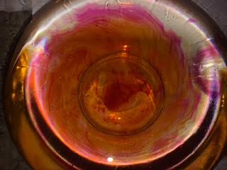
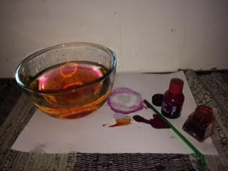
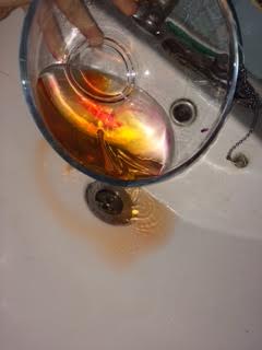
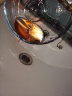
I found a graphic designer called Alberto Seveso who also photographs ink in water, he also had a page on how he creates the images. (Images 5 and 6) I then tried it myself, I used refill ink and pen ink then using a straw dropped it into a glass bowl. I took the photos with flash meaning there was more of a contrast between the ink and the water however it reflected of the glass bowl. |
|
https://www.diyphotography.net/beautiful-high-speed-photographs-ink-water/
|
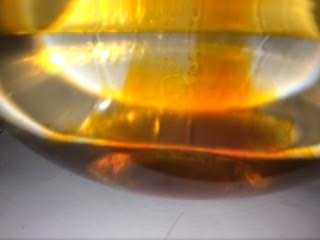
I tried the same process again with a different ink as the other ones separated very quickly, I also experimented with mixing colours more. If I do it again I'm going to try putting the water on a plate and taking the photos from a birds eye view or using a clear tank and taking the photos from the front so you can see the ink swirling downwards more like Alberto Seveso's images. |
Man Ray and solarstation.
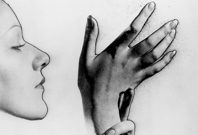
Solarisation is a process in which you expose a image to white light whilst the image is in the developer, giving it a unusual affect. It was discovered by accident when Lee Miller turned on the lights in the dark room whilst developing a photo as a rat run over his feet.
First try at solarisation
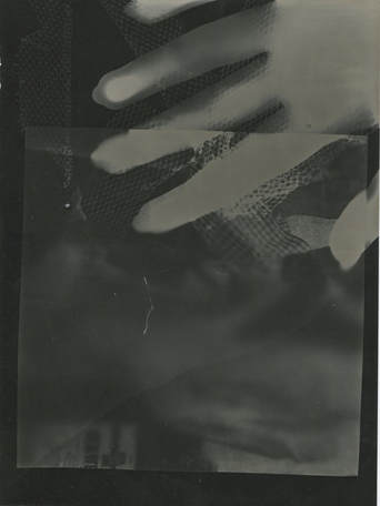
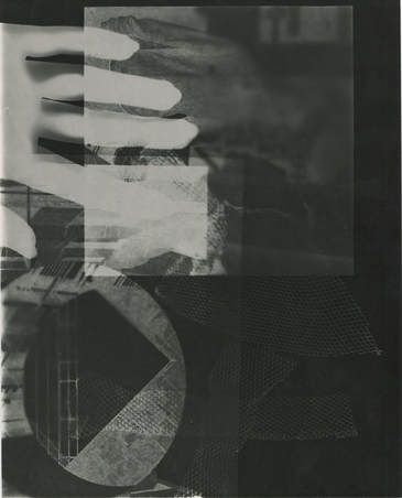
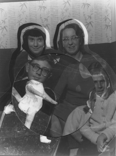
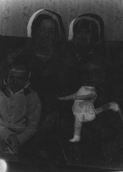
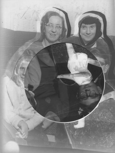
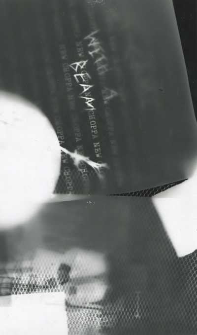
I made two photograms including my hands as well as pieces of paper from newspapers and random cut outs which I layered up. I also included pieces of metal mesh. solarising the images created a slight transparency around some objects such as my hands. It didn't work as well as I would have liked in the first attempt as the entire image is slightly over exposed so the entire image is too dark. However I really like how you can see the metal mesh through the hand. I like the contrast in the second attempt, I also like the overlay of the paper cut outs.
Photograms.
More Photograms.
Abstraction assessment, December 2017 - January 2018
Research - Jim Goldberg
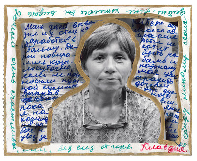
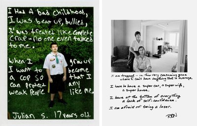
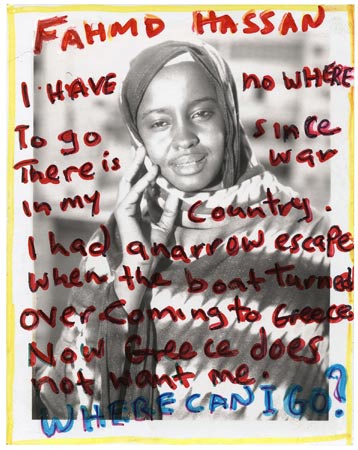
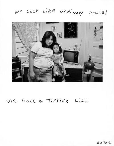
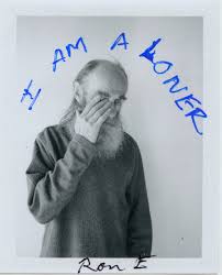
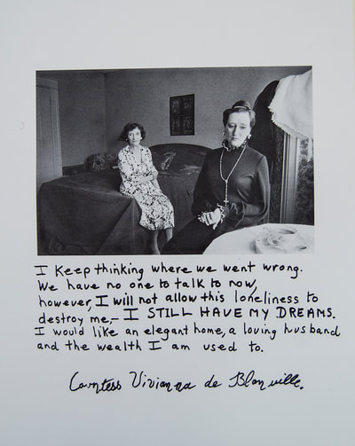
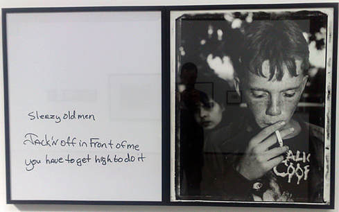
Jim Goldberg is an American artist and photographer whose work focuses on those neglected, isolated in some way. In his photobook 'Raised by Wolves' he captures the lives and untold stories of homeless youth and runaways in San Fransisco, who he spend 10 years among. The majority of the images within the book are in black and white which adds an element of abstraction to them. He also adds further abstraction to some images by including writing and drawings over the photo. This adds a different type of abstraction alongside the mechanical adjustments such as playing with contrast, exposure, colour etc. The book is very hard to find so the studio decided to make a short film, including work from the book alongside video and audio from Goldberg's archive.
Another of his pieces is 'OPEN SEE/PROOF', which was displayed in the Wilhelm-Hack Museum, Tate and Deutsche Börse, tells the stories of refugees, migrants and trafficked groups trying to find new homes in Europe. Much like in 'Raised by Wolves' his work for open see is mostly in black and white with the odd colour photo. He also puts quite thick boarders around the images and marks from tape, pen etc.
(Open See, Jim Goldberg)
|
Raised by Wolves from Jim Goldberg on Vimeo. |
The juxtaposition of the writing on the left to the image on the right gives the image a new idea of innocence and experiences as the writing describes a experience that a child should not have to go through however its the reality for some children.
Research - Hiromix
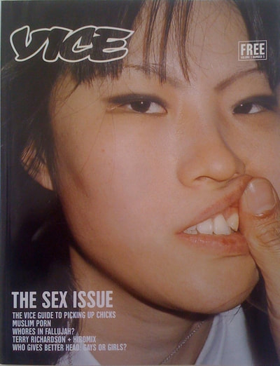
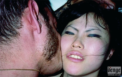
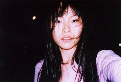
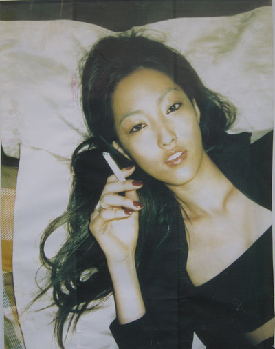
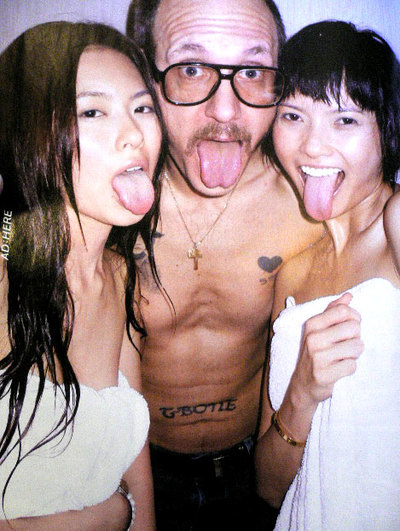
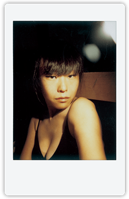
Hiromi Toshikawa, or Hiromix, is a Japanese photographer and artist. Her photographs show life from a teenagers perspective, This is why she is such a sensation in Japan. Her career was fuelled after winning the 11th New Cosmos of Photography award, a competition held by Cannon. she was also nominated as one of Japan's best photographer for a series of photographs called Seventeen Girl Days.. She went on to make 3 books, Girl's blue (1996), Japanese beauty (1997) and Hiromix (1998). Hiromix makes her images appear slightly abstract through the contrast, saturation, exposure etc. These adjustments create a filter which distances the photo from reality.
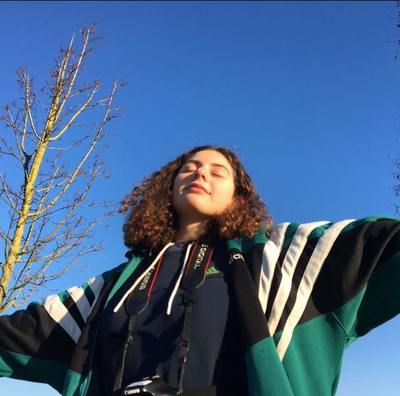
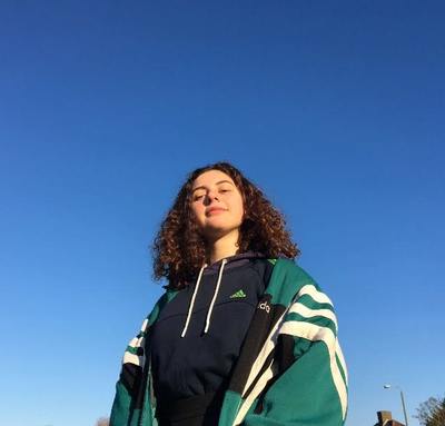
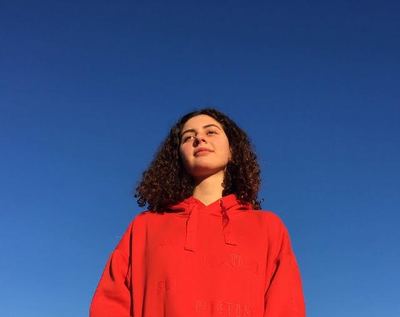
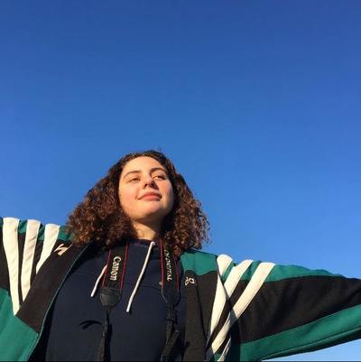
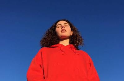
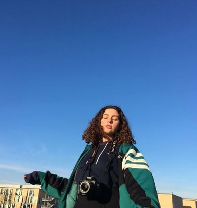
I took these photos taking inspiration from hiromix's work, although they are not very abstract I want to incorporate them into future work and make them more abstract. I took the photos on an old digital camera.
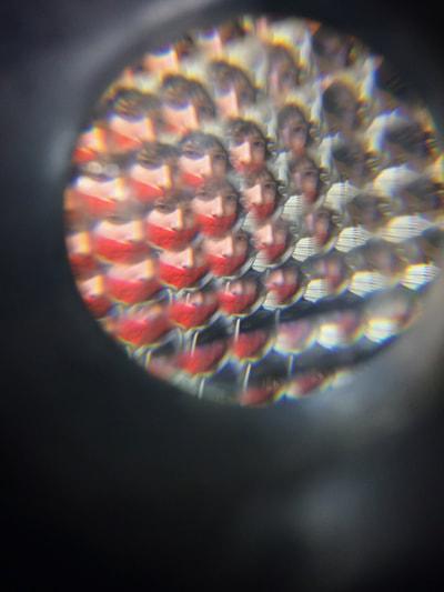
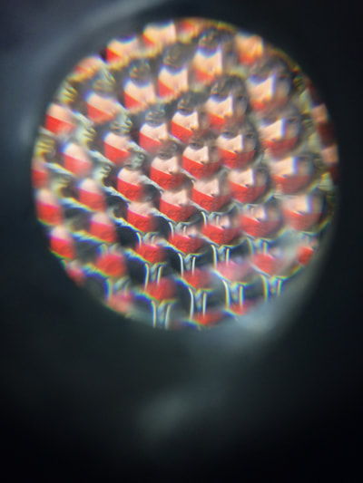
Fly vision photos
Projecting images
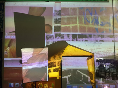
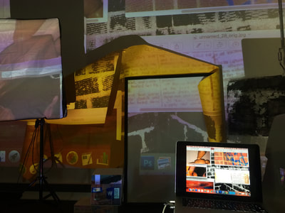
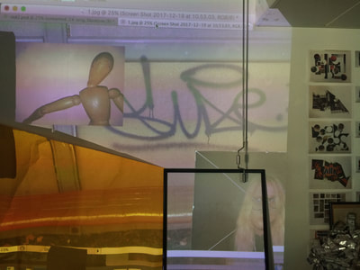
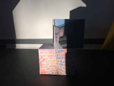
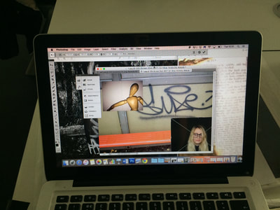
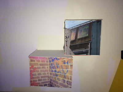
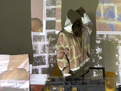
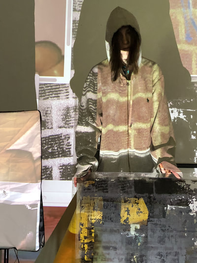
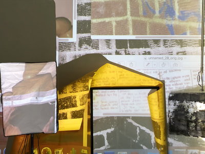
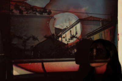
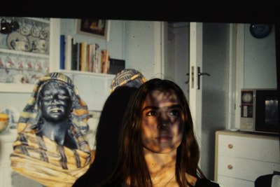
I opened a bunch of photos on my desktop, overlapping them and arranging them in interesting ways. I then projected my computer screen onto the wall and placed a variety of objects in front of the wall to distort the projections. It also created shadows which add depth to the photos. I also used some cuboids i made previously with my images pasted on.
|
I took one of the photos and photoshopped it in varies different ways to add more abstraction.
|
|
Slide projections
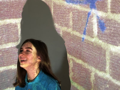
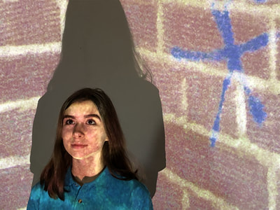
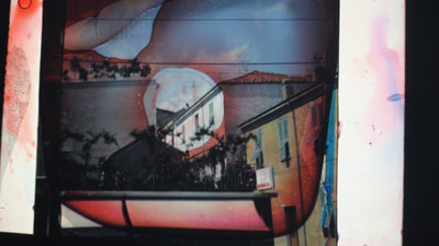
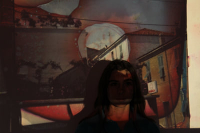
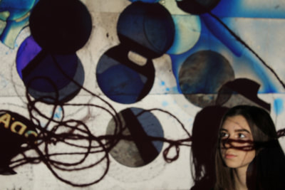
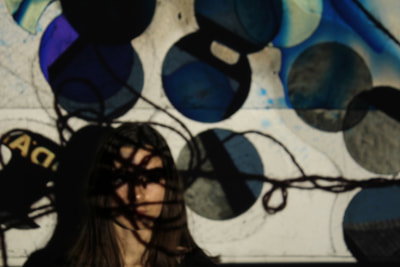
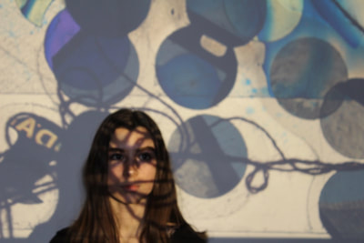
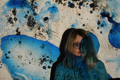
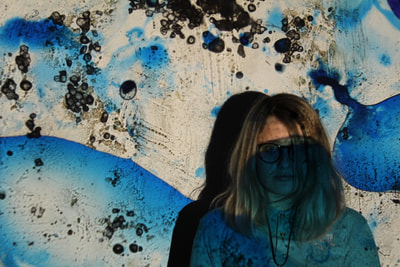
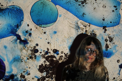
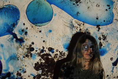
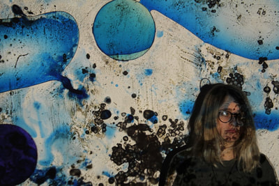
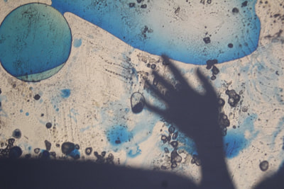
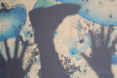
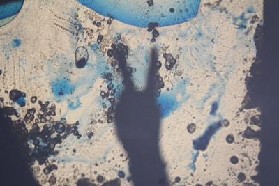
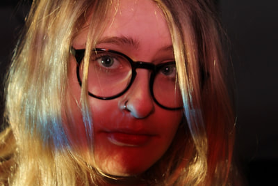
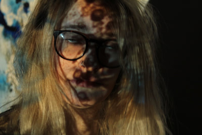
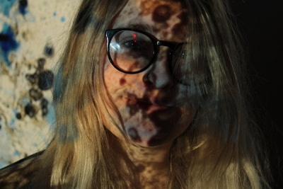
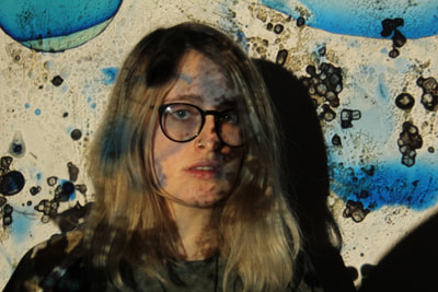
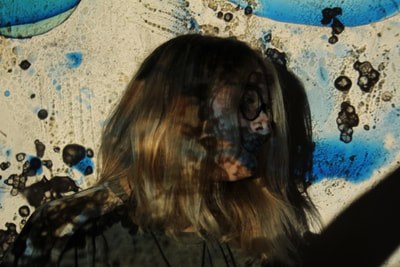
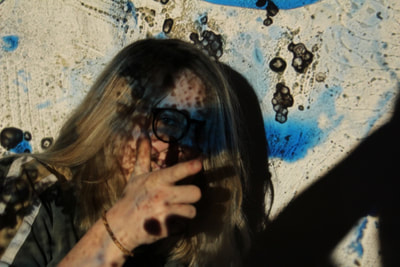
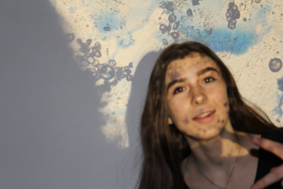
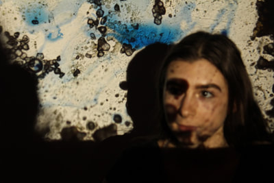
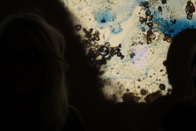
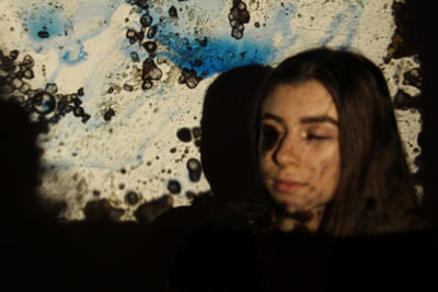
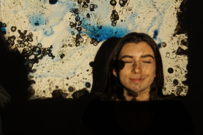
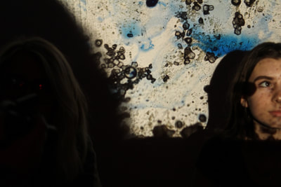
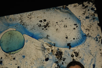
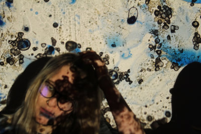
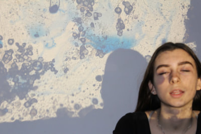
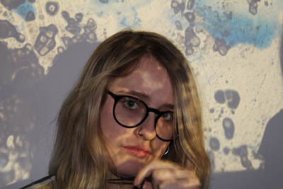
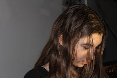
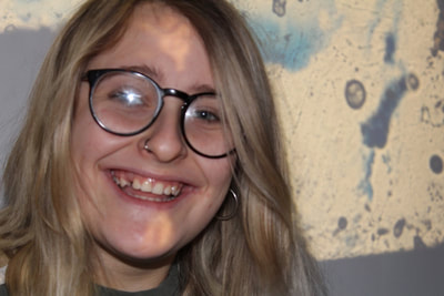
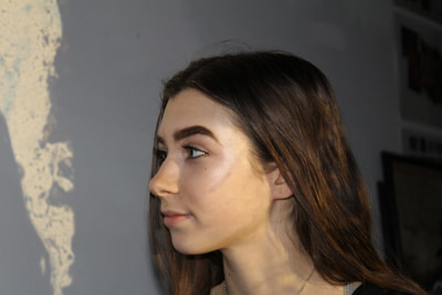
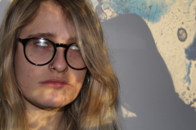
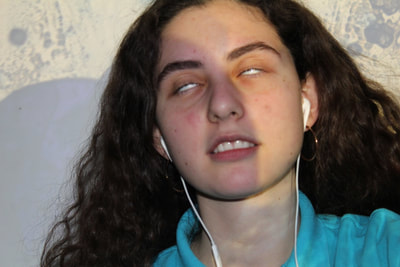
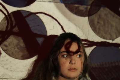
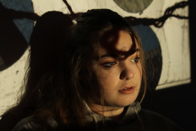
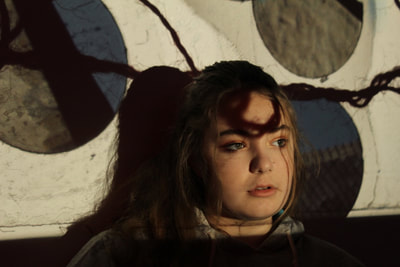
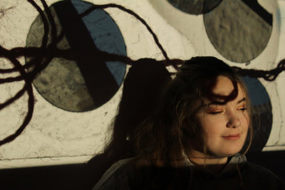
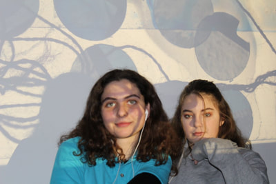
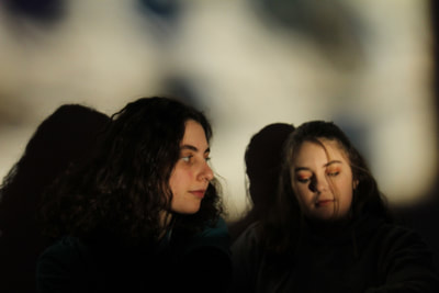
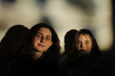
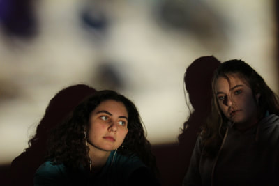
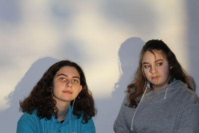
Continuing from the work of Dafna Talmor, I created slides using ink, string, sections of other slides etc and projected it on the wall. I created the slides by putting the substances between two pieces of clear acetate and put it in a slide case. I got my friends to stand/sit in front of the wall so the slides were projected on there faces. I liked using the ink as the heat of the projector caused the ink to move around and bubble up inside the frame so the projections were frequently changing.
EVALUATION
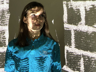
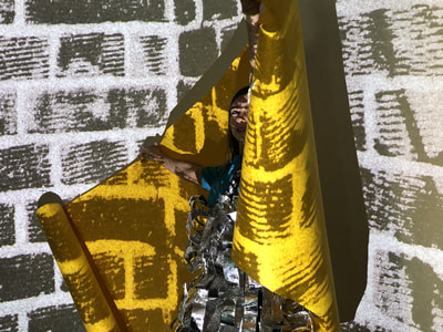
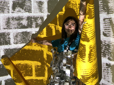
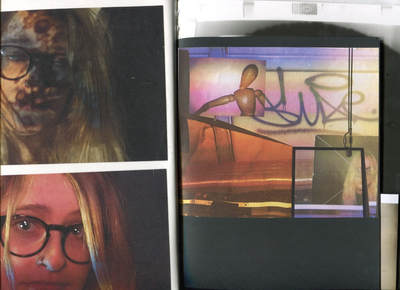
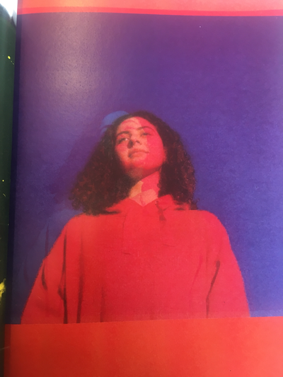
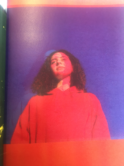
My favourite photos are below. I like the first one as its Really defined, I like the effect of the overlay of the projection over my subject making it abstract. This overlay creates a type of masl, covering the faces and creating a sense of mystery.
EVALUATION
My favourite photos are below. I like the first one as its Really defined, I like the effect of the overlay of the projection over my subject making it abstract. This overlay creates a type of masl, covering the faces and creating a sense of mystery.
Final Outcome
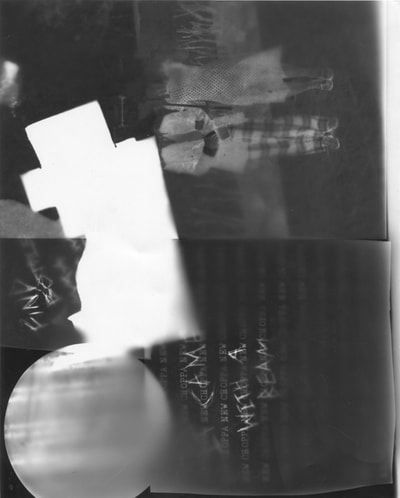
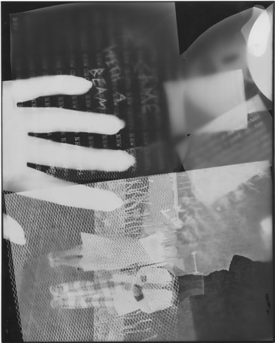
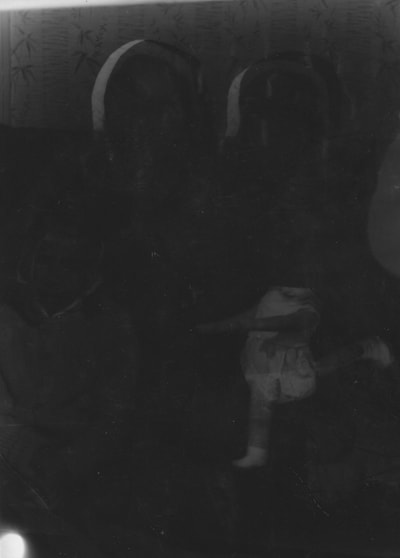
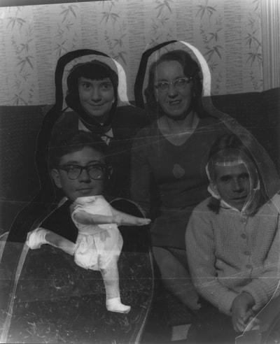
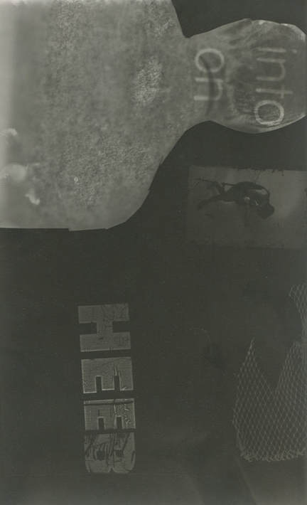
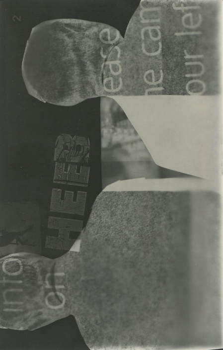
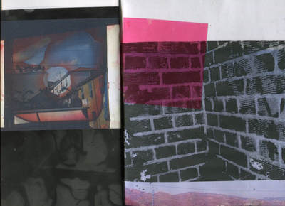
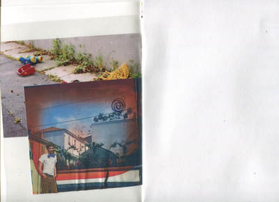
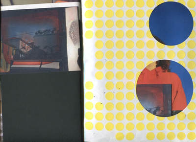
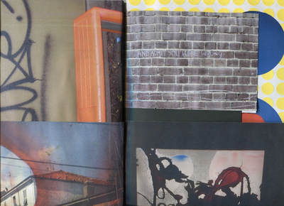
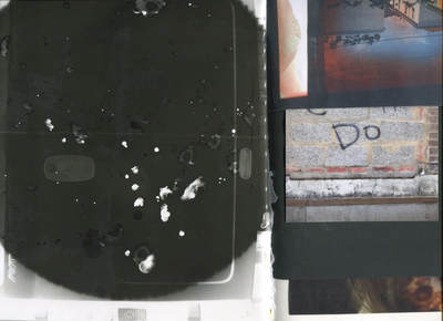
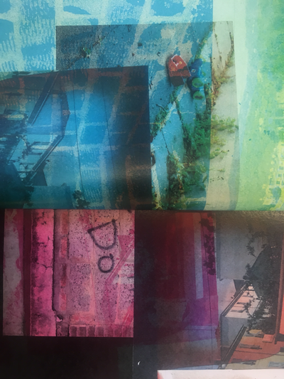
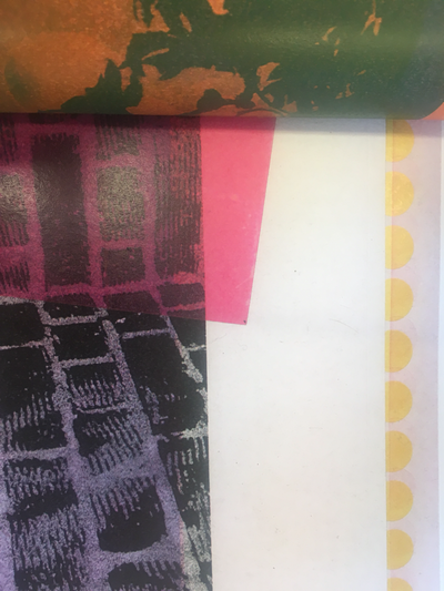
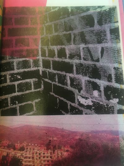
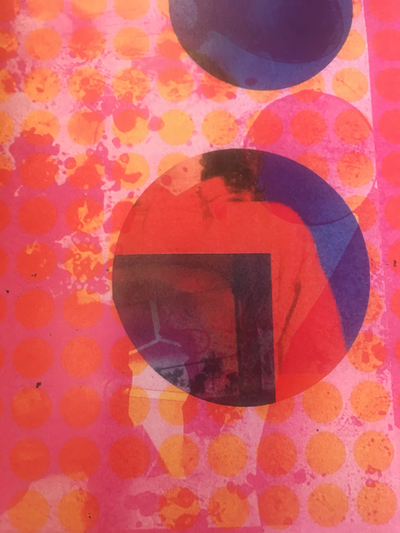
I created a book by stapling together different images and pages, of various sizes. This means the book has an interactive quality as the reader can play with the book making different pages and images expose. The book has a continuous theme of projections i created on the wall in class, wither digitally or with slides i made by putting substances such as ink and string between two pieces of clear acetate to create interesting shapes and patterns. After making the book i scanned various pages of the book
